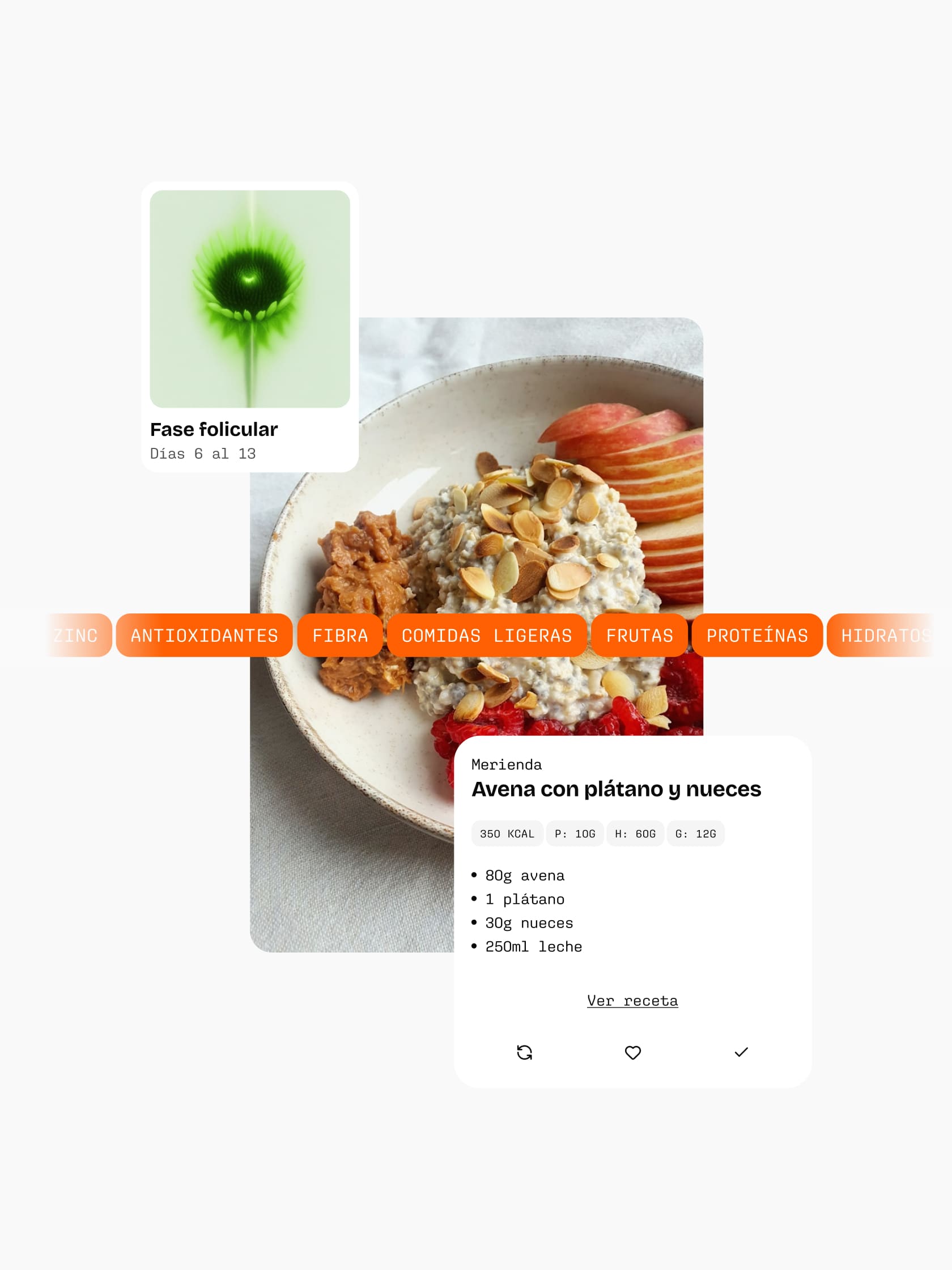
The femtech market is flooded with passive platforms that just collect metrics and predict dates.
Blumm was born to break that mould, translating the physiology of the hormonal cycle into a practical, day-to-day plan you can actually use. Our job was to build the project from the ground up, covering naming, strategic positioning, corporate identity, and digital product design to build a rock-solid ecosystem ready for launch and future funding rounds.
Brand strategy: From passive tracking to programmed action
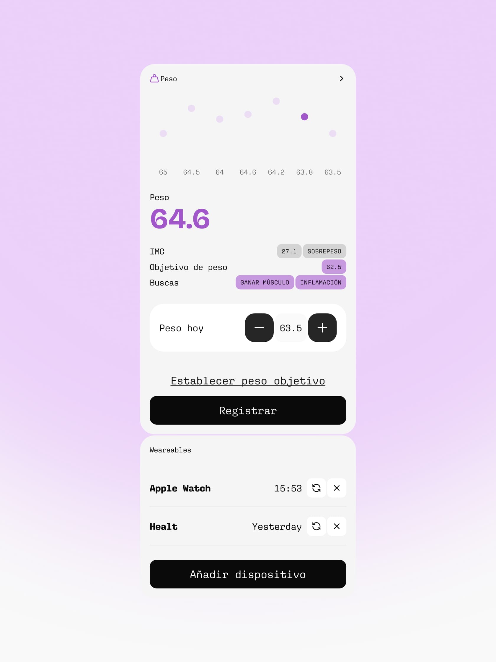
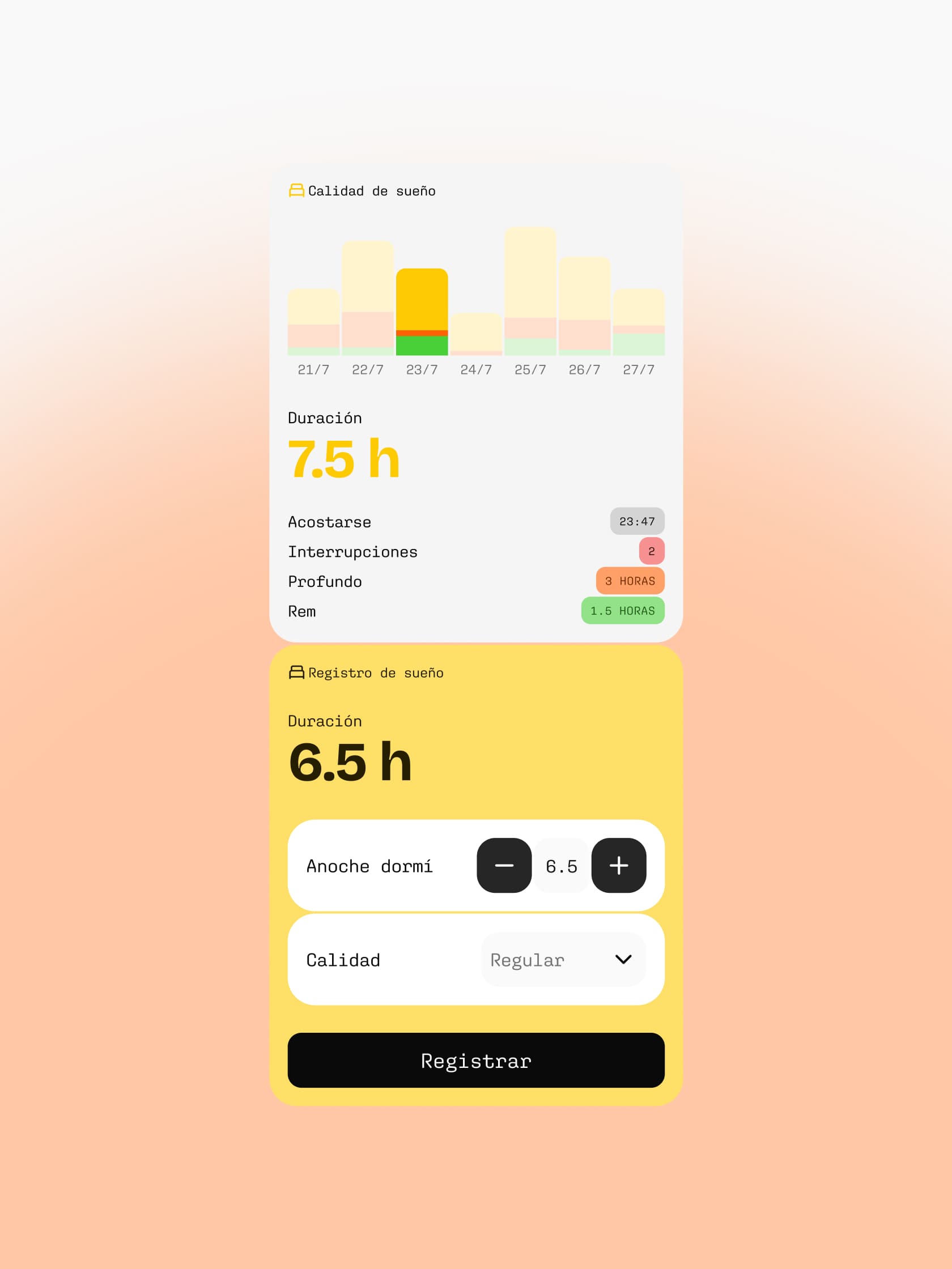
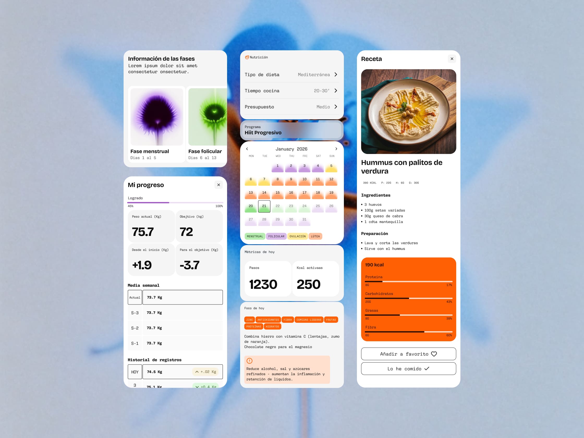
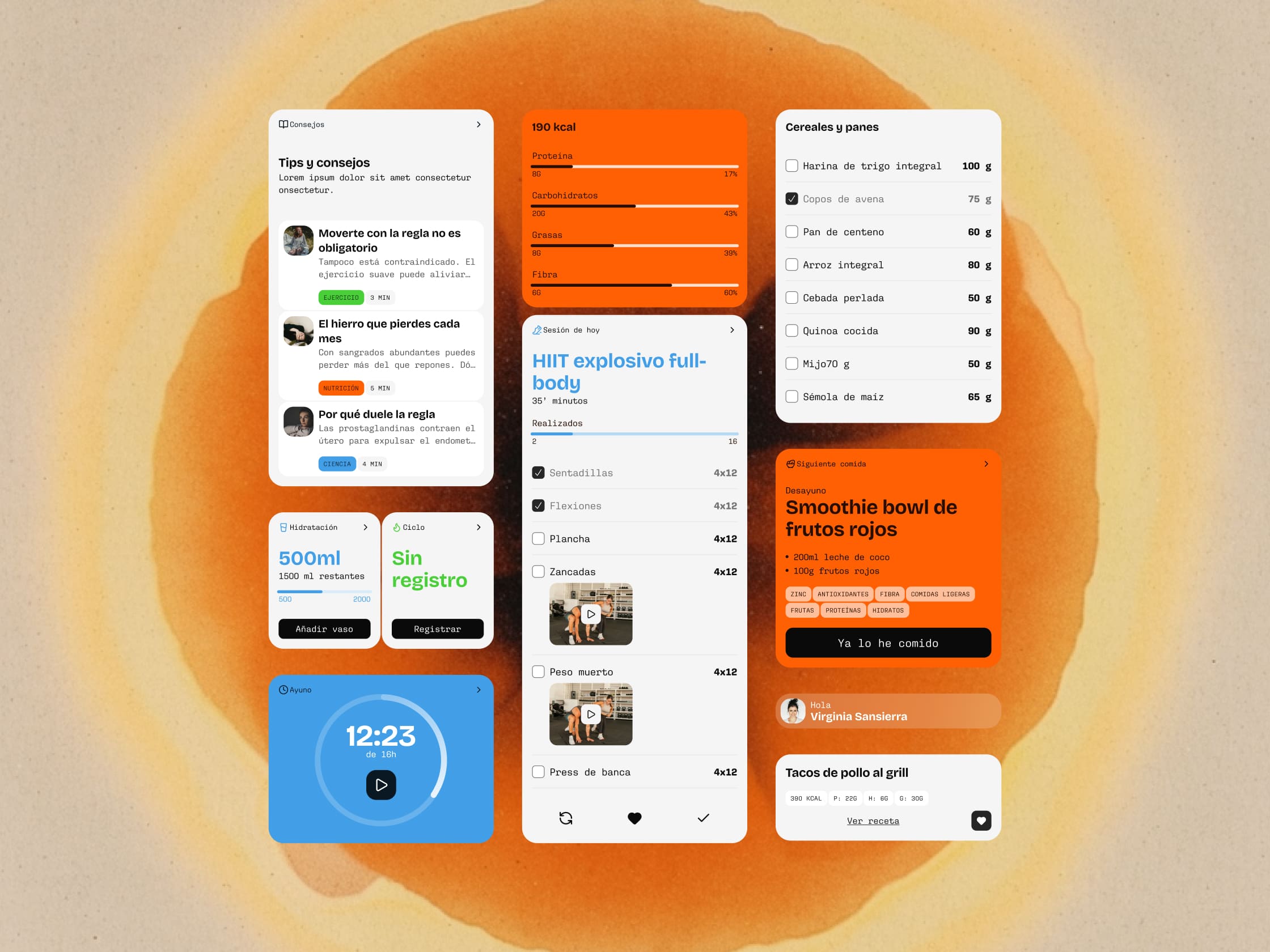
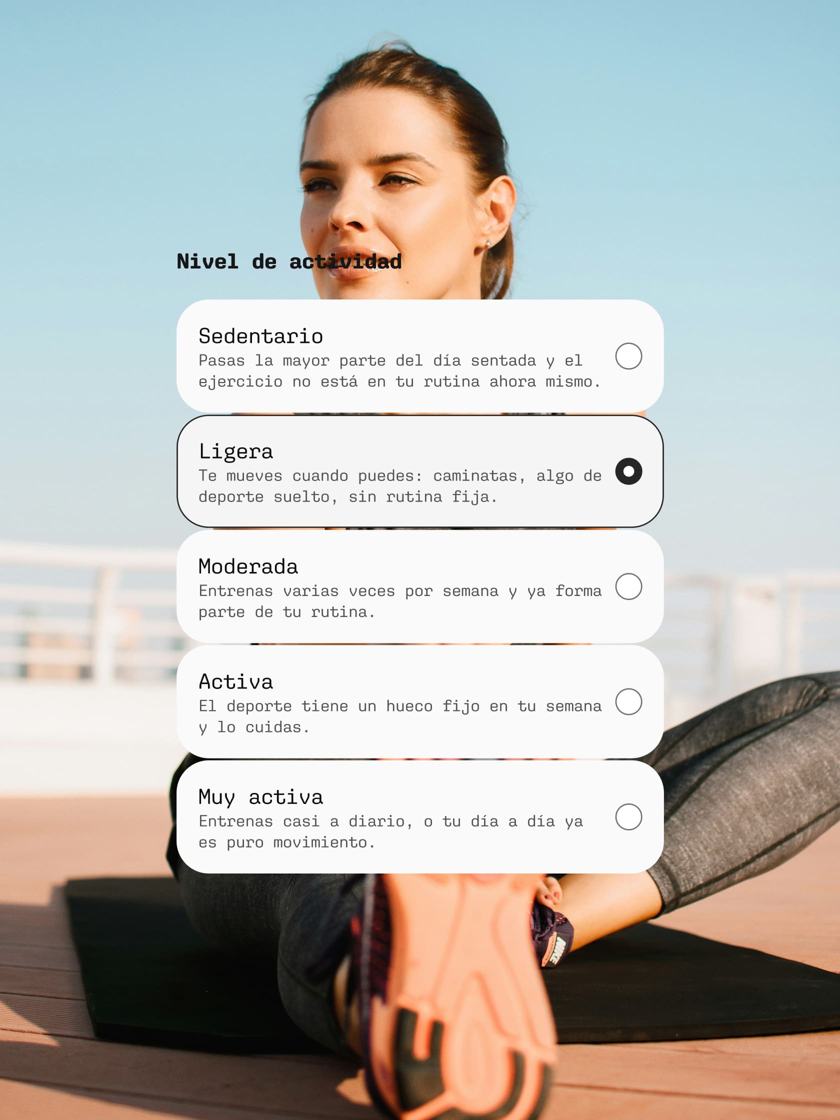
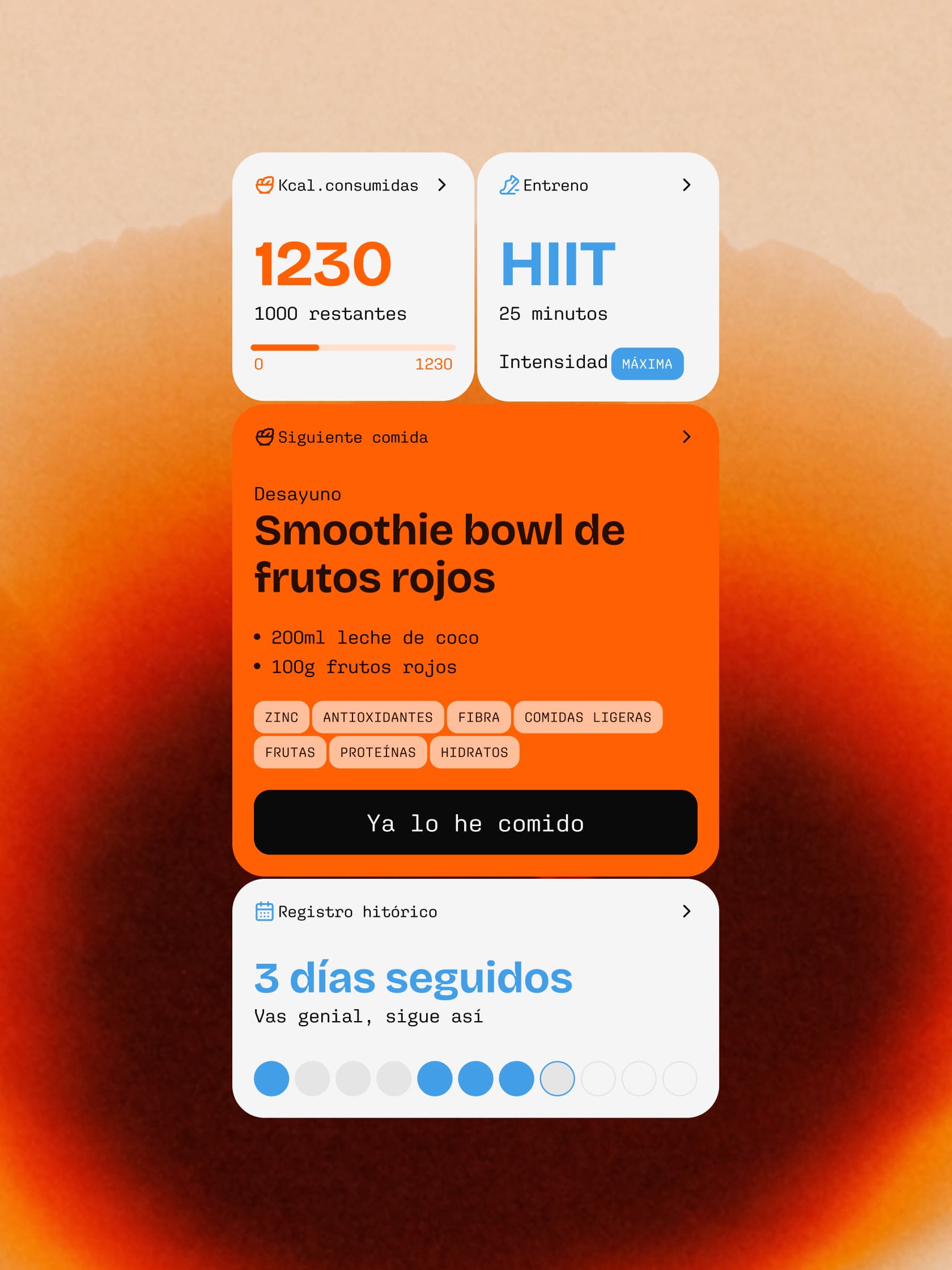
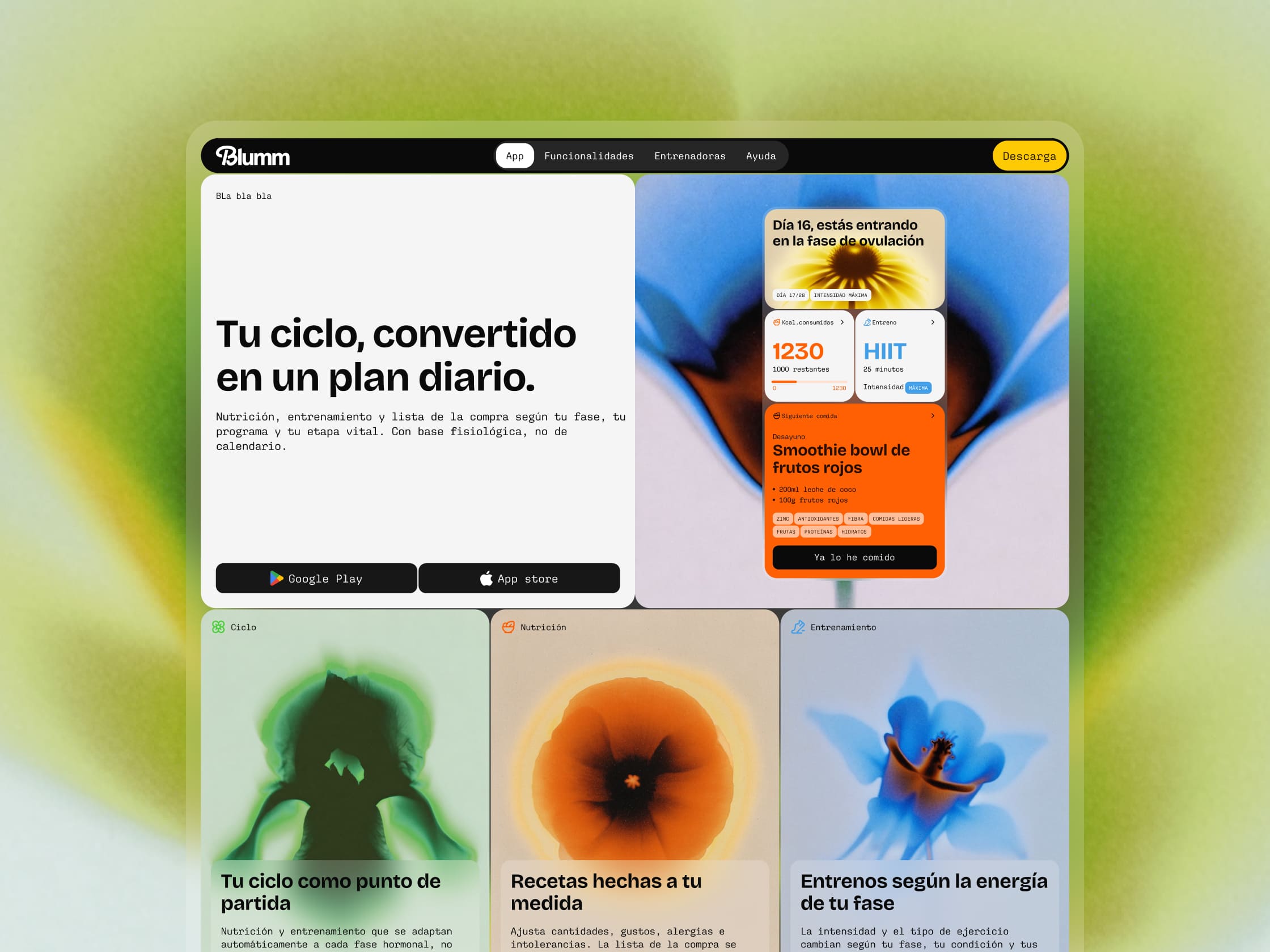
The strategic challenge was fixing the disconnect between logging a symptom and knowing what to do about it. We positioned Blumm in a space of applied science and pure common sense. To achieve this, we translated dense medical and sports data into an intuitive information architecture. On the UX/UI side, we structured the interface so that a massive crossover of variables (life stage, clinical nutrition, and training periodisation) resolves into a clean, frictionless, and action-oriented user experience.
Visual identity and UI design: Structural sophistication over clichés
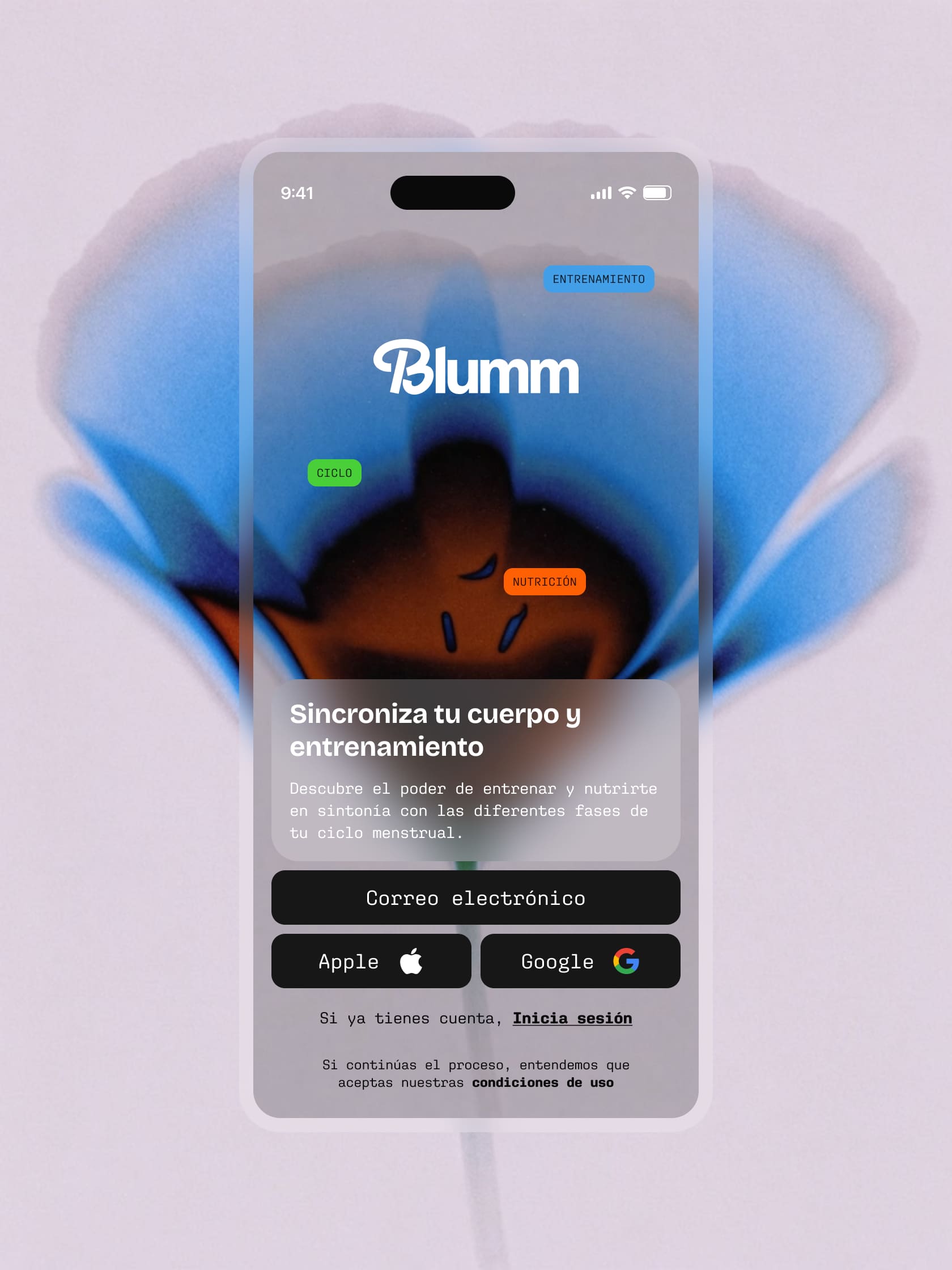
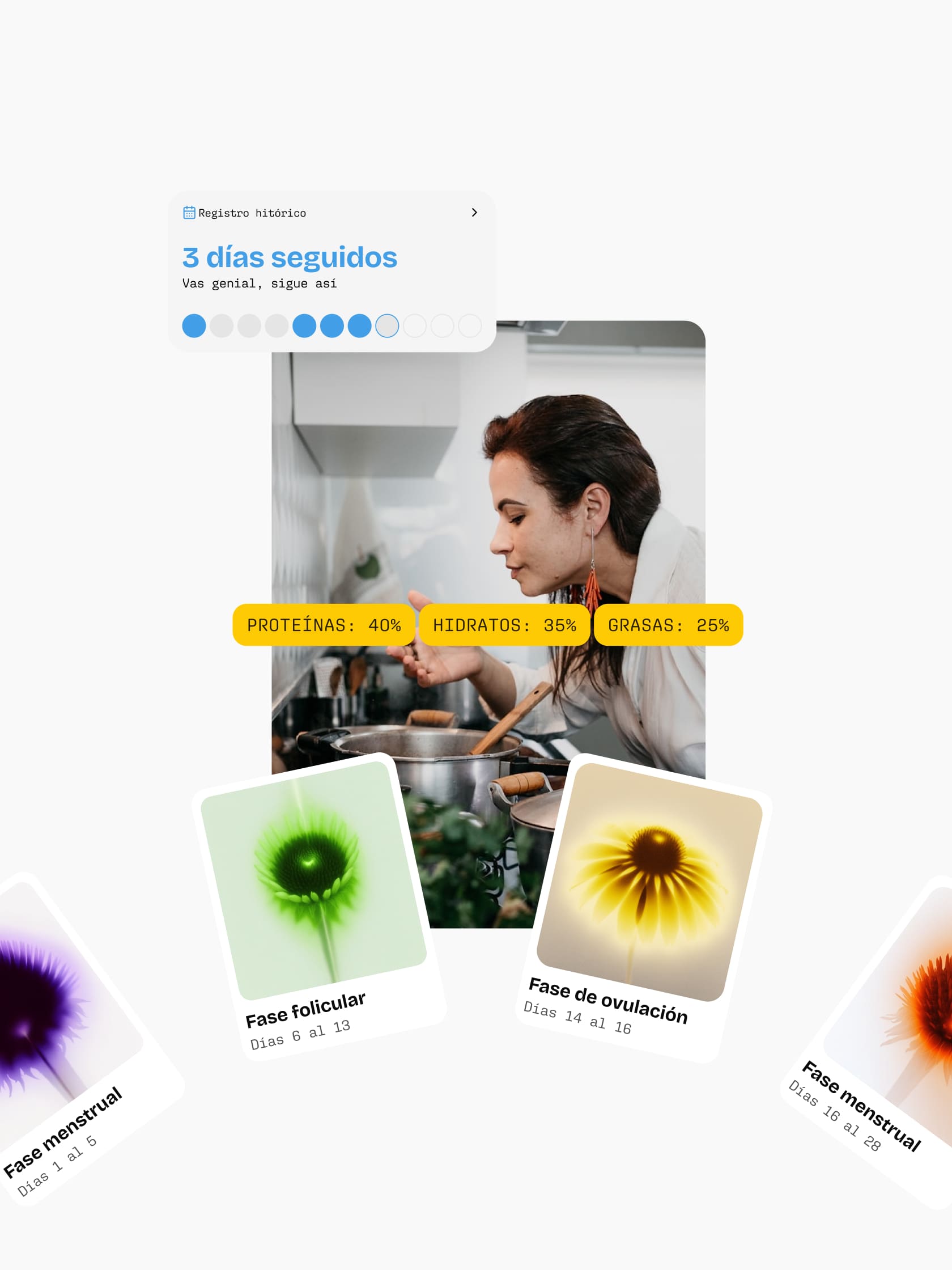
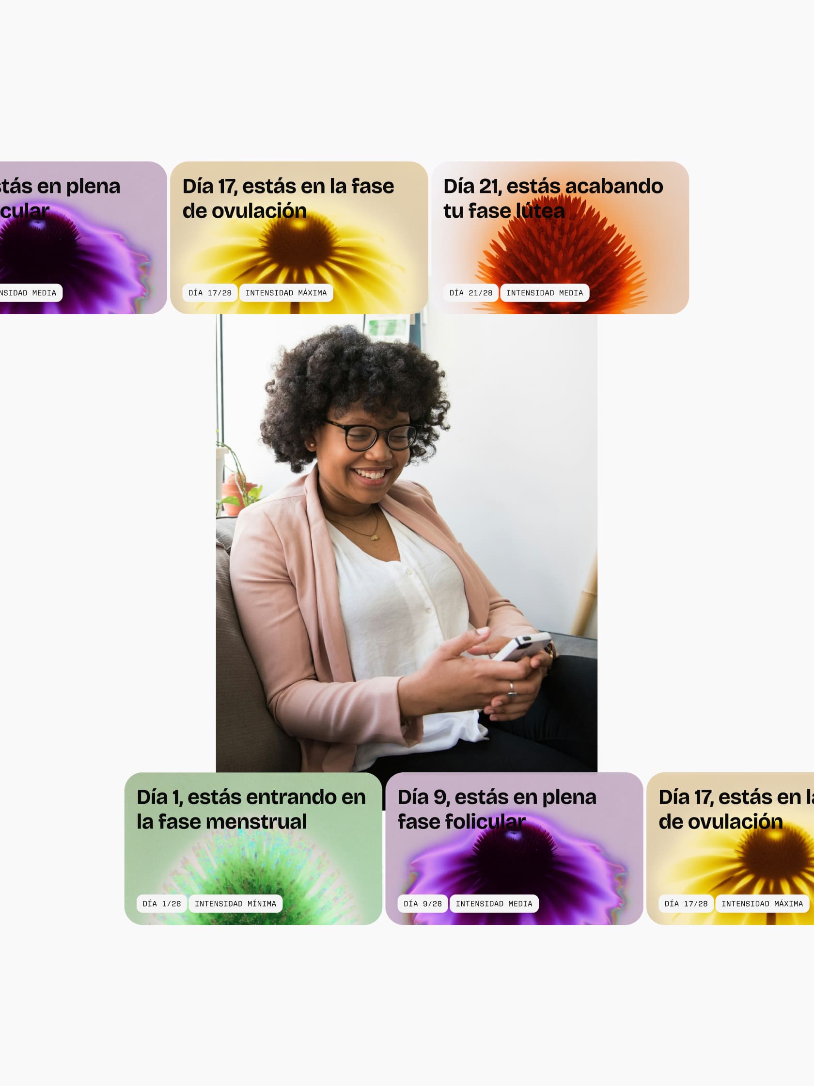
Pushing back against the sector’s standard aesthetic codes, we completely ruled out standard-issue pink and literal iconography. Pulling from the naming’s conceptual thread, we used floral elements as a running motif to visually differentiate the cycle’s phases and the app’s core pillars. We gave them an abstract, out-of-focus treatment with a vibrant, intense colour palette. The result is a unique, highly recognisable visual code that feels organic, sensory, and almost scientific, steering well clear of the conventional.
This striking graphic universe lives alongside a clean, highly functional interface system.