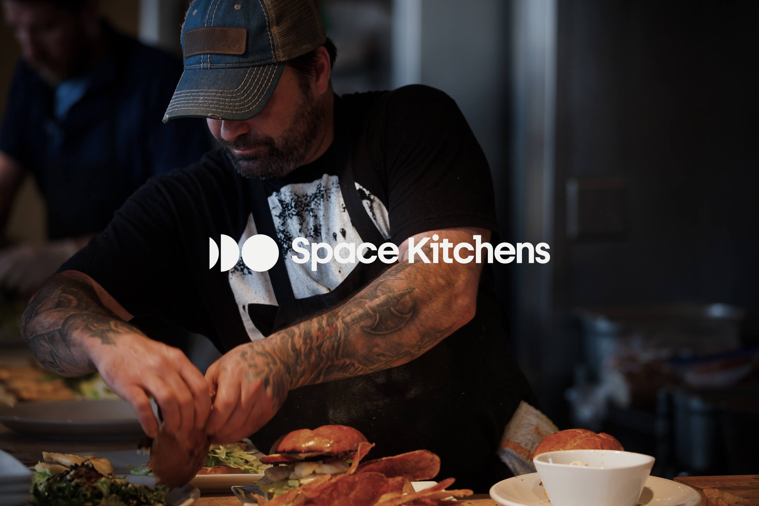
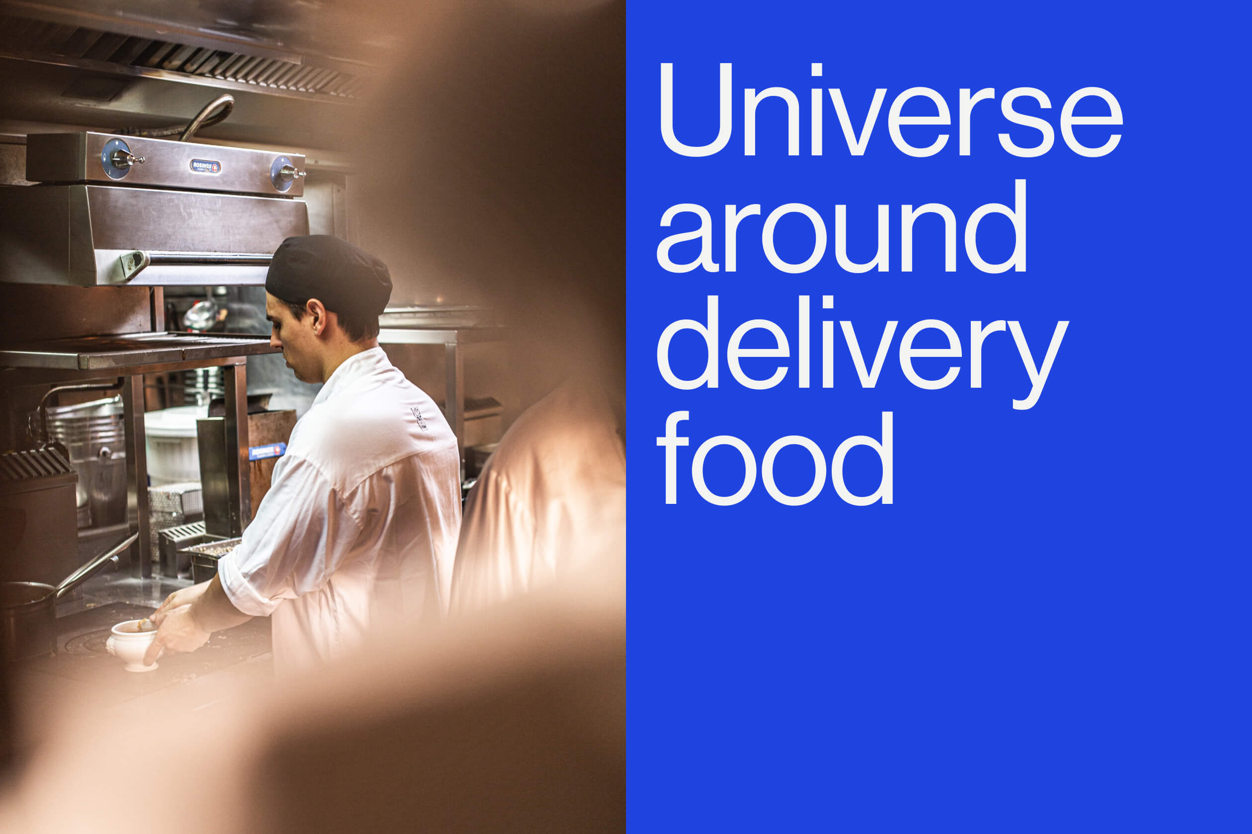
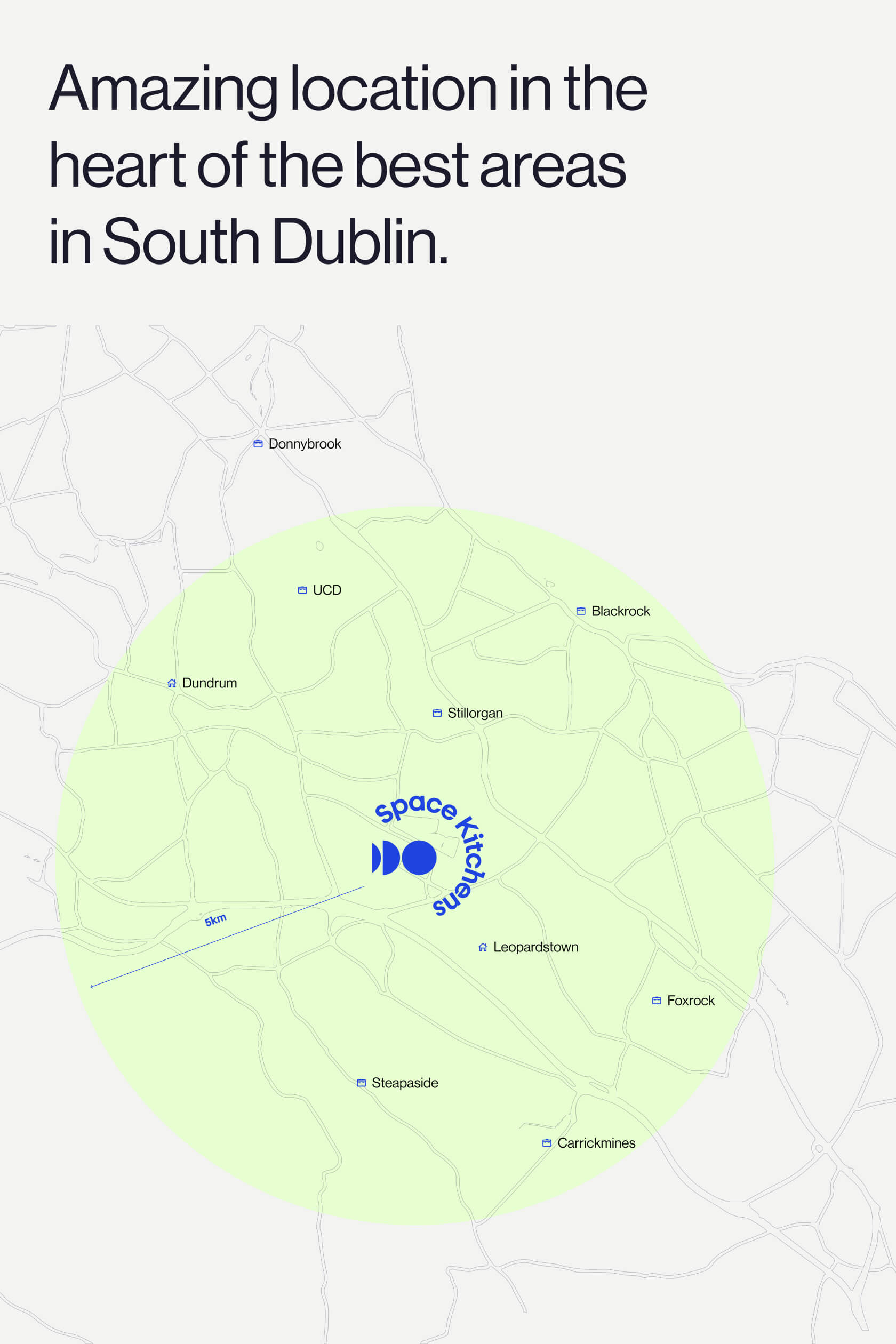
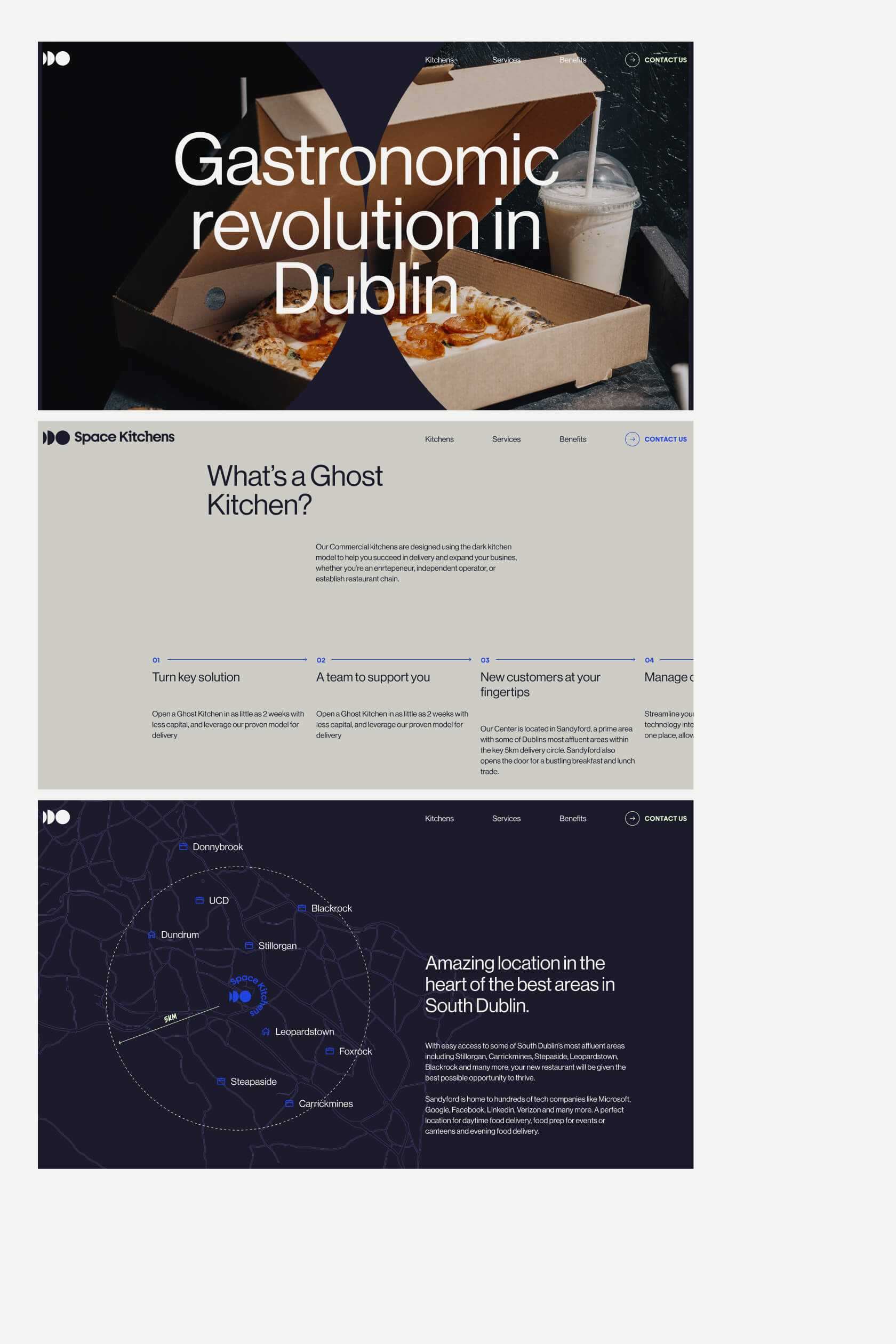
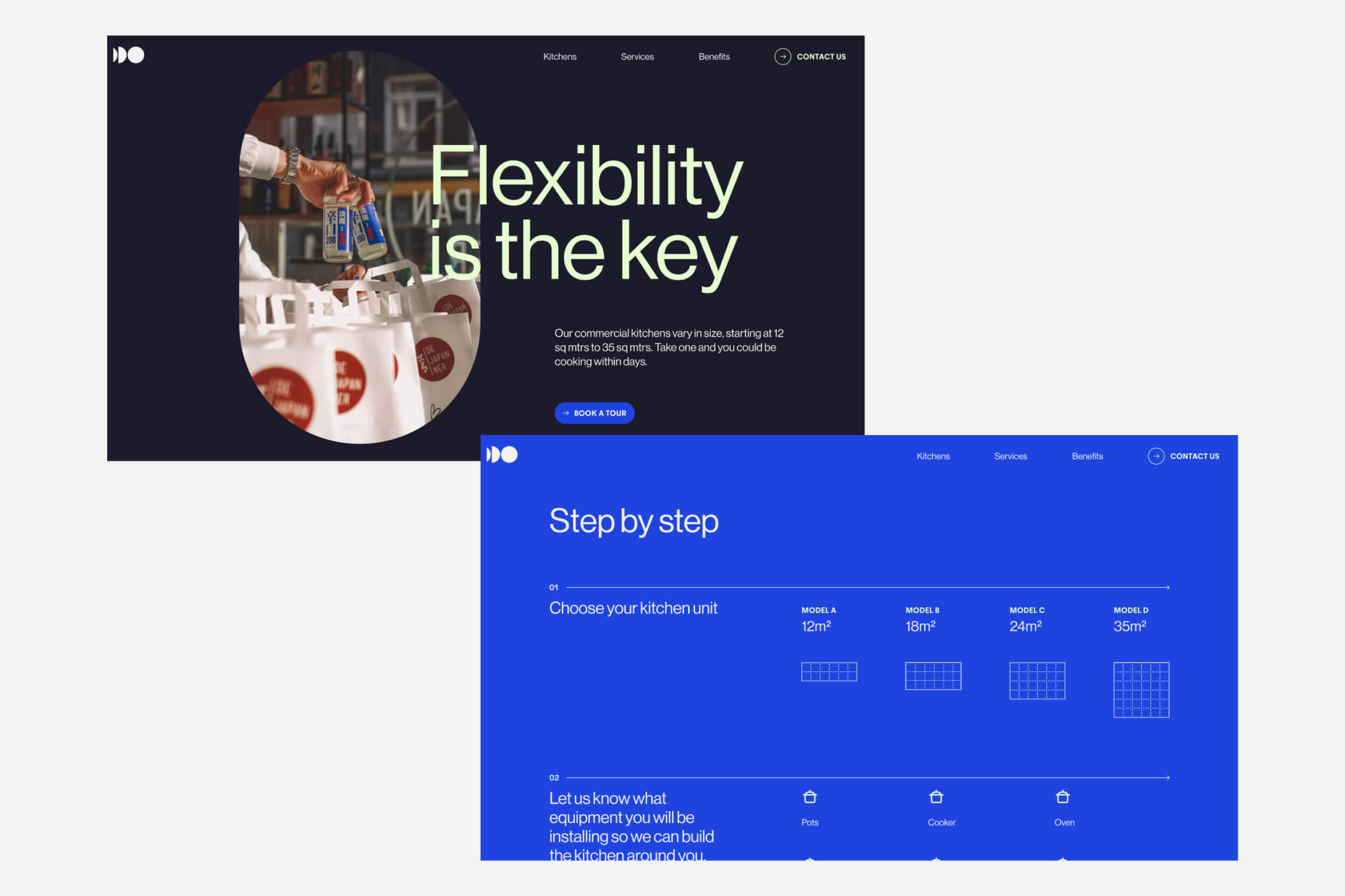
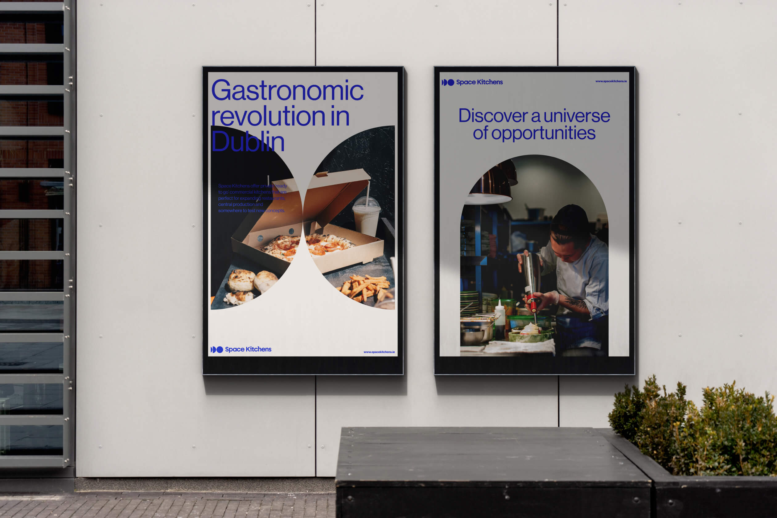
Space Kitchens empowers businesses to broaden and extend their offerings to an increasingly dispersed customer base.
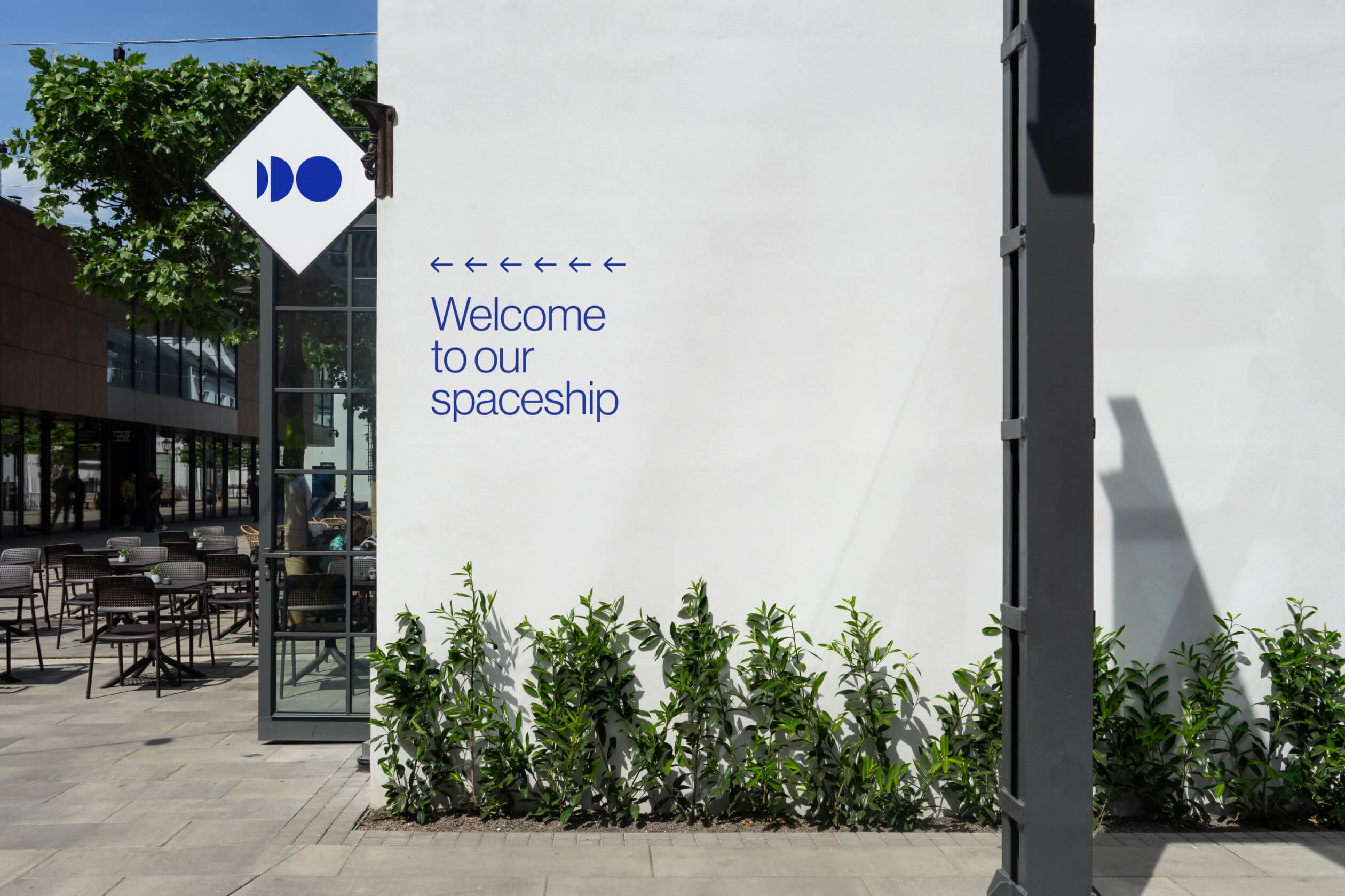
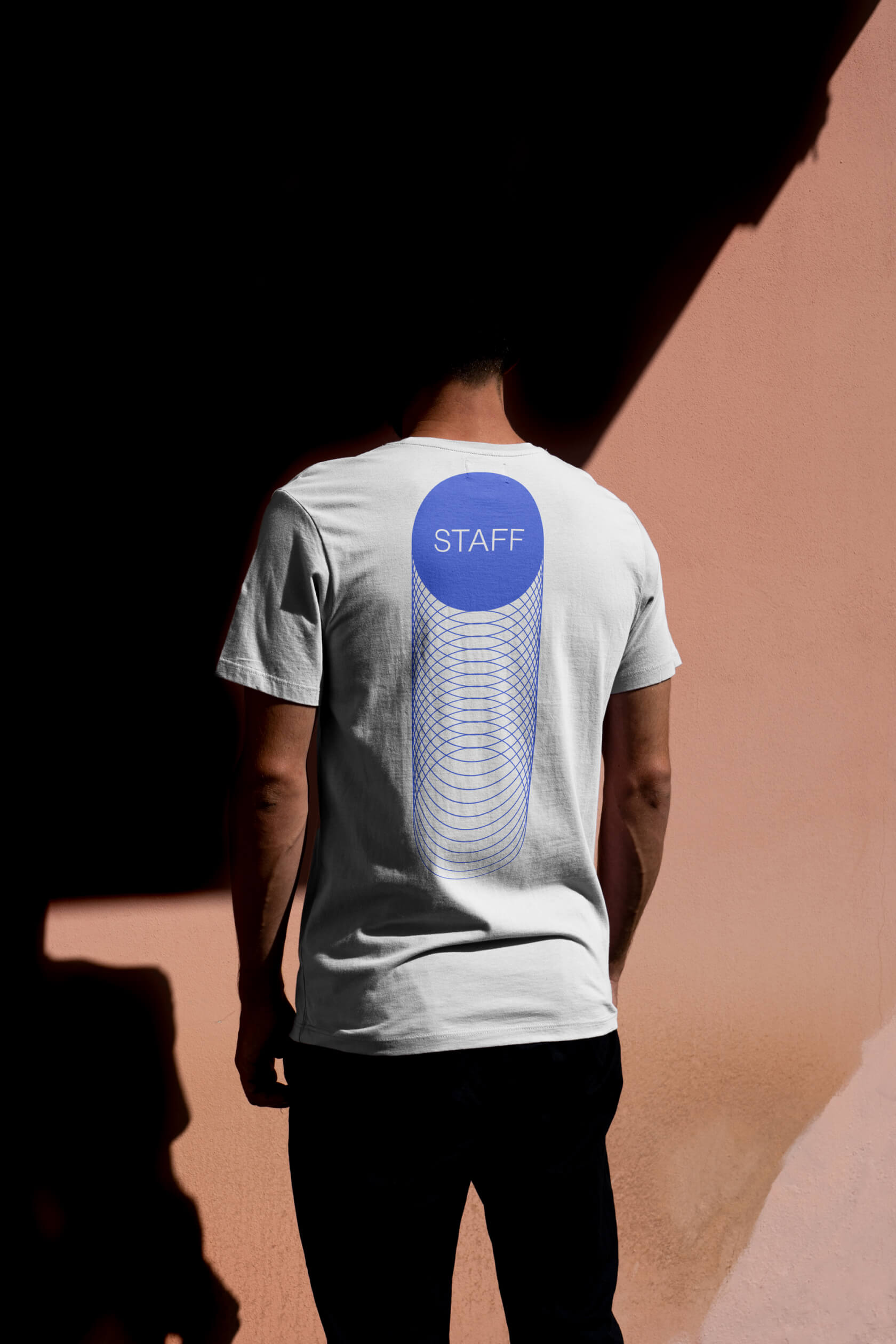
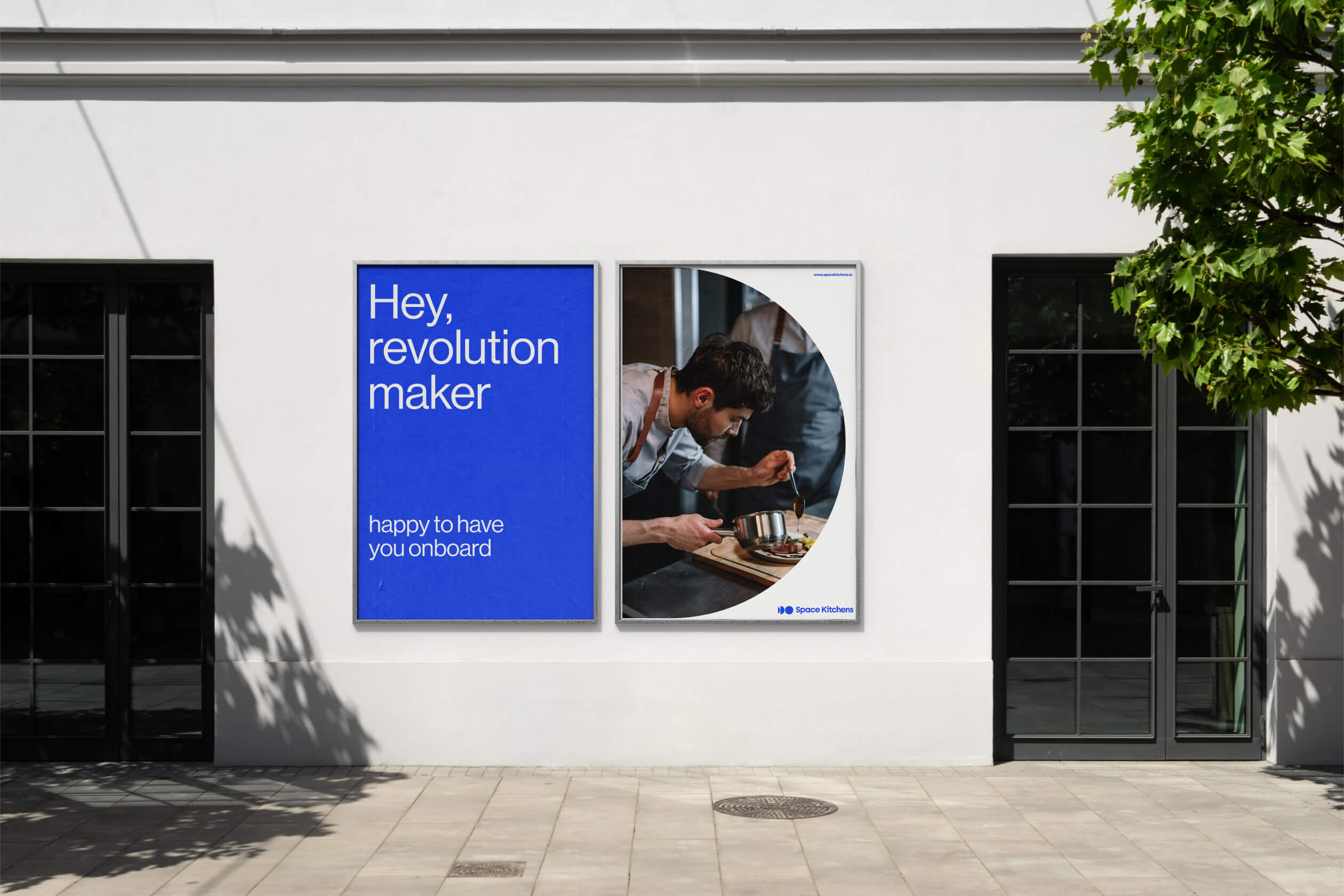
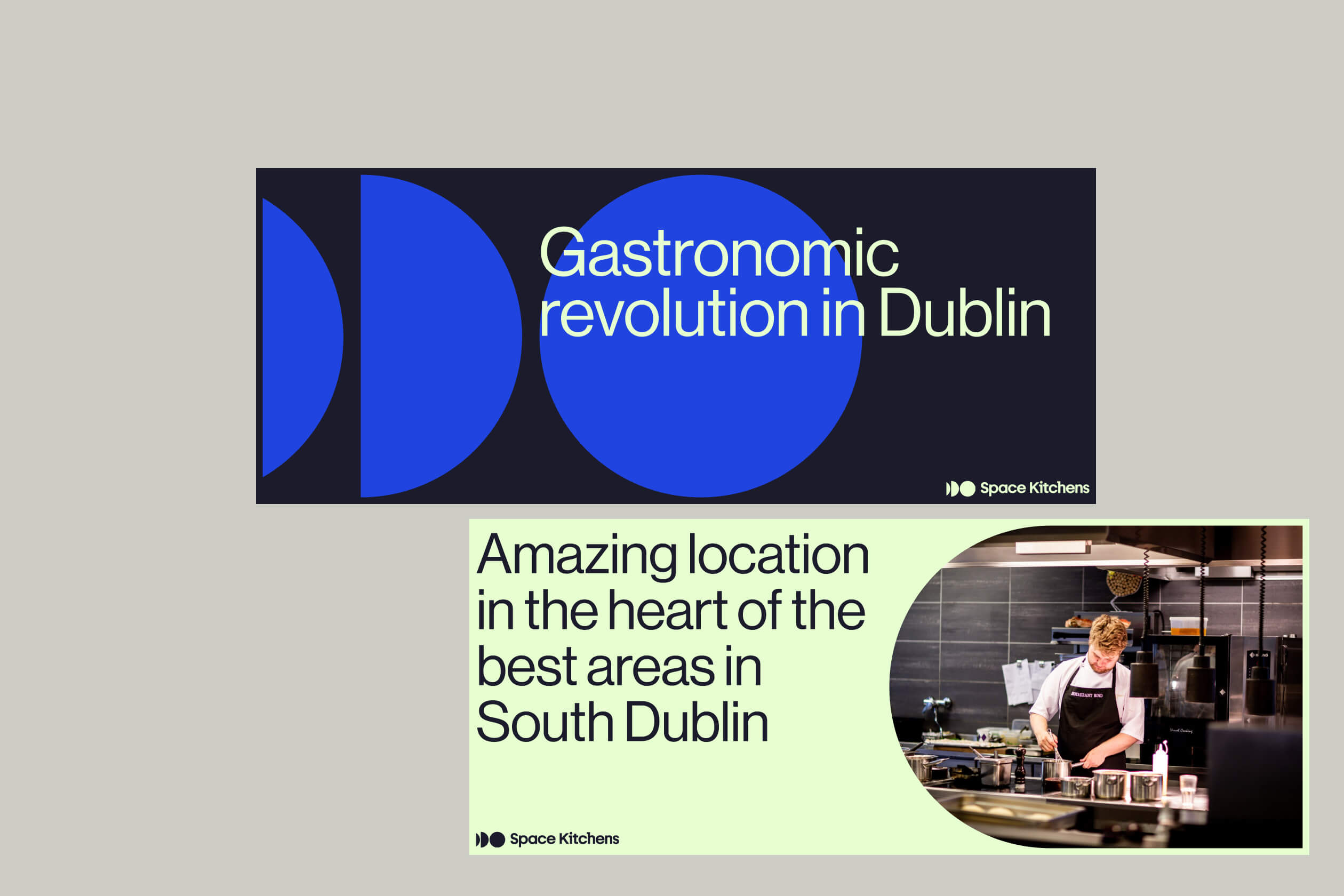
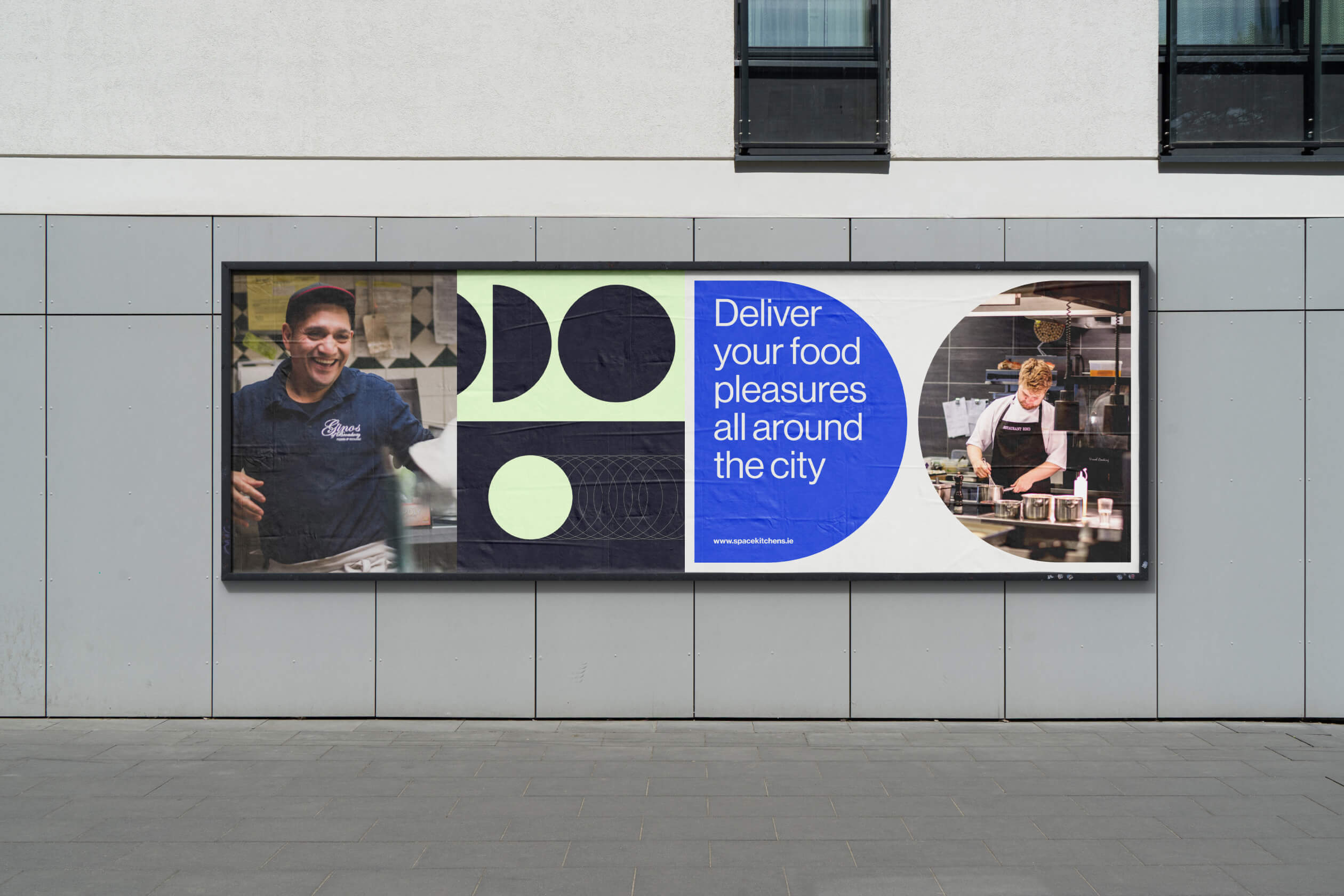
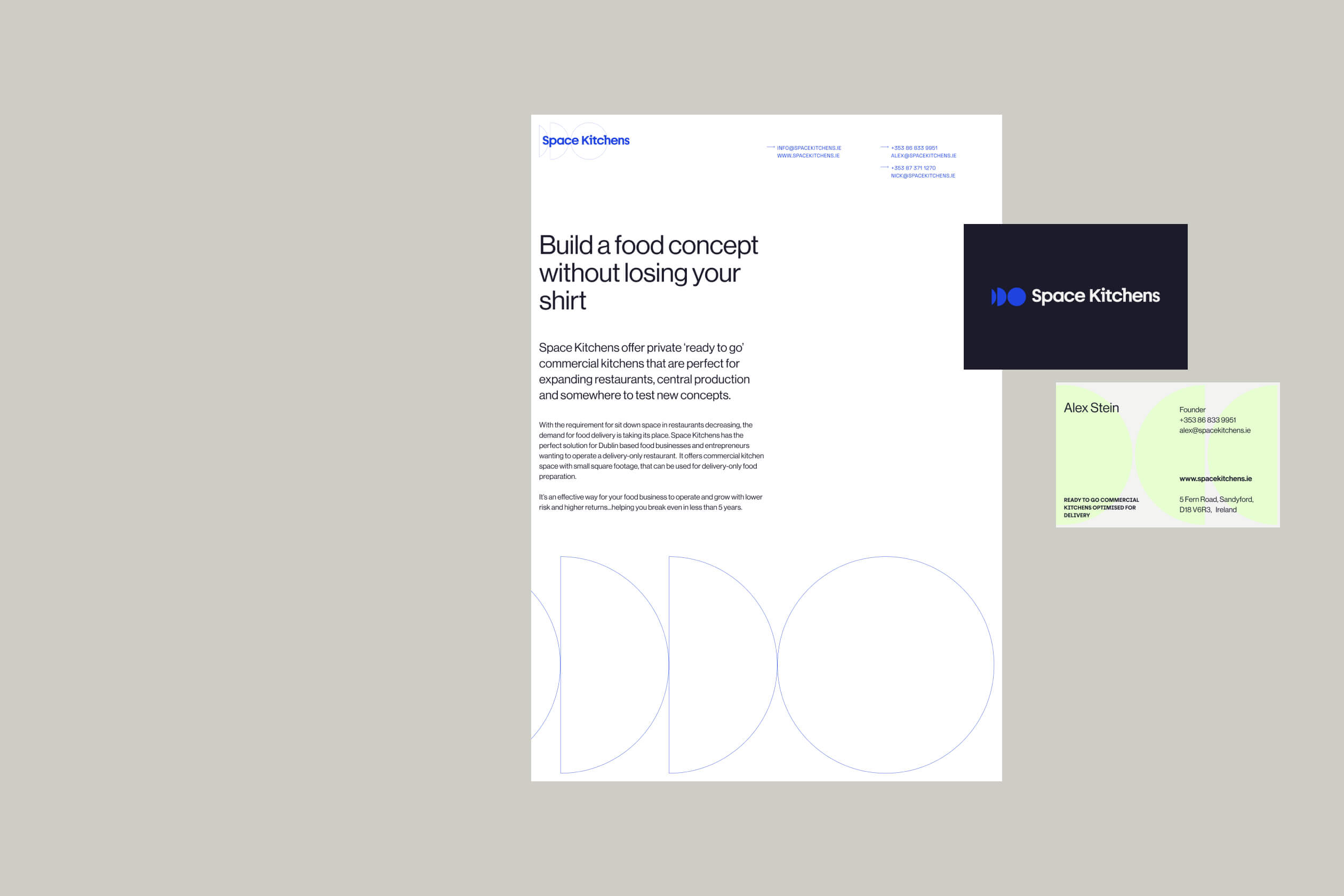
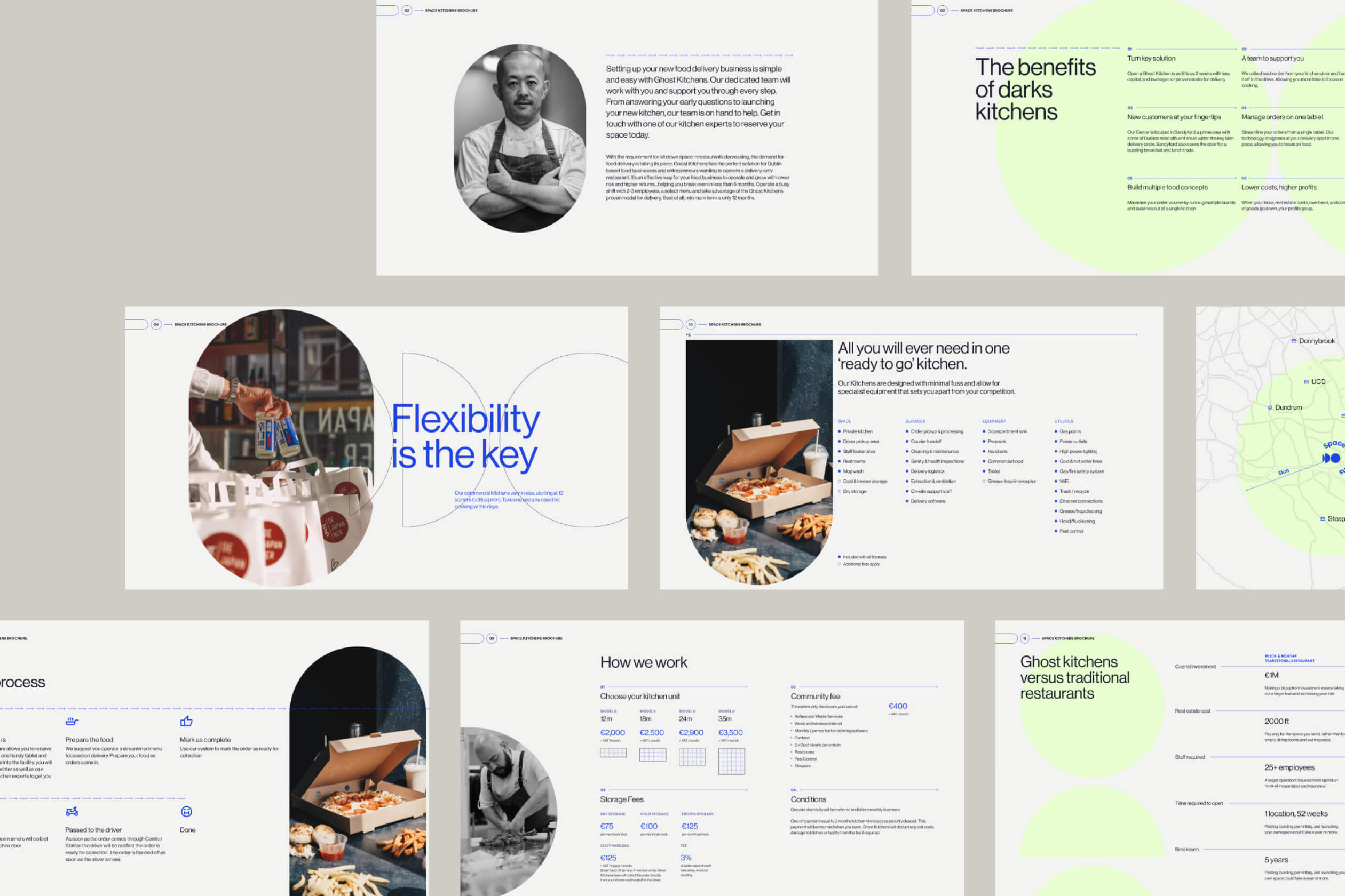
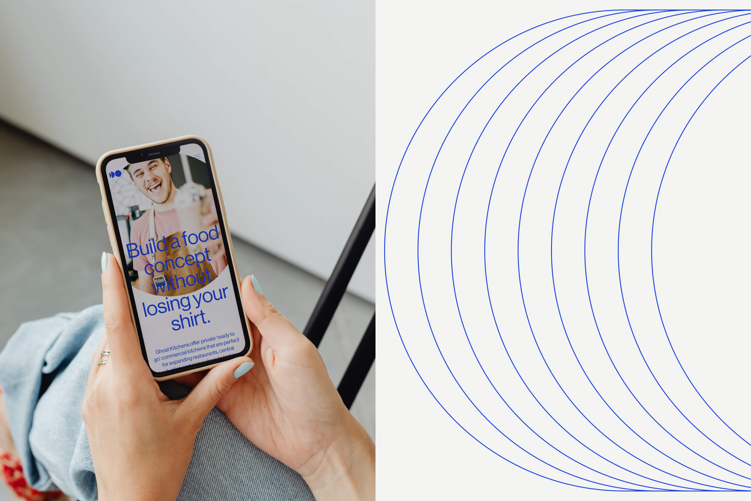
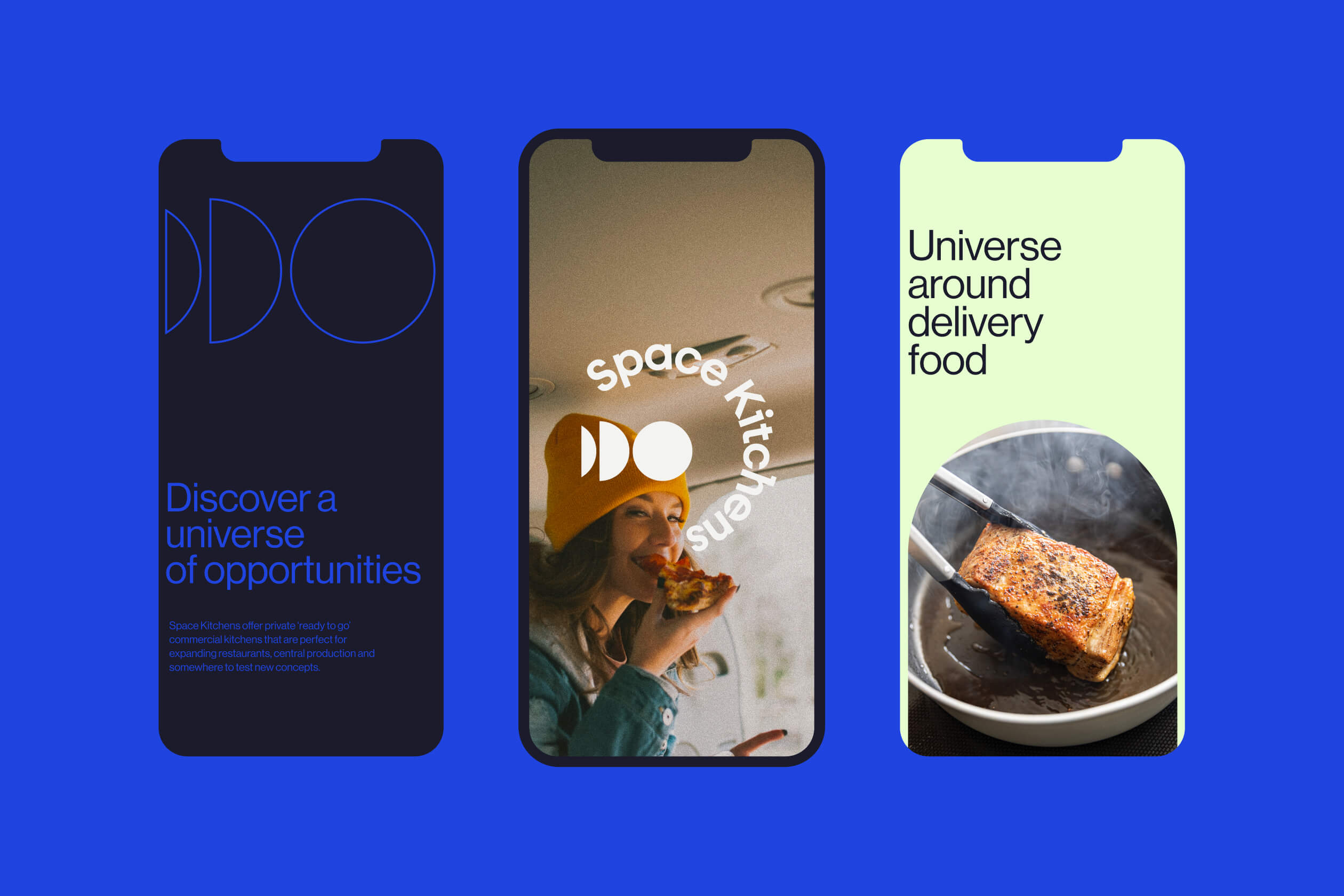
The brand’s system is made up of simple and lively shapes, each with lots of different versions but all based on the idea of growth and motion. We created a colour palette based on blue to mimic the imagery surrounding the universe, yet maintaining a corporate and sober tone that doesn’t lose the character of a B2B company.
We designed a highly adaptable and versatile brand system. We played with the elements to increase the size of the icon and its proportions, creating blocks of striking colours that add dynamism.
Related Projects
ProjectsProjectsProjects