Defining the beautifully imperfect
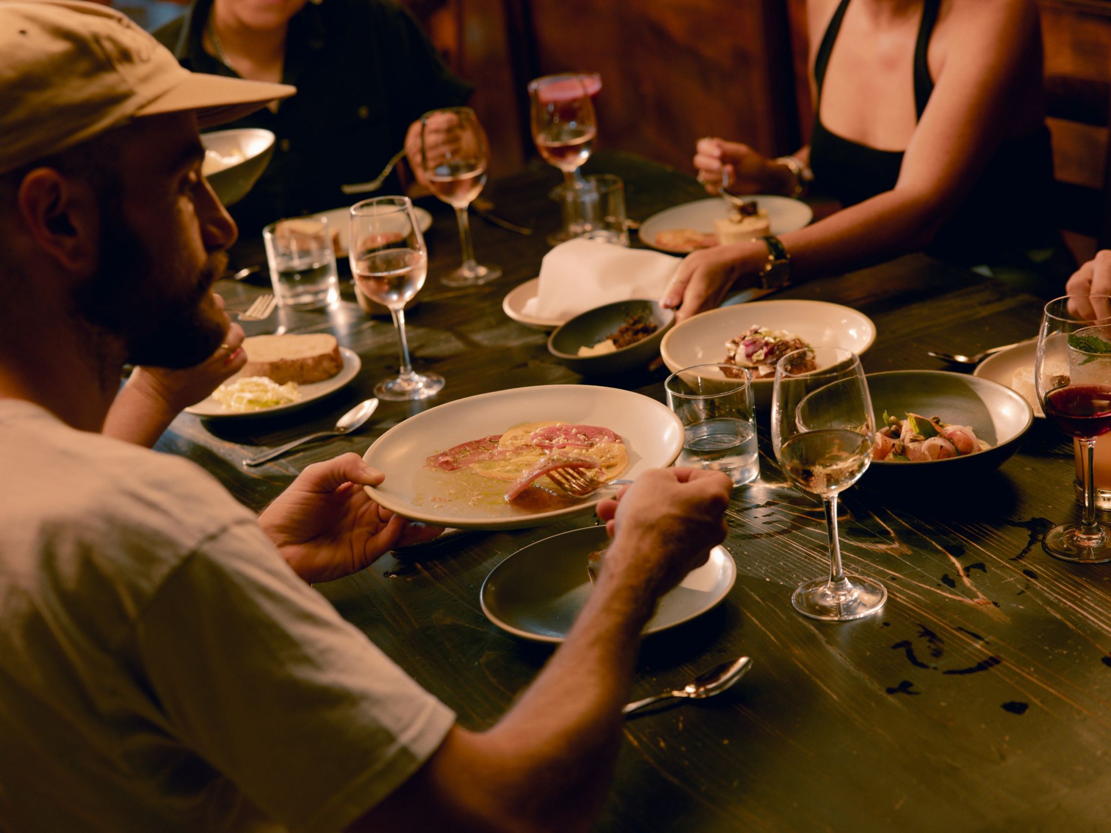
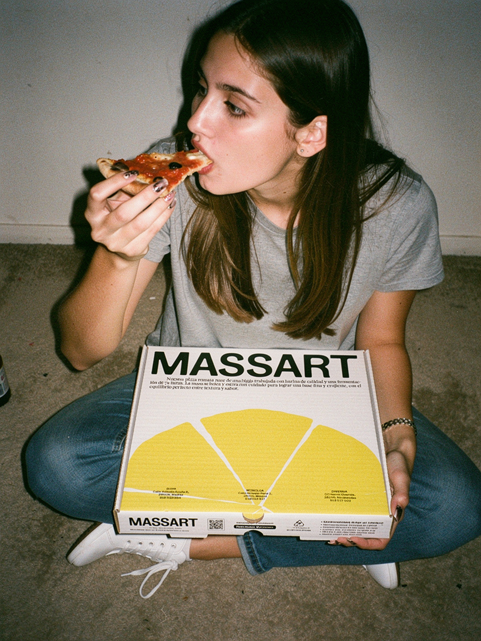
Massart is the result of two Belgian brothers’ obsession with authentic Roman pizza. In a Madrid market saturated with soulless, industrial chains, they chose the workshop approach: testing, failing, and refusing to stop until they had perfected their signature dough.
The challenge was to strike a fine balance between the fresh energy demanded by a younger crowd and the dependable warmth that brings families back to their favourite trattoria. We gave the brand a face with an identity that moves and evolves, much like fermenting dough. The result is a brand that feels truly artisanal because it is, filled with organic irregularities and hand-drawn details that steer well clear of the cookie-cutter.
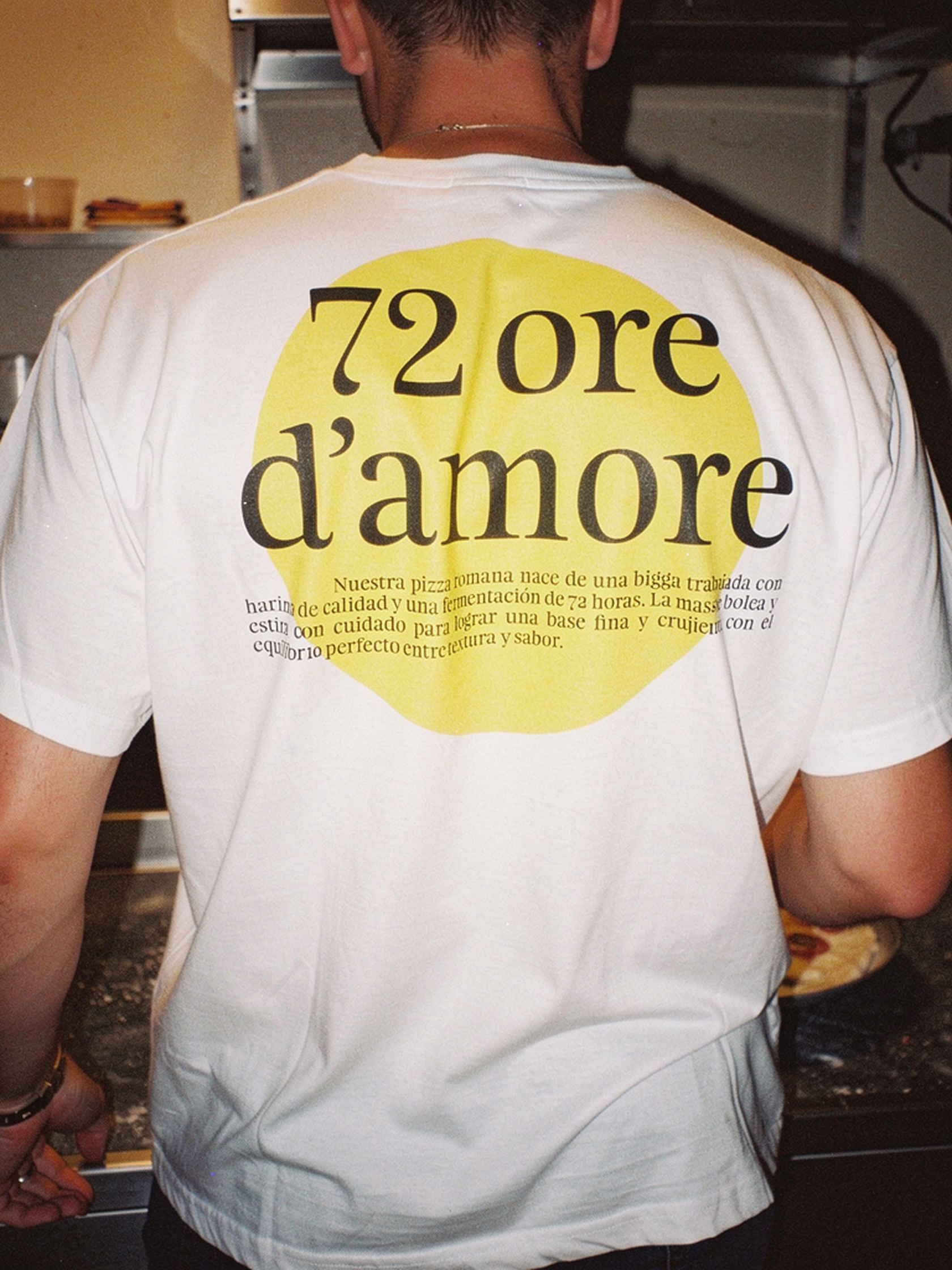
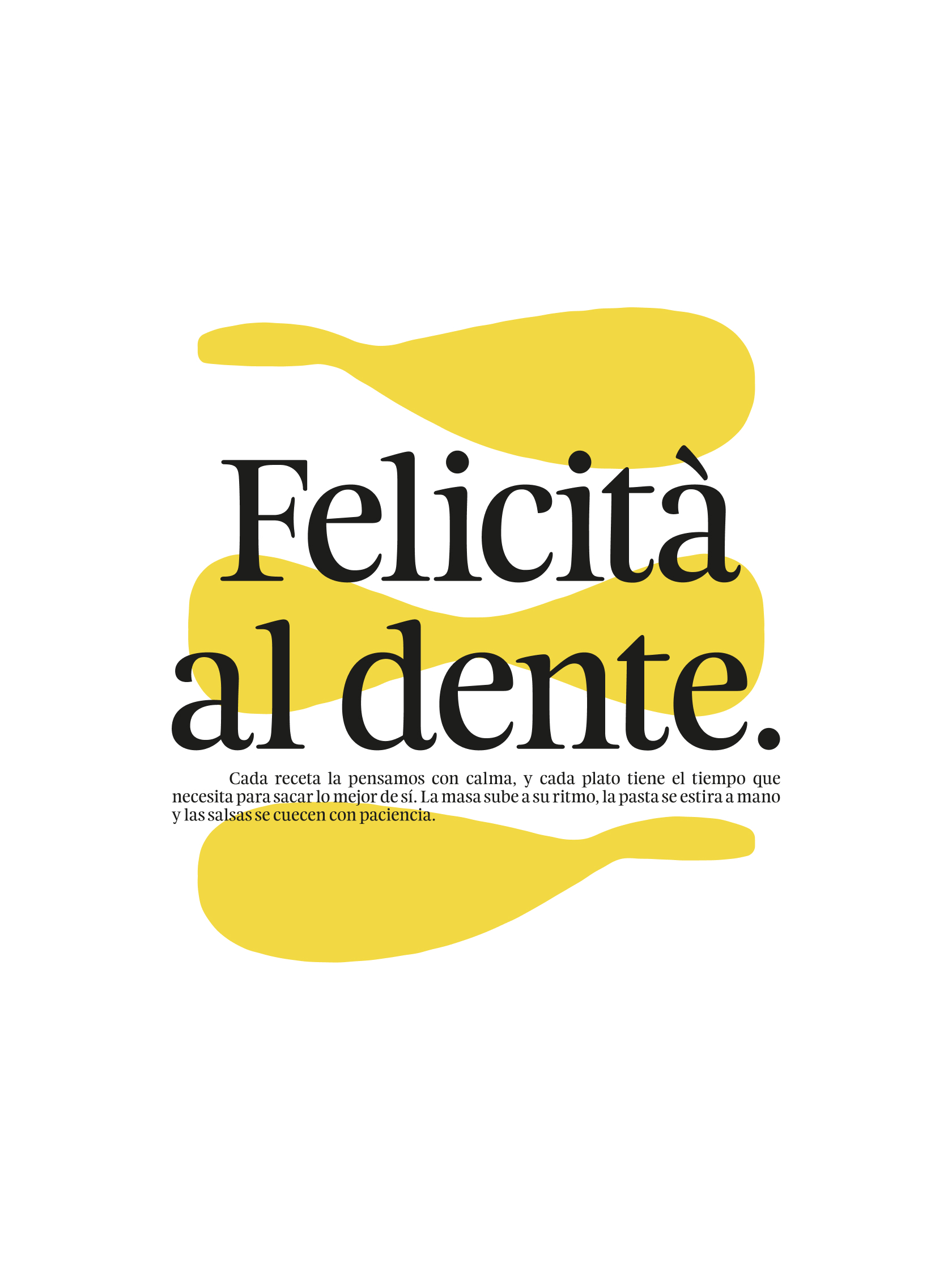
72 ore d’amore: Good dough takes time
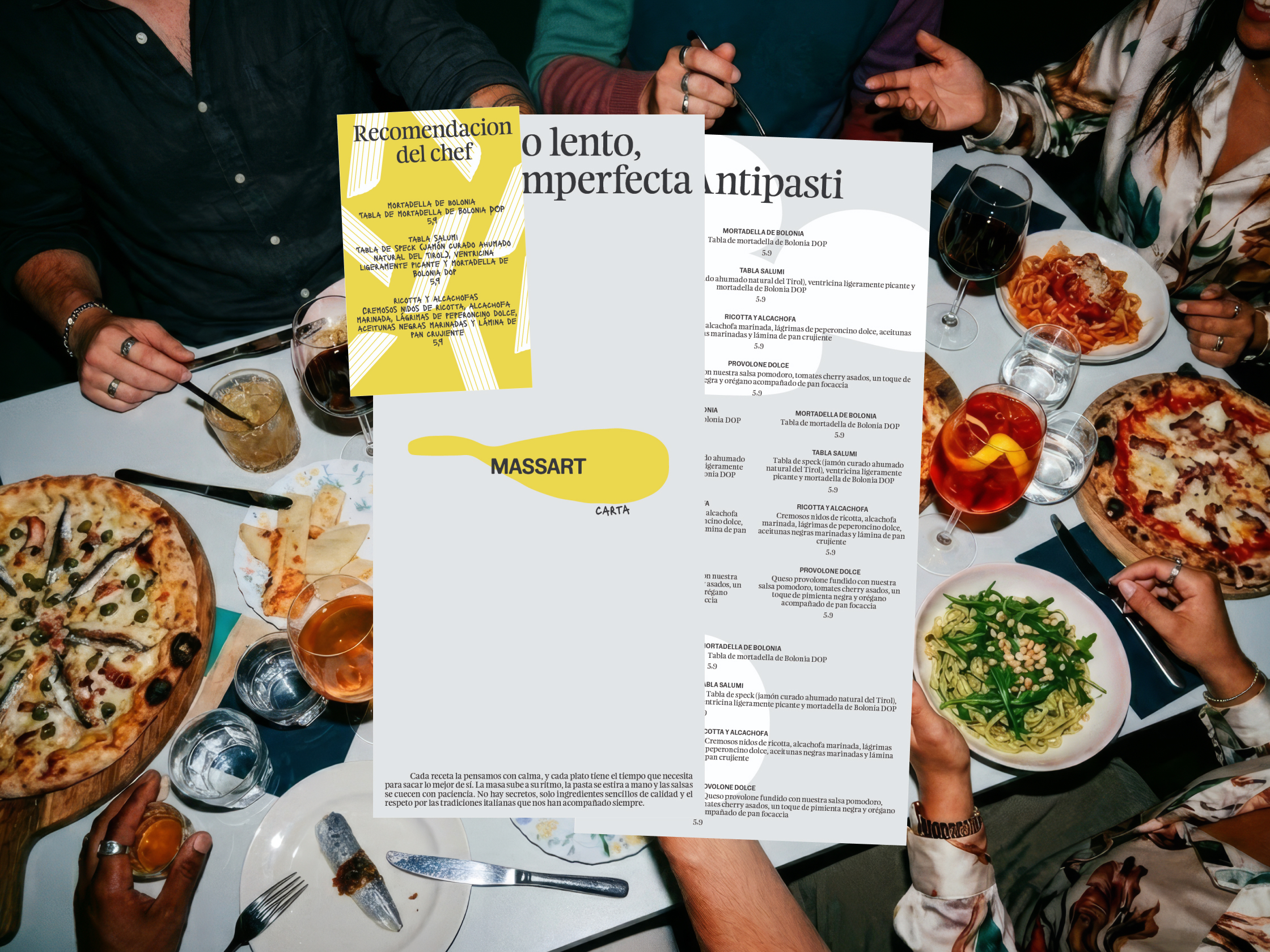
The visual concept is rooted in the fermentation process itself. We used the typeface States Variable as the core of the logo, playing with “ink pressure” to mimic the way dough expands and breaks free from geometric rigidity. It is a logo with a pulse; it feels alive.
To balance this dynamism, we introduced Feijoa as the secondary typeface. It brings a touch of class and an elevated feel, yet retains an approachable, friendly quality. This duality allows the brand to move effortlessly between the sophisticated and the everyday, ensuring Massart feels like a special destination without losing the “home-cooked” heart at its core.
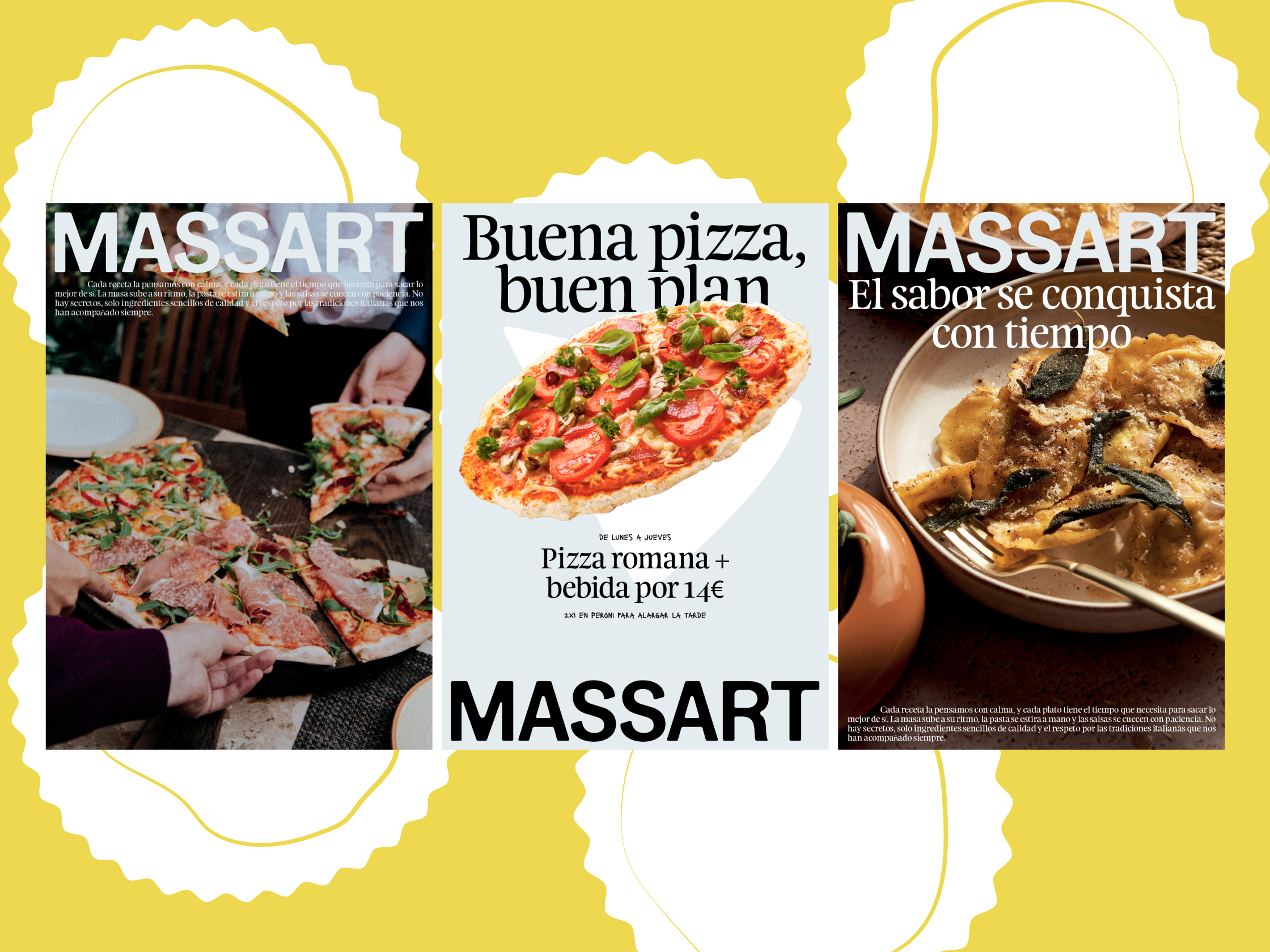
A hands-on identity
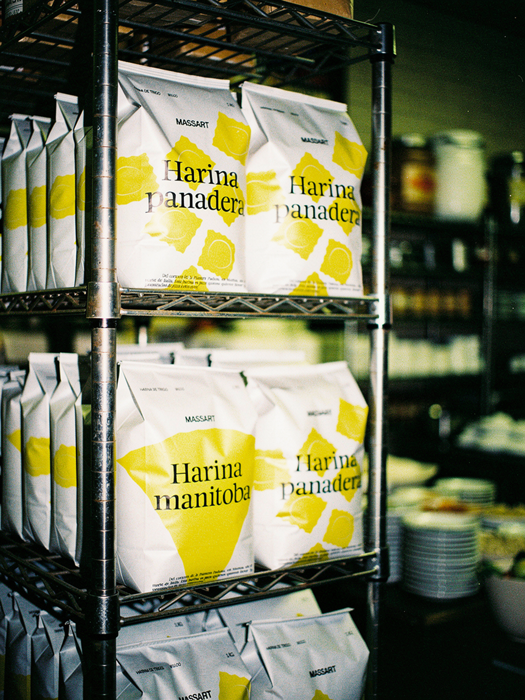
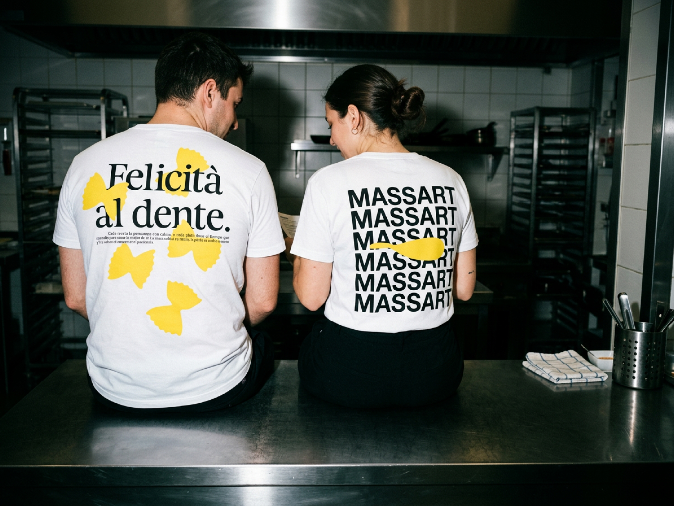
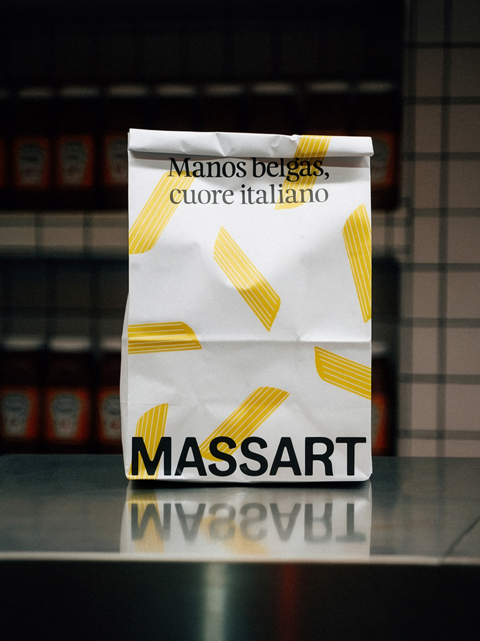
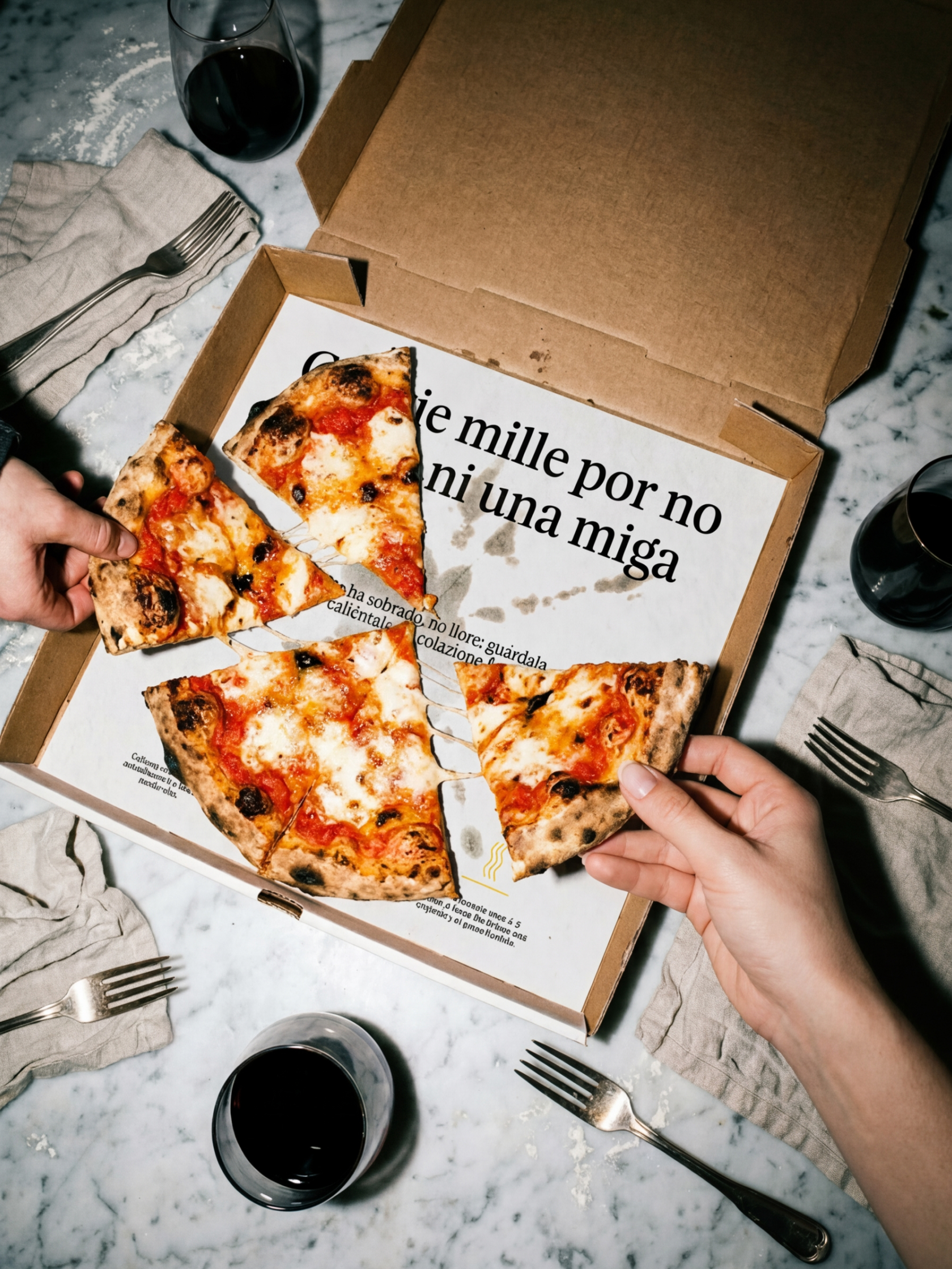
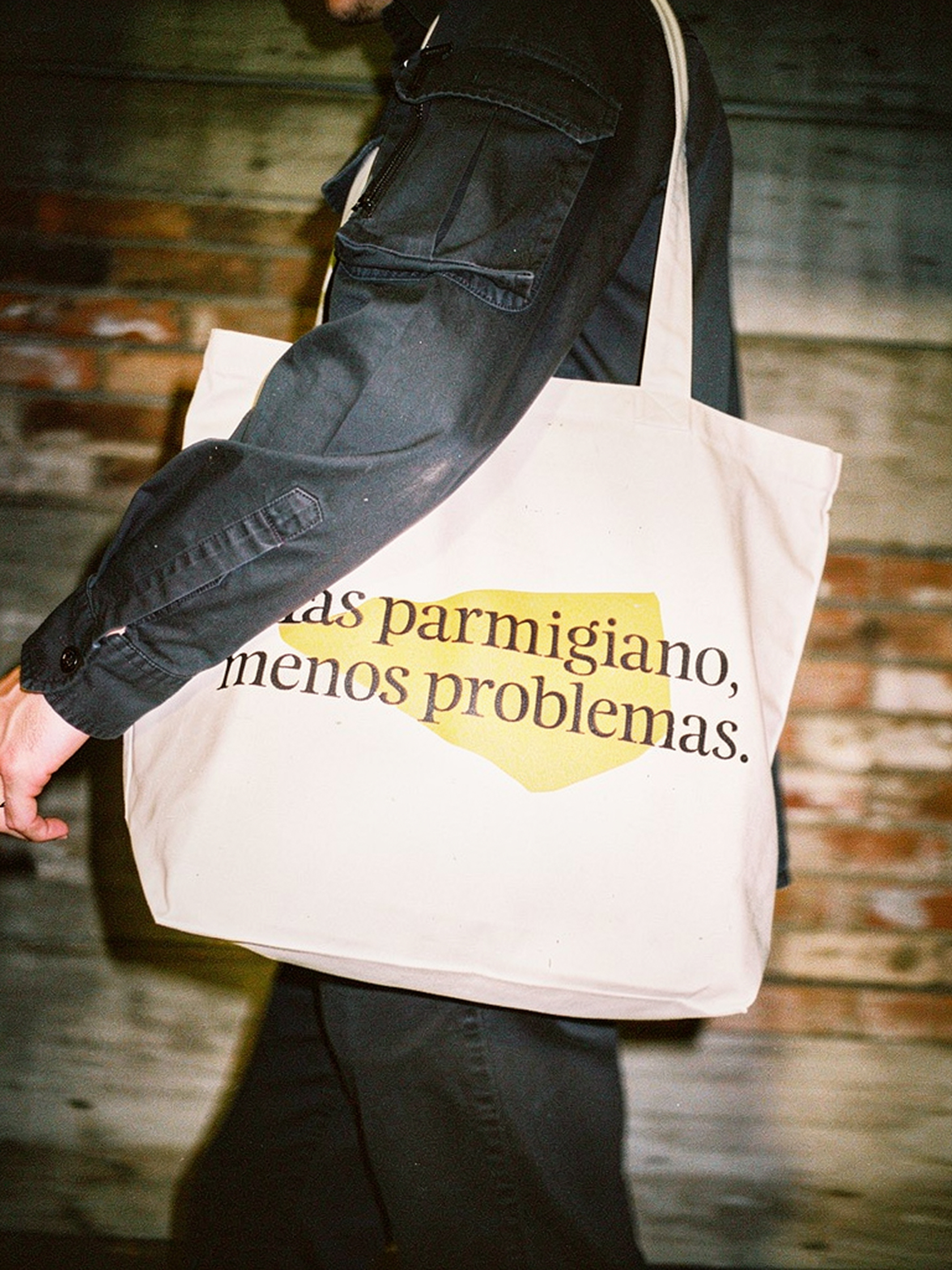
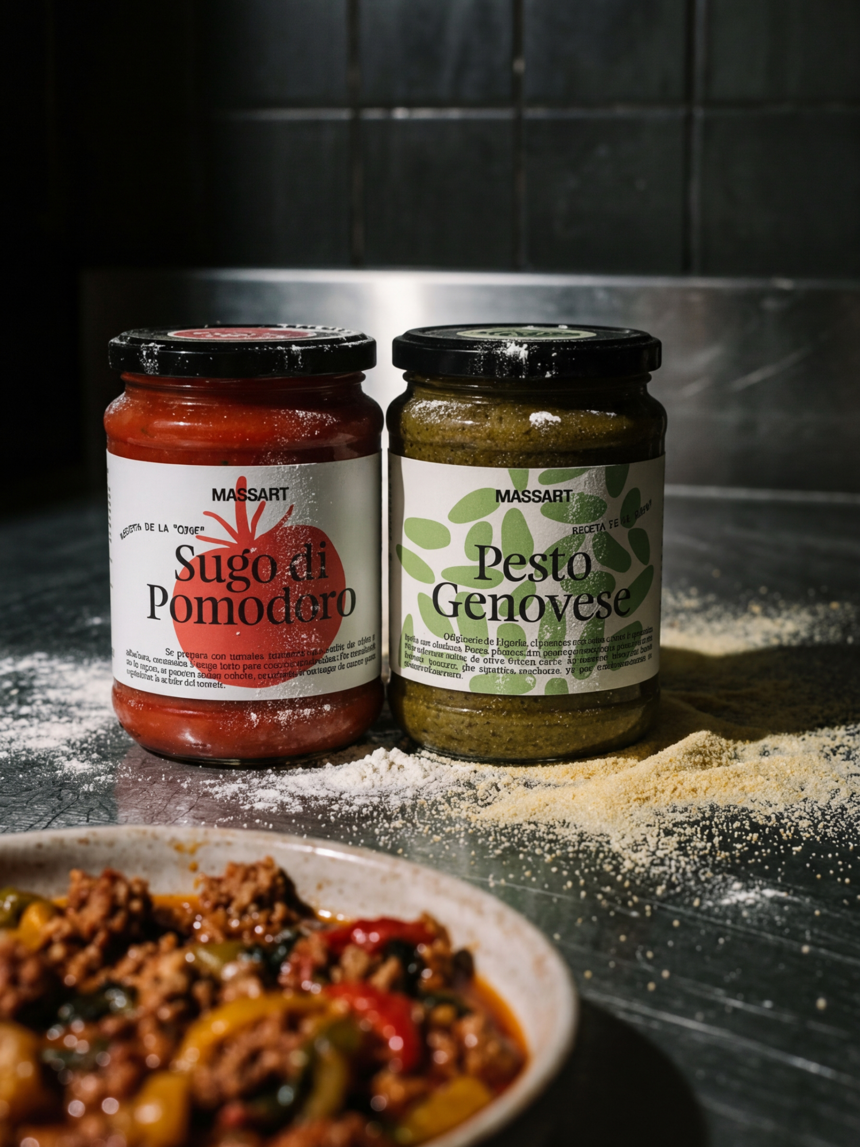
In hospitality, design doesn’t live on a screen, it lives on the texture of the menu, the weight of the tablecloth, and the fast-paced rhythm of the kitchen. We carried the identity into every corner of the restaurant, from the flour sacks and sauce jars to the delivery stickers and staff uniforms.
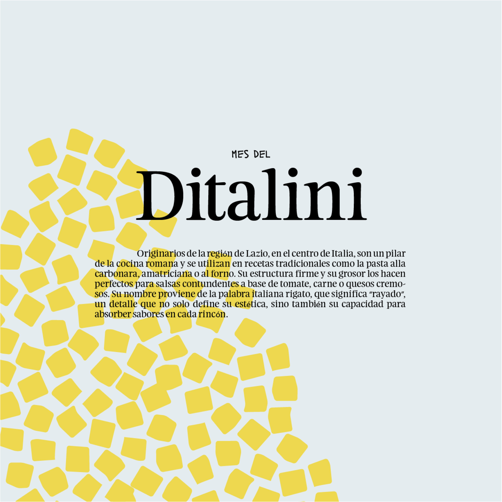
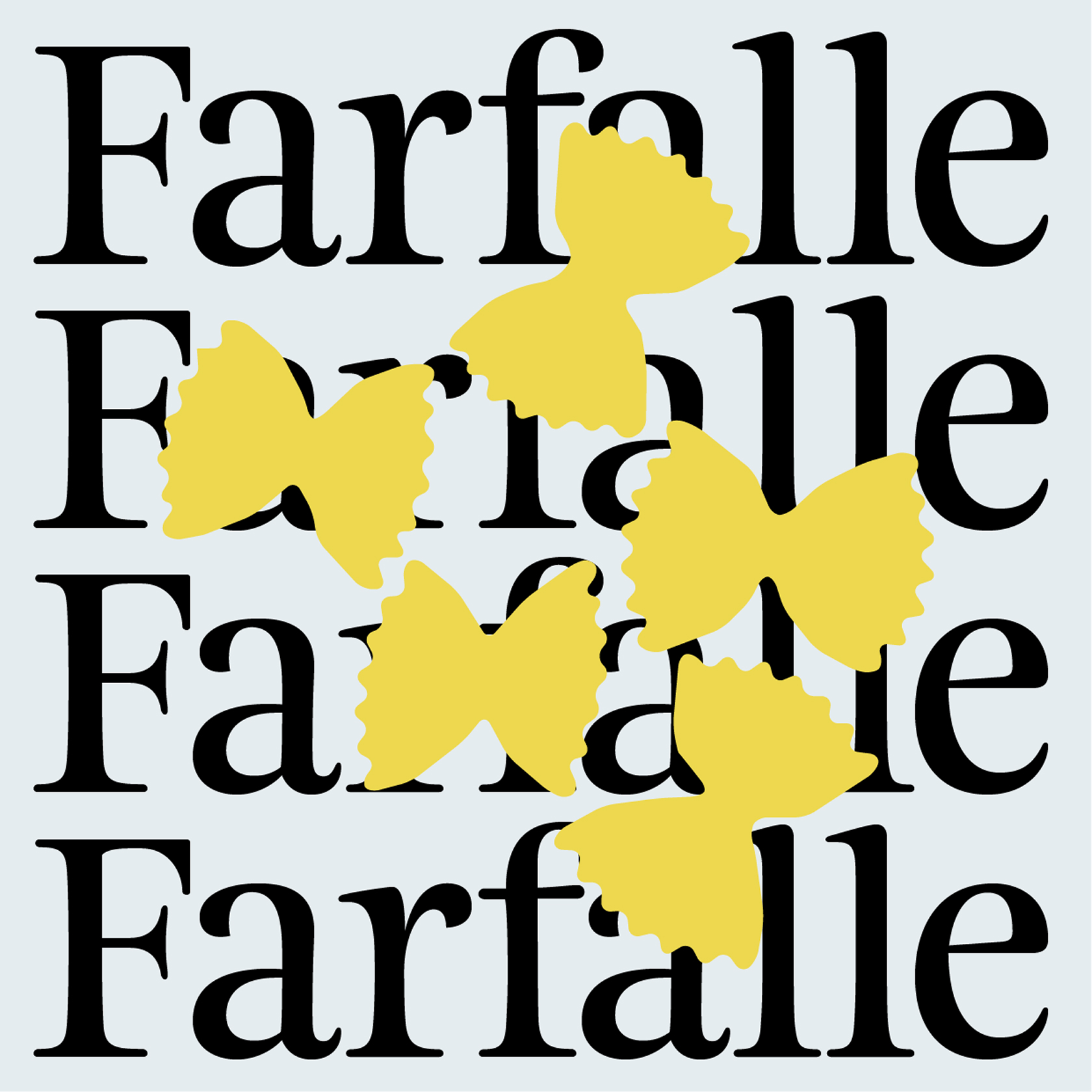
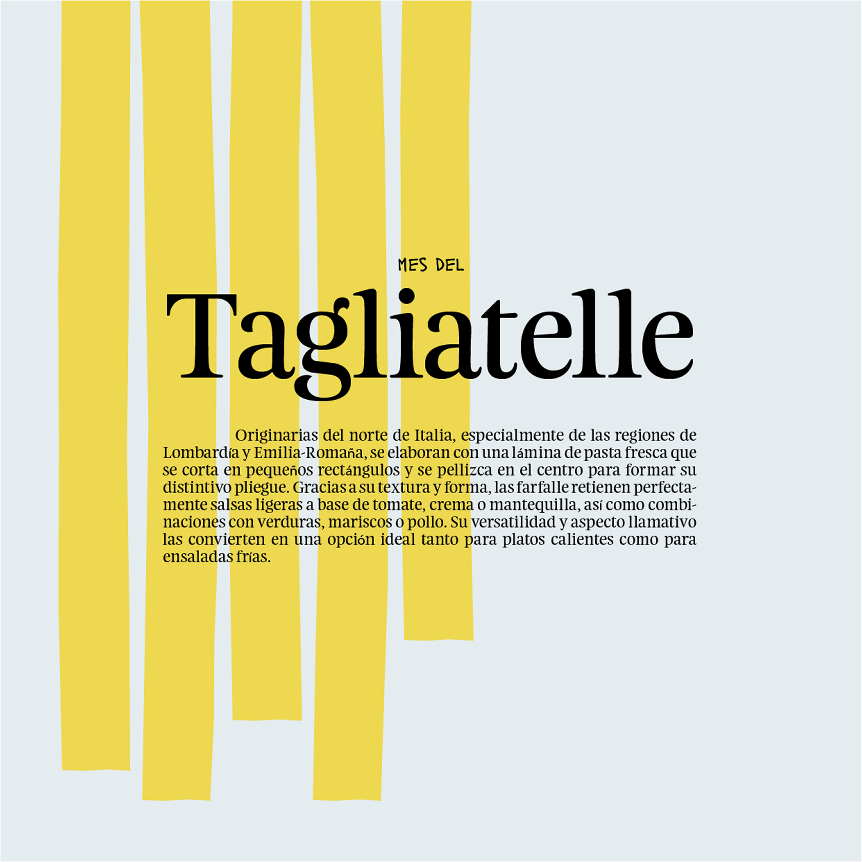
We incorporated hand-drawn strokes, as the “chef’s signature”, to add that human spark that separates a soul-filled local spot from a soulless assembly line. It is a professional, honest identity for a project that isn’t afraid to get its hands dirty.