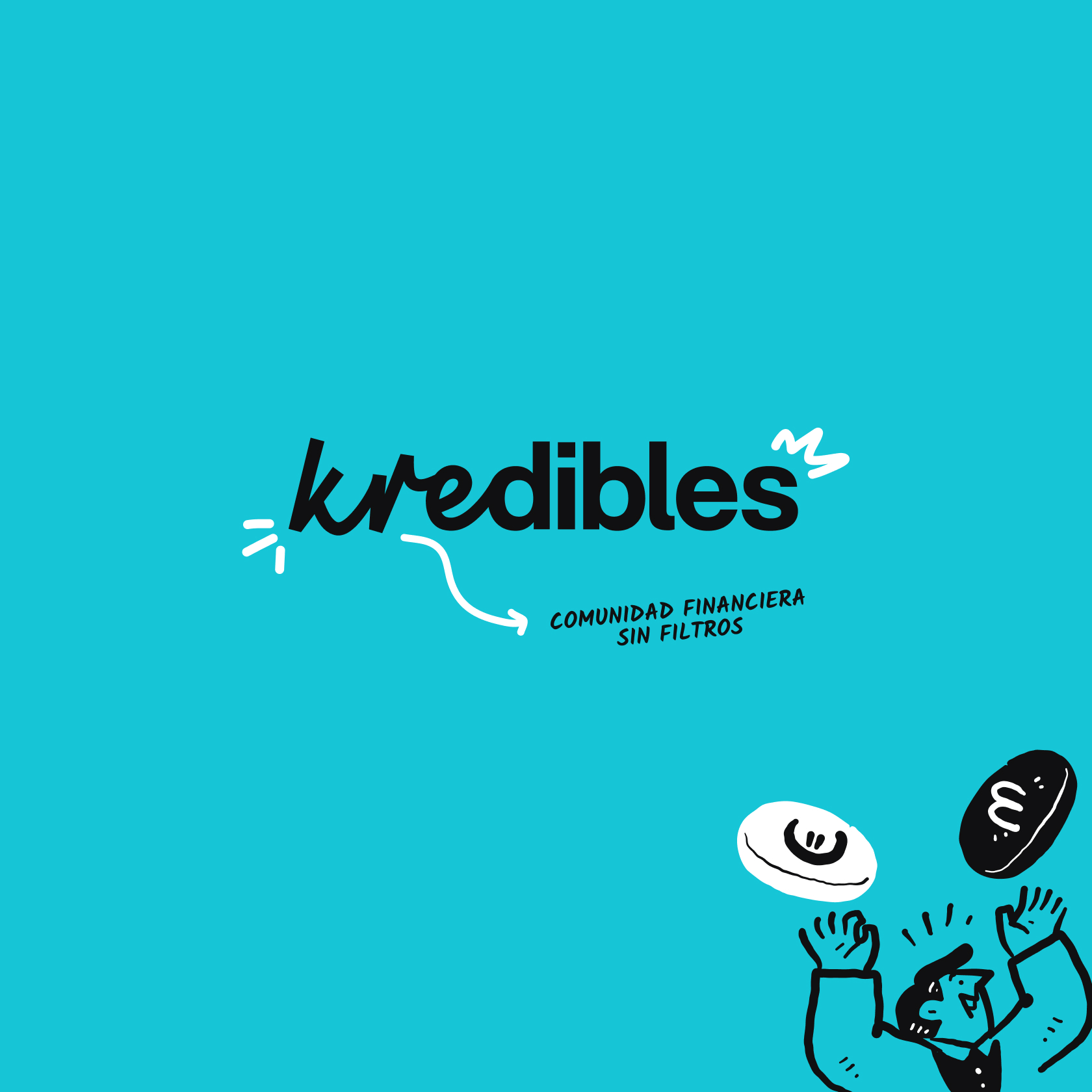
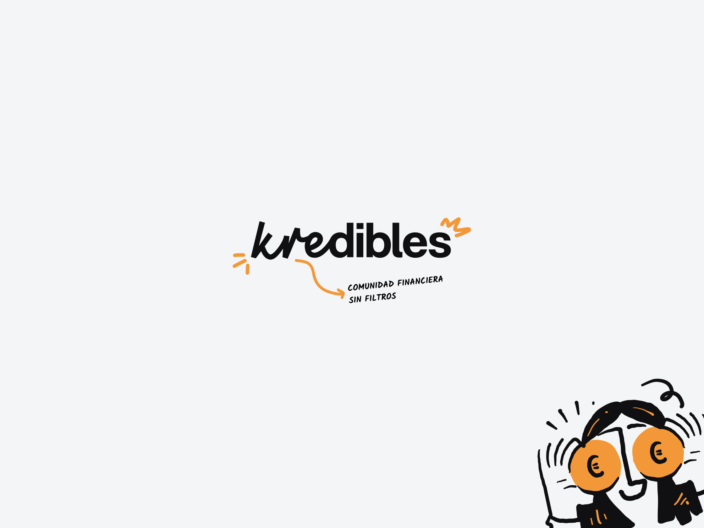
Naming: The value of shared trust.
Kredibles is more than just a brand, it’s an adjective for a community rooted in transparency. The name is built on an etymological foundation, linking the trust of Latin credere with the excellence of Greek kreittōn (KRE, the root), directly connecting the brand to the essence of credit and credibility. By adding a suffix that suggests reliability and opting for the plural (IBLES, the suffix), we have turned an individual quality into a collective movement. The result is a sound that feels familiar yet innovative, projecting security while being designed specifically to be memorable.
A New Code: Finance for everyone.
Nos alejamos de la rigidez tradicional del sector para crear una identidad que invita en lugar de imponer. El logotipo utiliza un binomio tipográfico que diferencia visualmente la raíz latina del sufijo para construir una marca intuitiva, legible y con una personalidad propia.
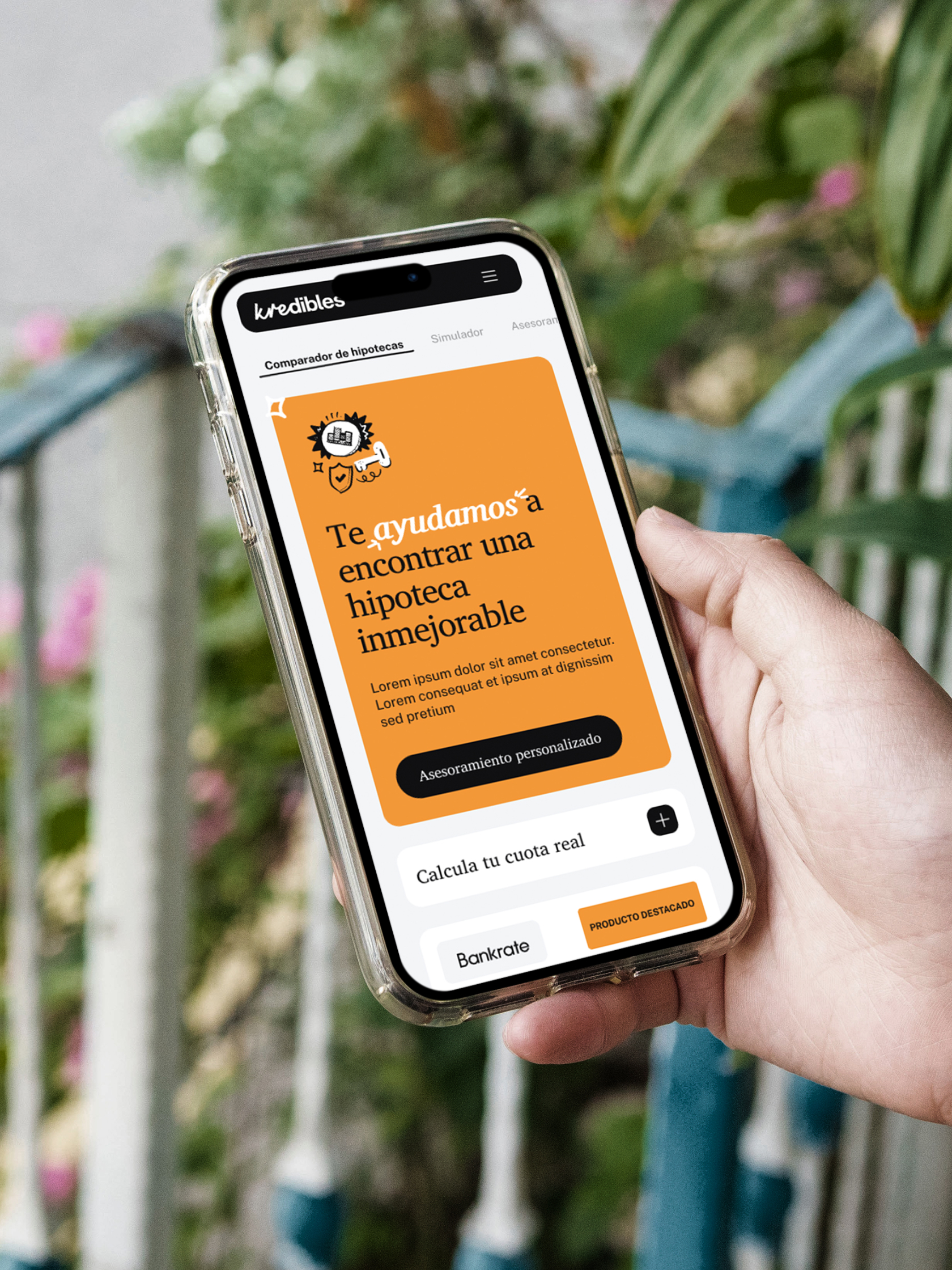
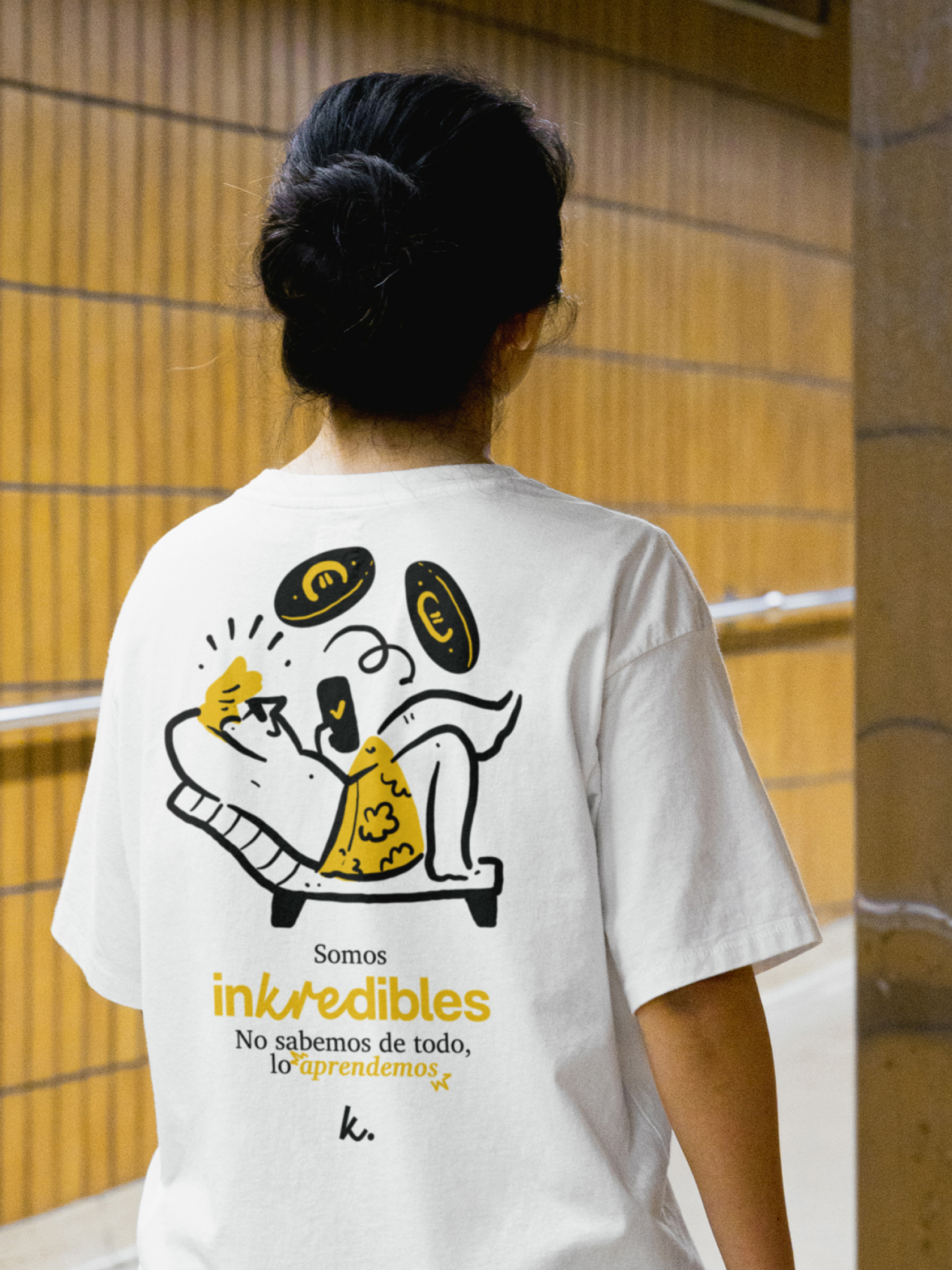
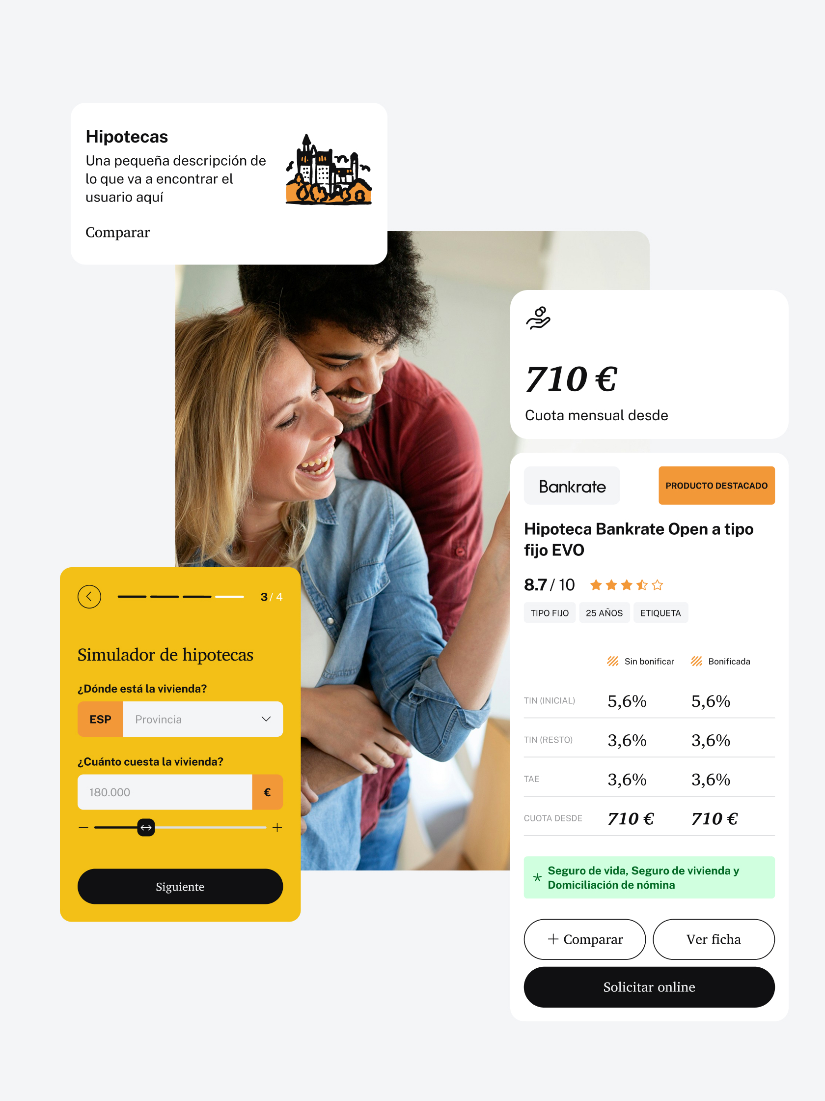
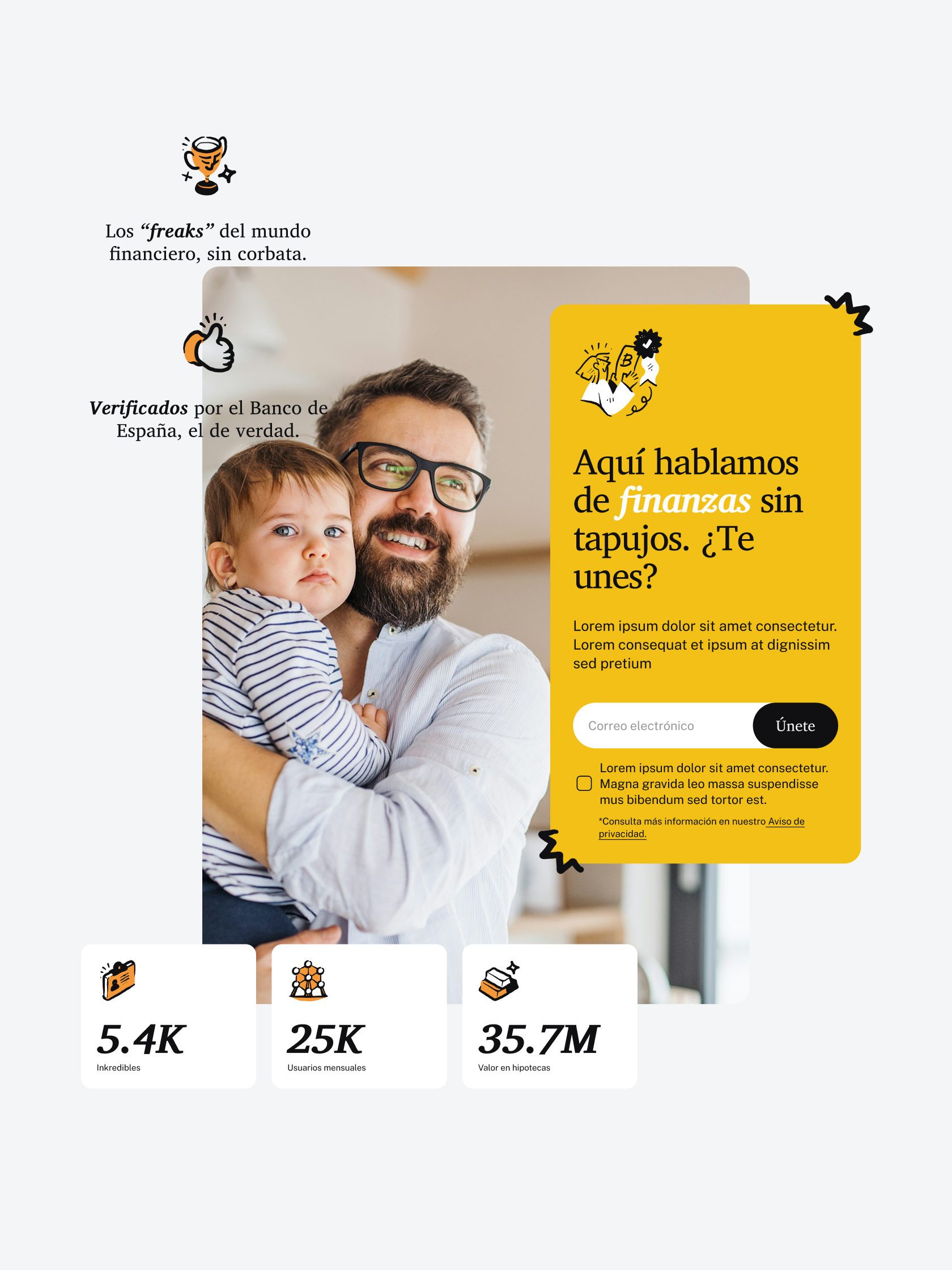
We stepped away from the industry’s traditional rigidity to create an identity that invites rather than imposes. The logo uses a typographic pairing that visually distinguishes the Latin root from the suffix, creating a brand that is intuitive, legible, and full of character. This approach proves it is possible to project expertise without being solemn. We built an approachable and respectful identity that recognises we only truly trust what we understand. With this strategic base, our goal is for every user to feel a sense of belonging and pride in being “kredible”.
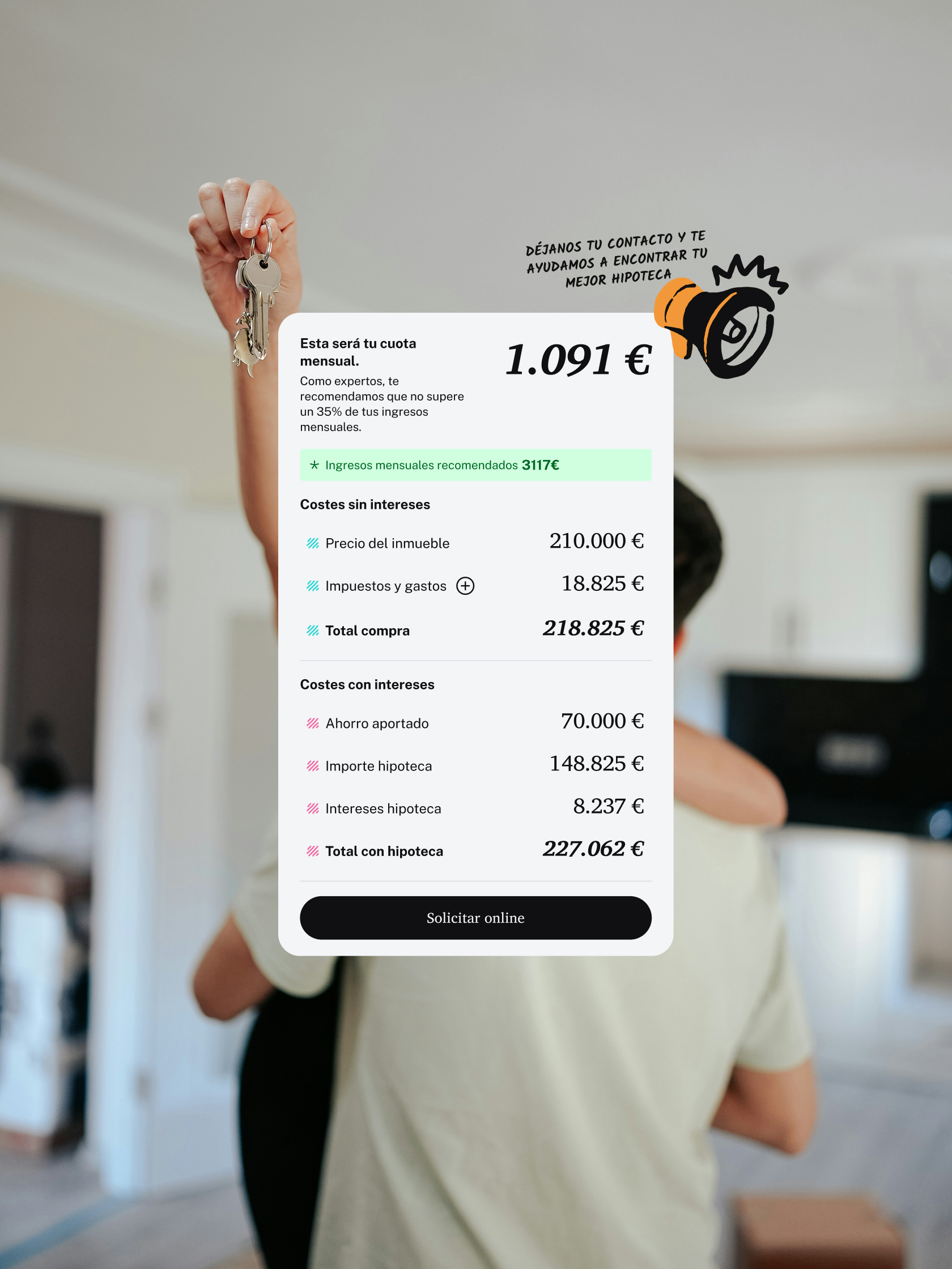

A visual system balancing rigour and warmth.
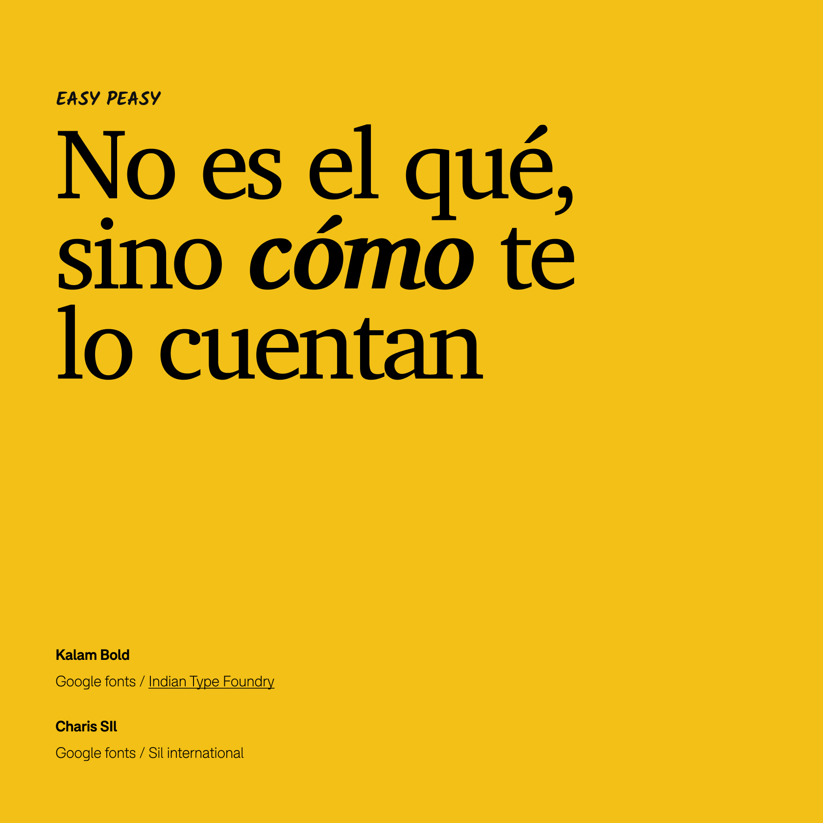
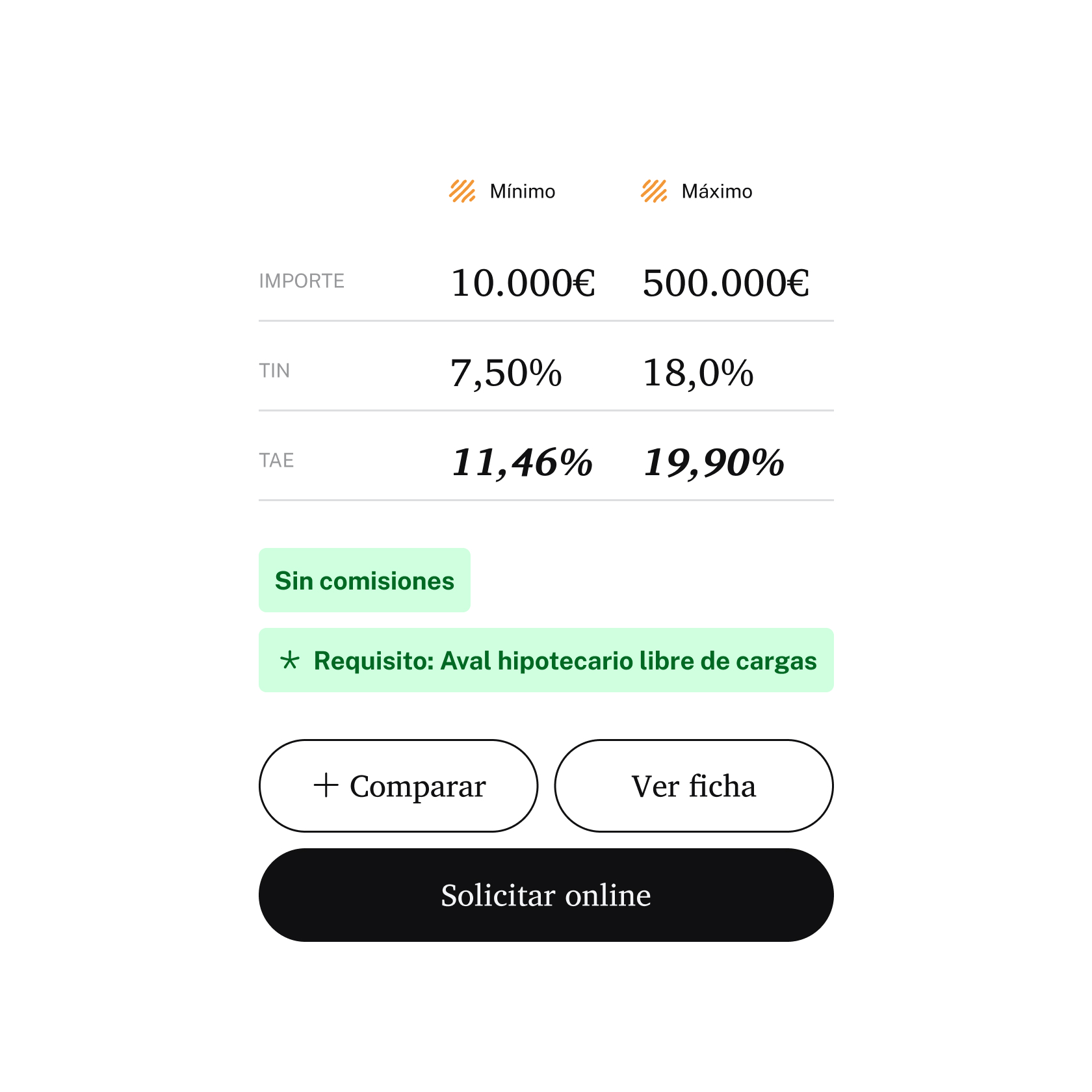
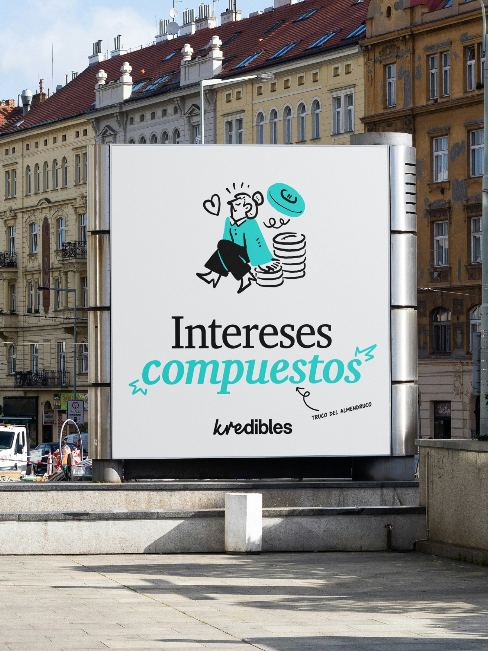
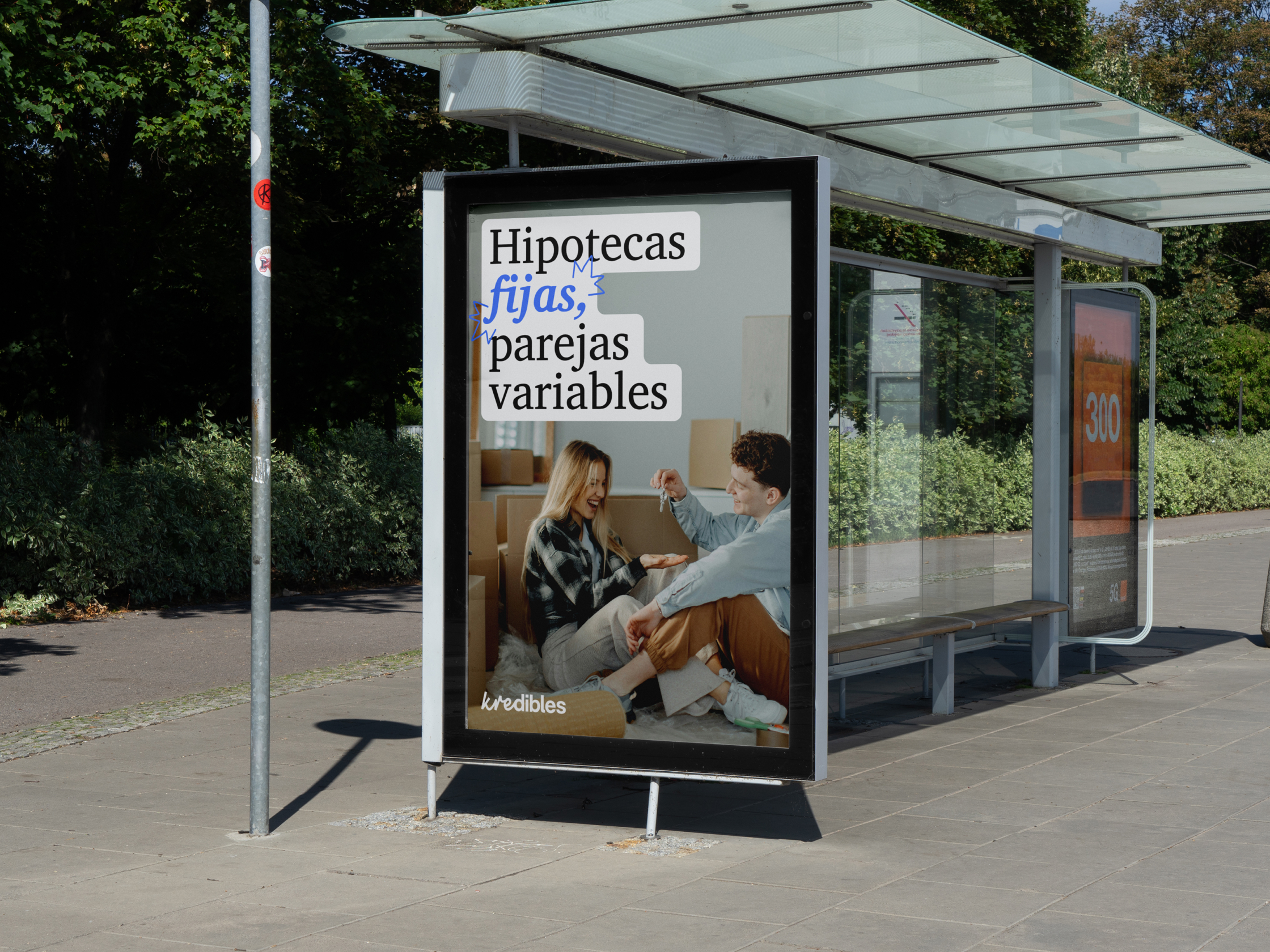
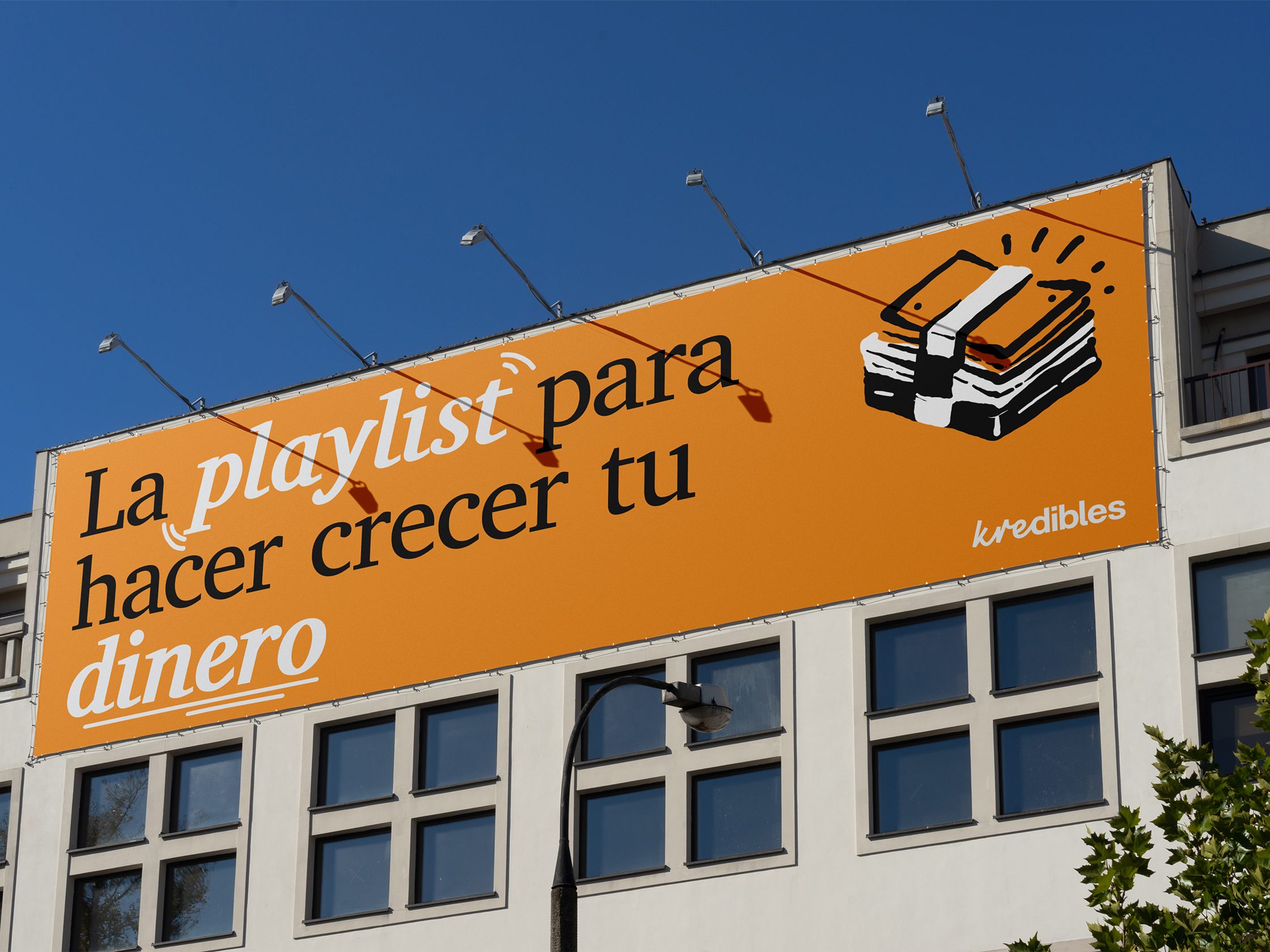
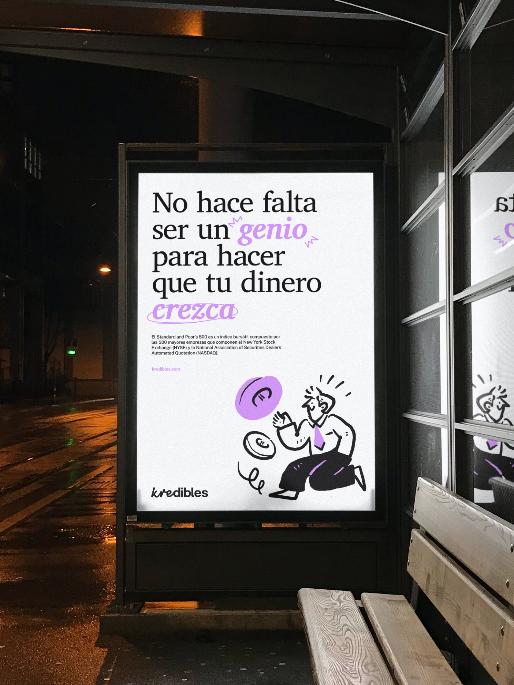
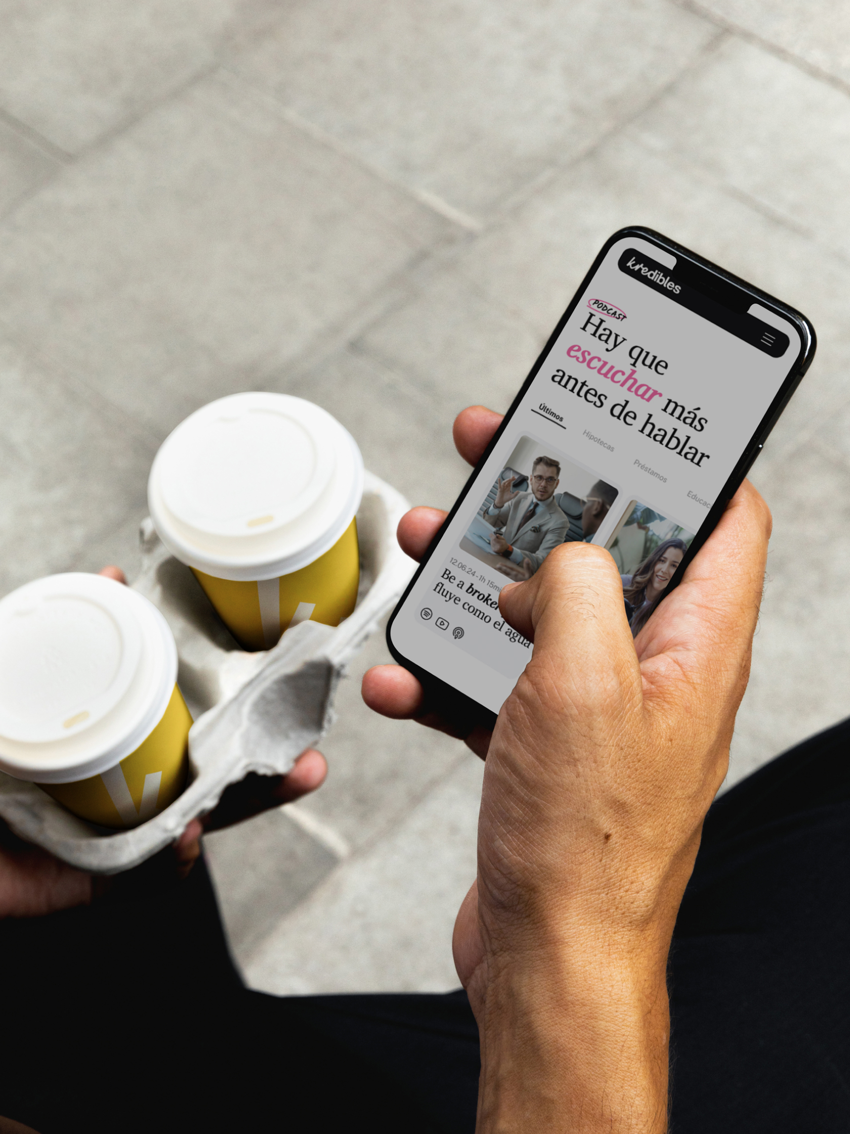
For a financial brand to connect, it must be as professional as it is human. We designed a visual system where the typography prioritises legibility while adding a touch of warmth, blending solid forms with hand-drawn details that break through the formal noise. This same intent carries through to the colour palette, we moved away from whites in favour of a soft grey that offers comfort, using a vibrant and cheerful palette to organise information and give the platform rhythm.
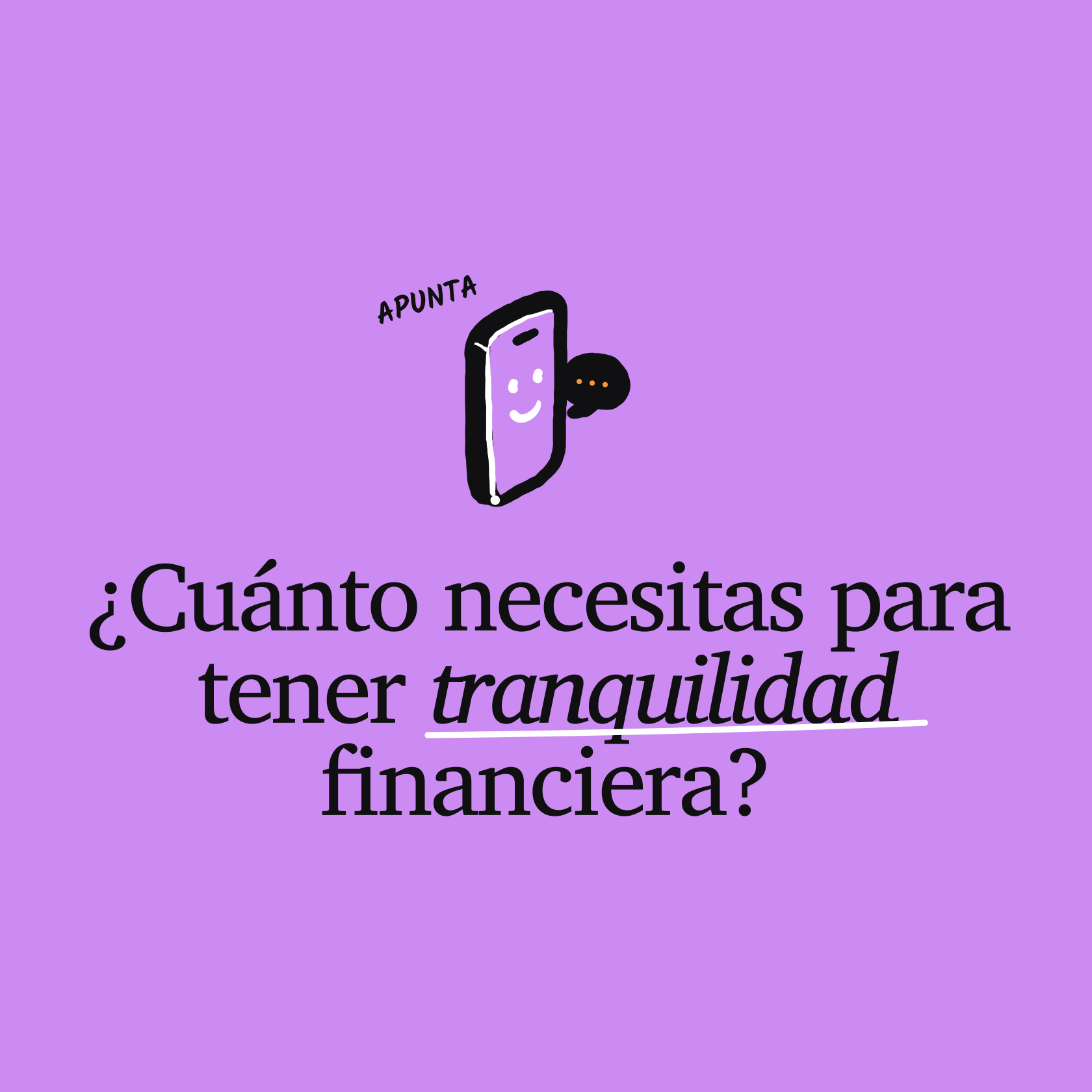
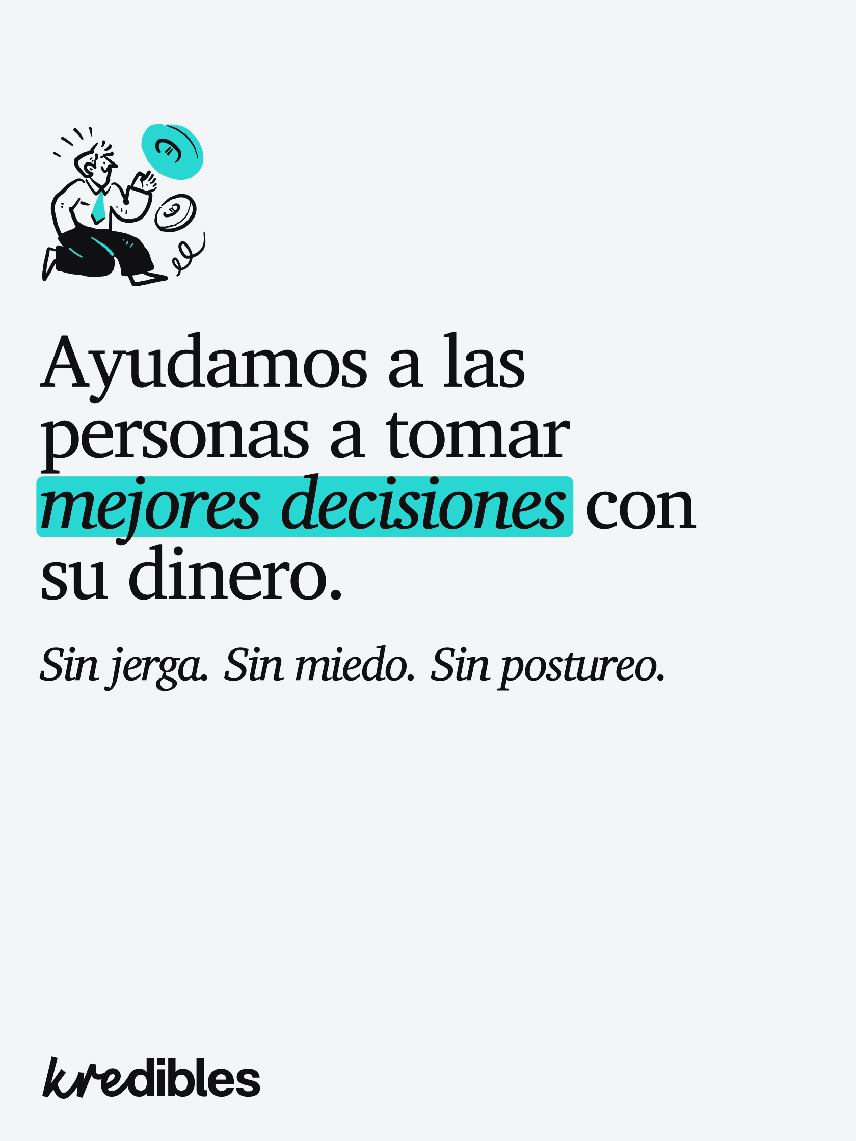
To complete the human touch, we introduced hand-drawn illustrations that act as a narrative tool. These drawings help translate complex financial concepts into something visual and easy to grasp. The result is an identity that doesn’t just provide data, it educates and sparks curiosity. Kredibles stands as a dynamic meeting point where knowledge is built together, delivered with a bold and honest voice.