Industrial heritage, contemporary edge
Transforming nearly seventy years of industrial craftsmanship into a contemporary brand system, capable of projecting the authority and maturity needed to stand out in the demanding Contract sector. With that premise in mind, our starting point was a logo already defined by the client. Our job was to expand its visual and verbal ecosystem to build a robust brand universe. We updated their corporate language to genuinely connect with an industry where design and communication are, now more than ever, absolute deal-breakers.
Brand strategy.The value of certainty
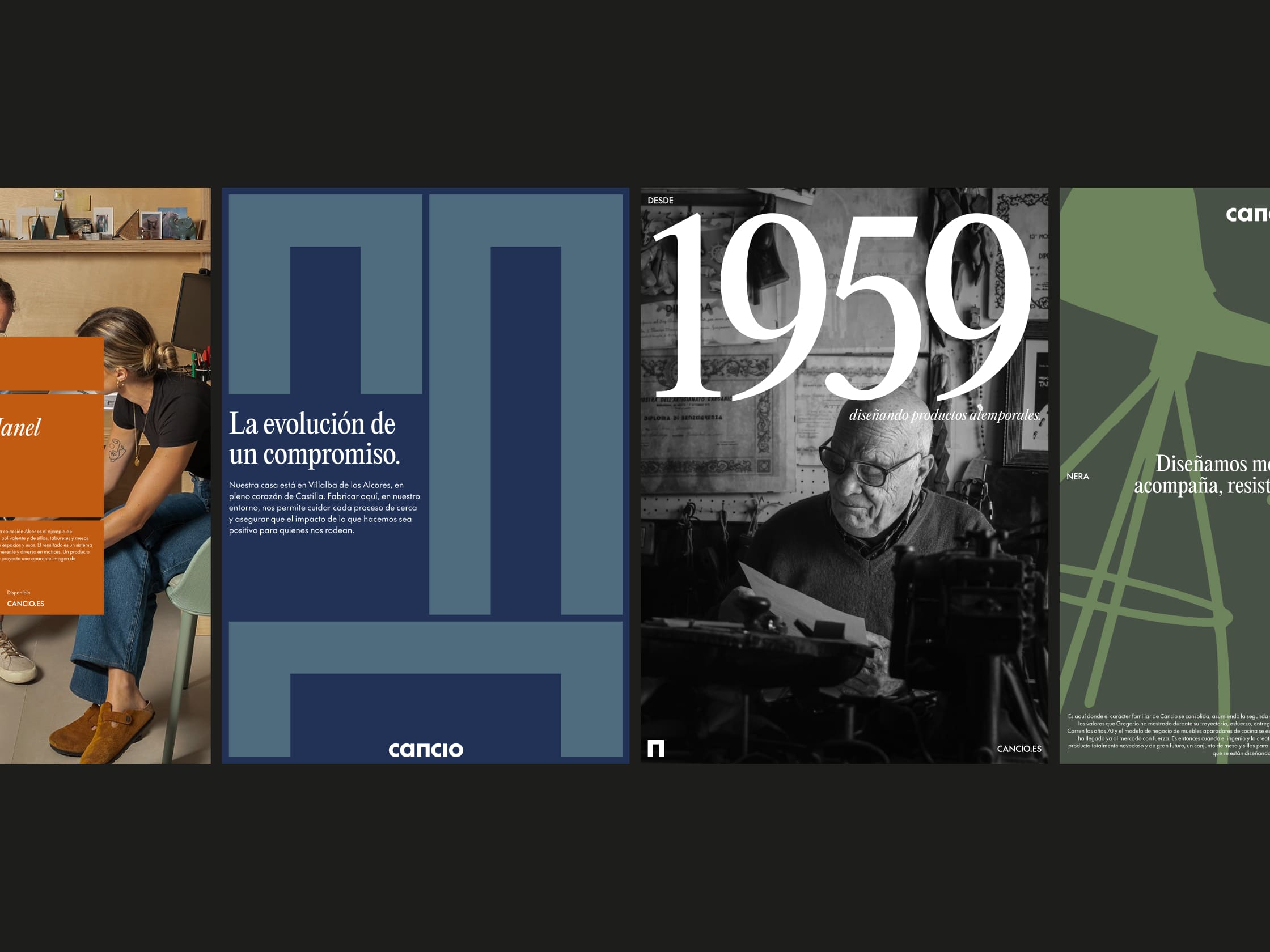
Steering clear of fleeting trends or disruptive gimmicks, we backed a timeless aesthetic. In the Contract sector, beauty is a given, but reliability is the real prestige. We positioned Cancio as the safe, solid choice, turning their maturity into a highly desirable asset.
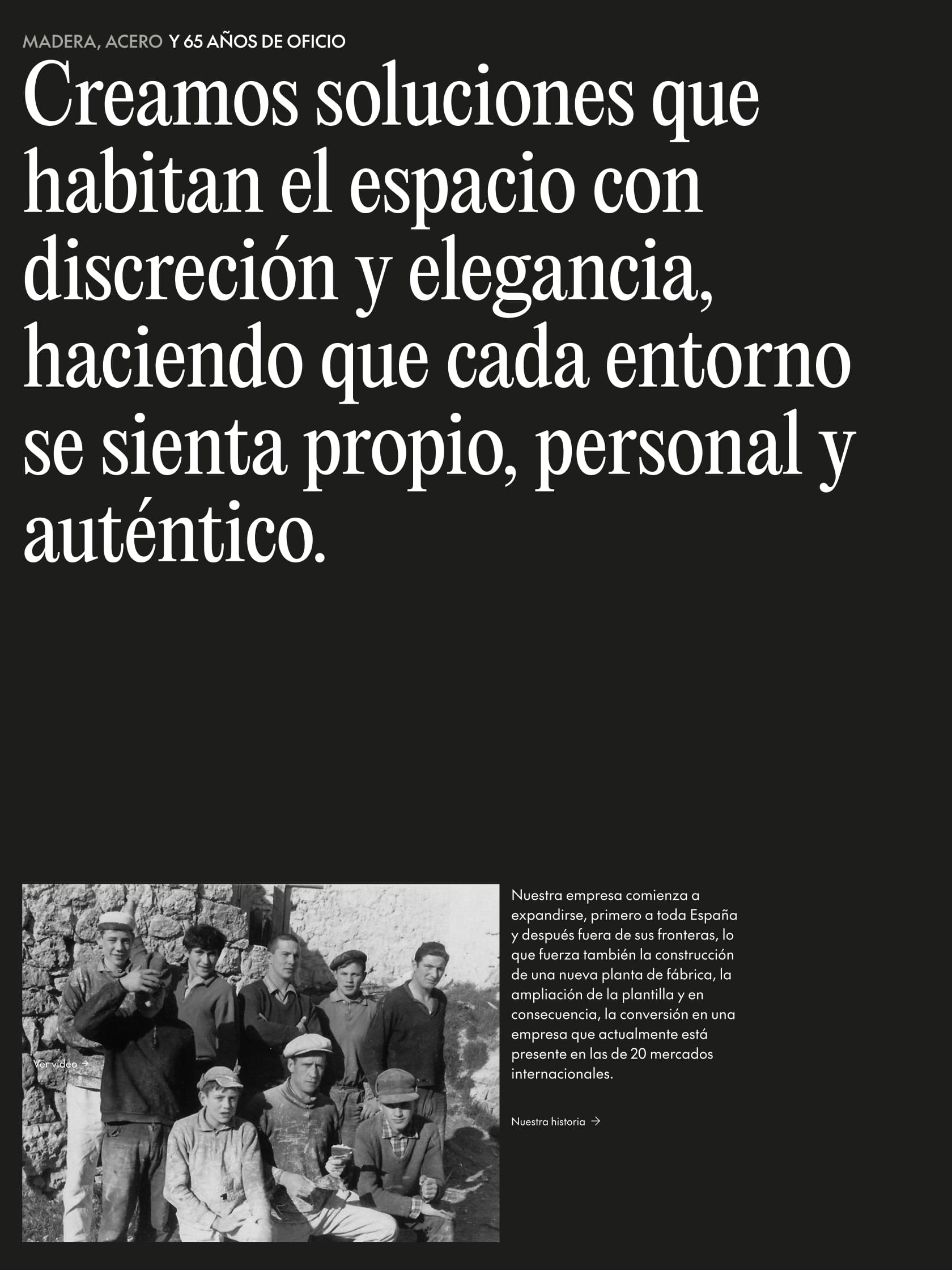
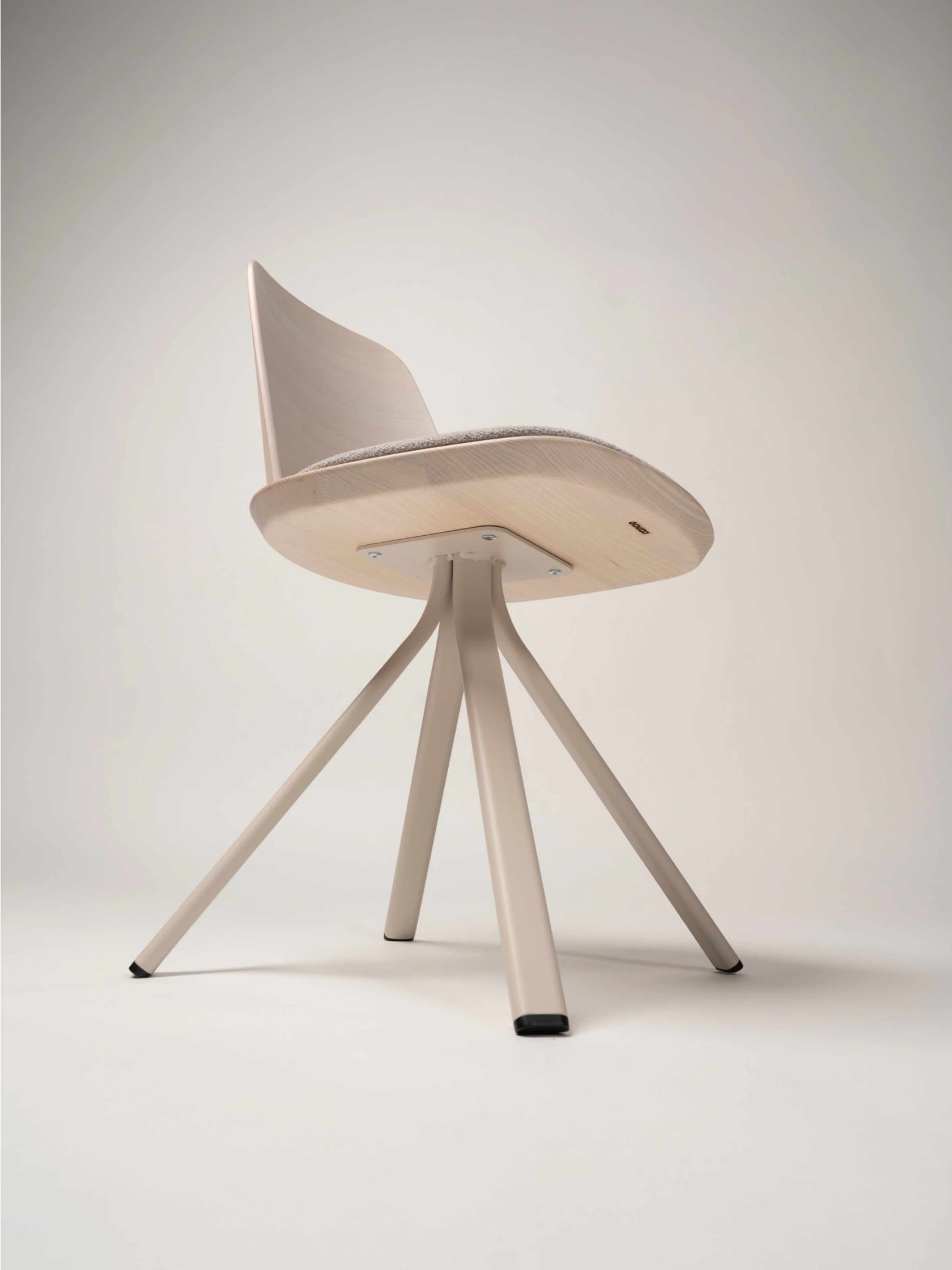
To achieve this, we stripped away the cold corporate feel and brought back the honest truth of the trade and the soul of the factory floor. Highlighting their in-house production and local manufacturing in Villalba de los Alcores isn’t just a nostalgic nod, it’s proof of a real infrastructure that guarantees total control over details, materials, and deadlines.
Verbal identity. Authority without the noise
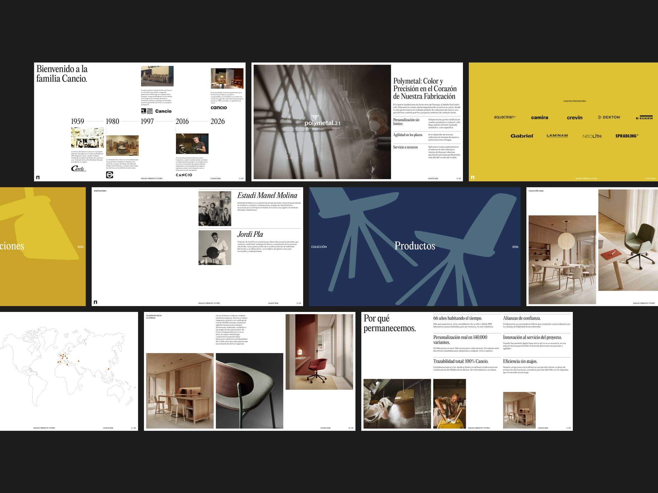
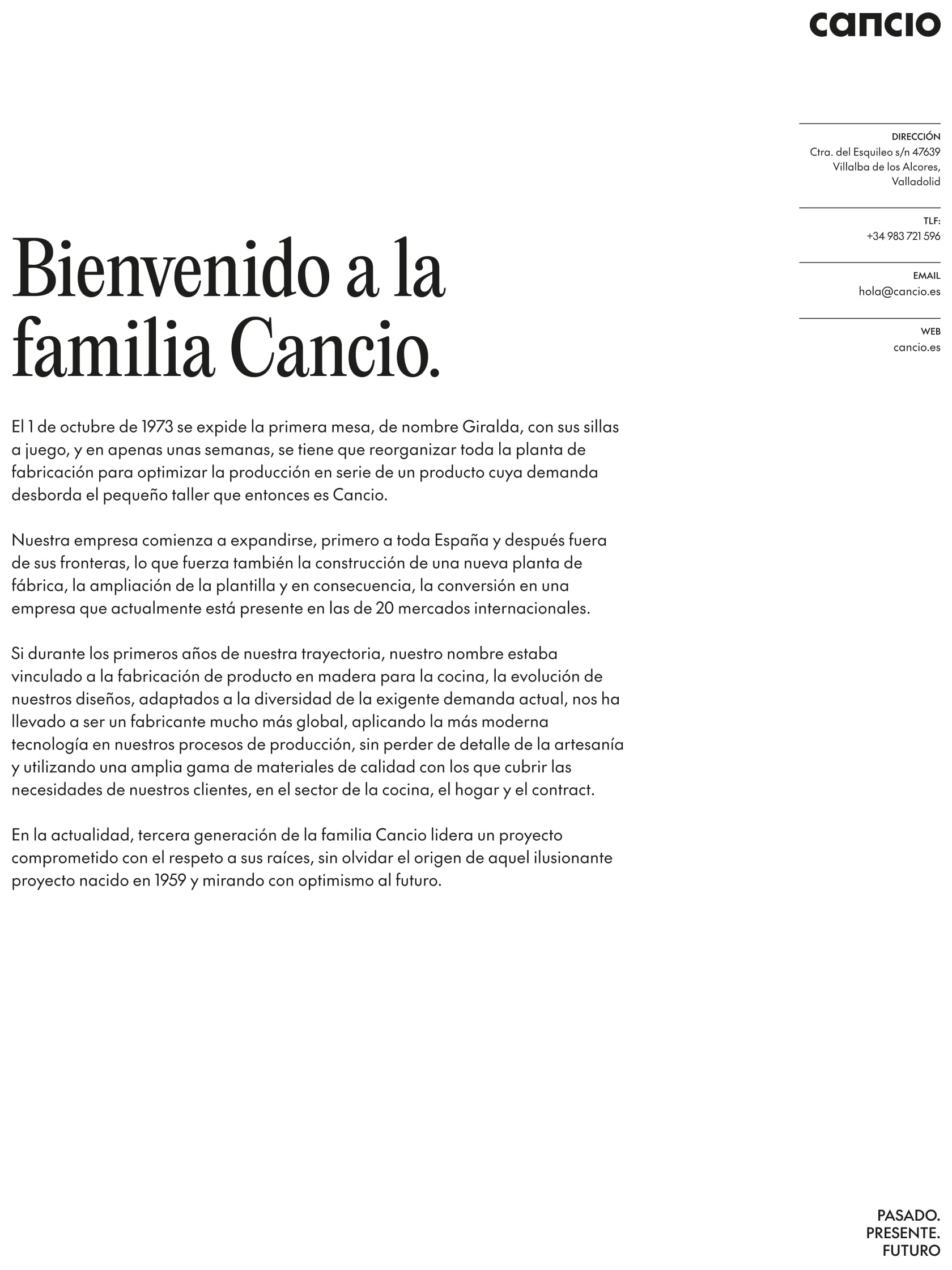
Their language needed to reflect a highly experienced industrial authority, cutting out the marketing fluff. We defined a brand voice structured to be direct, approachable, and enduring. Steering clear of gimmicks, passing fads, and overly poetic or stiff corporate speak, we built a system of honest, documentary-style claims.
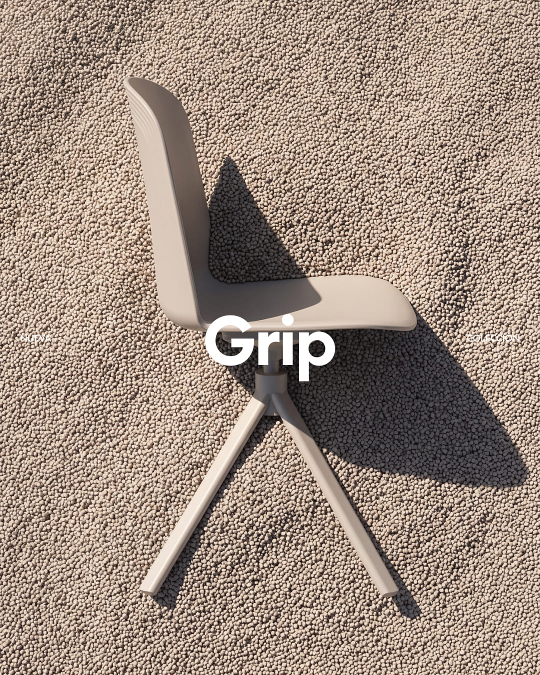
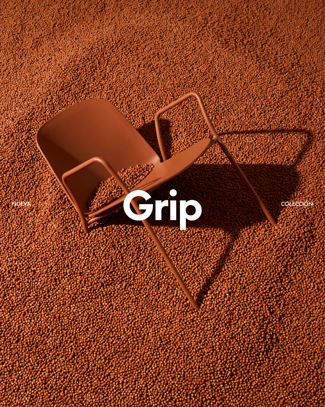
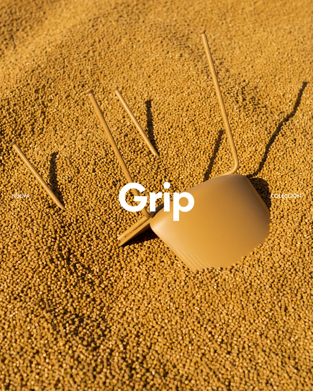
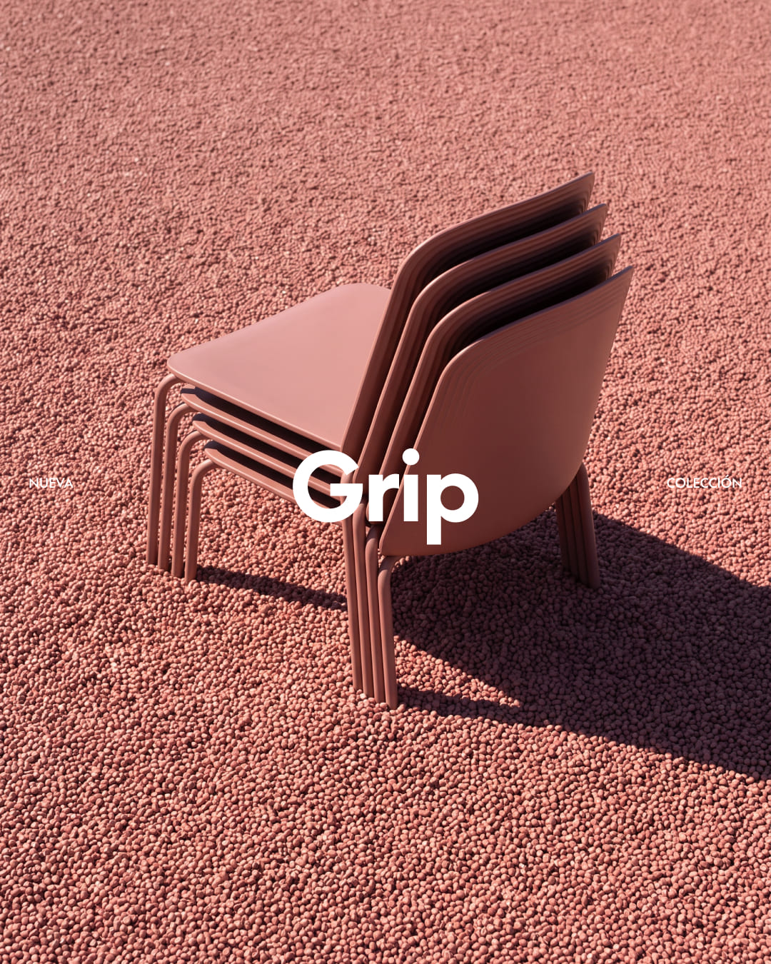
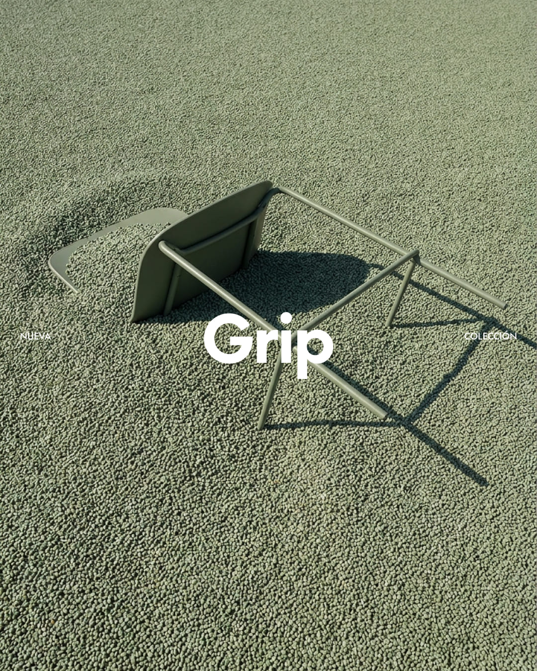
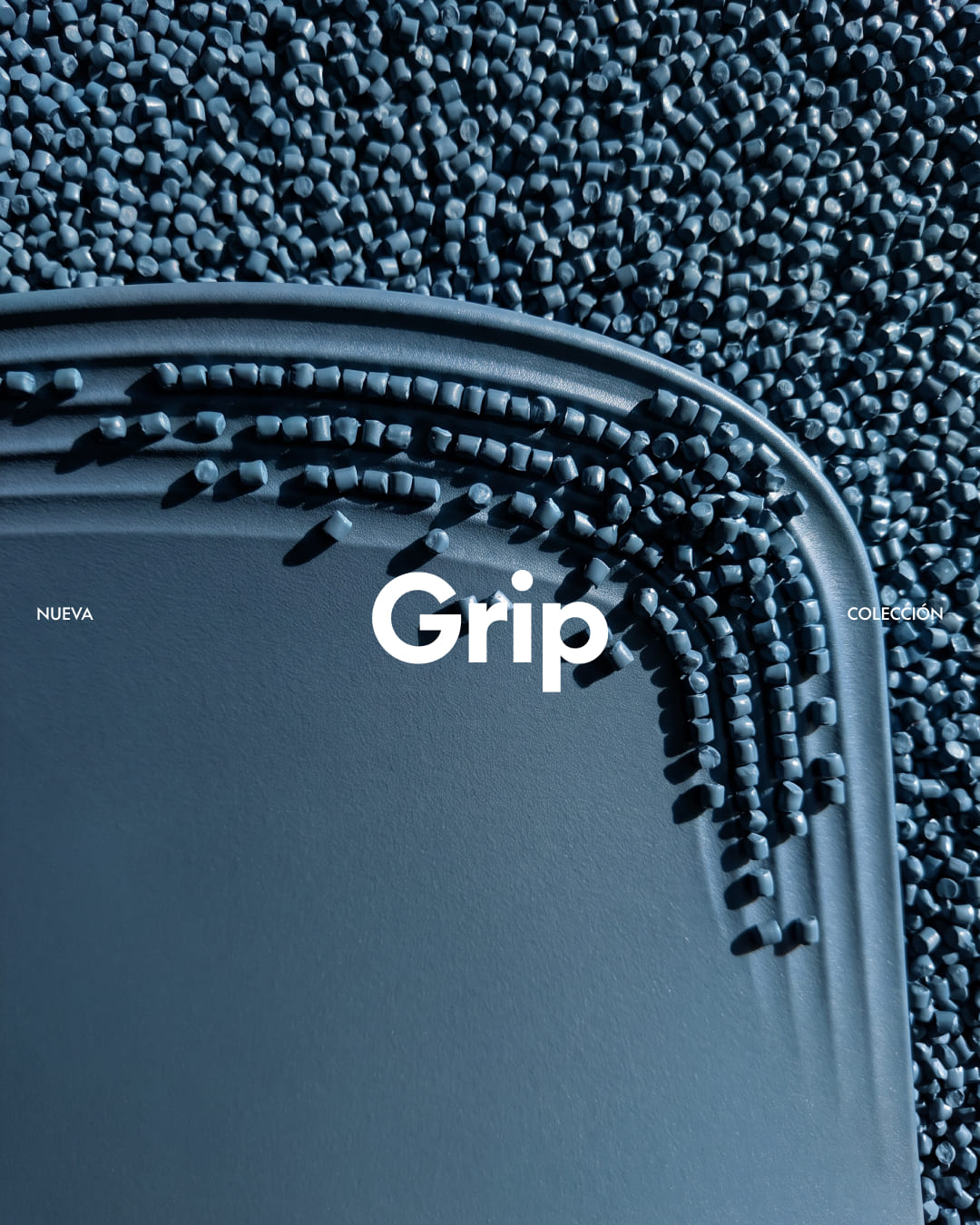
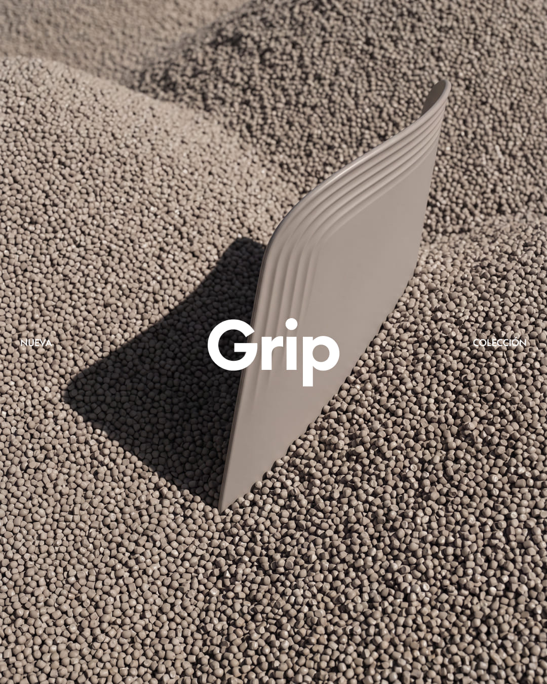
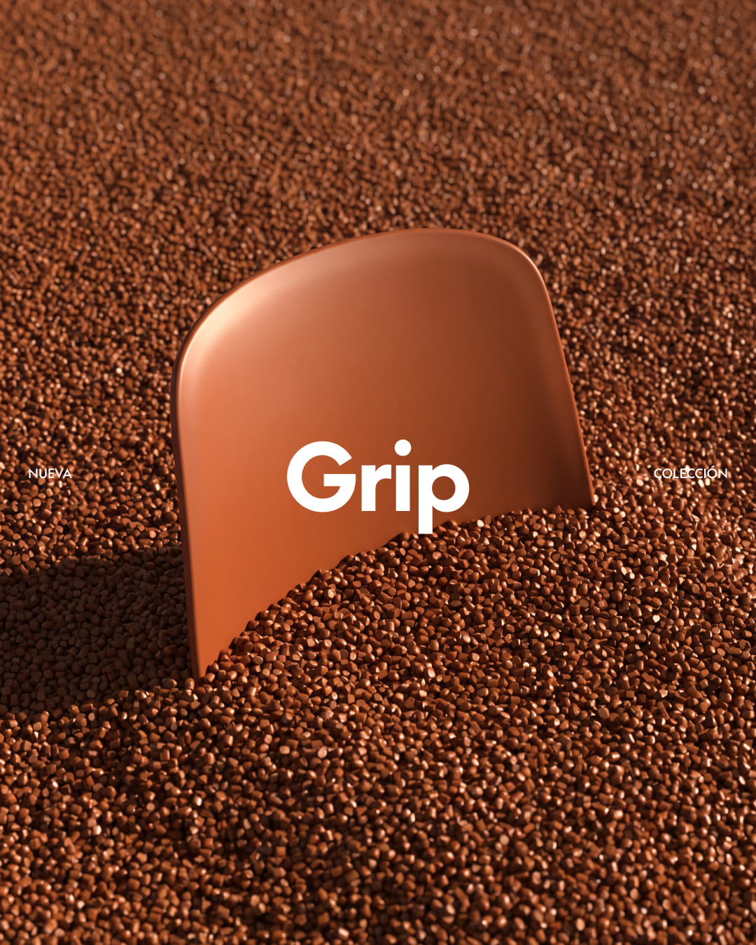
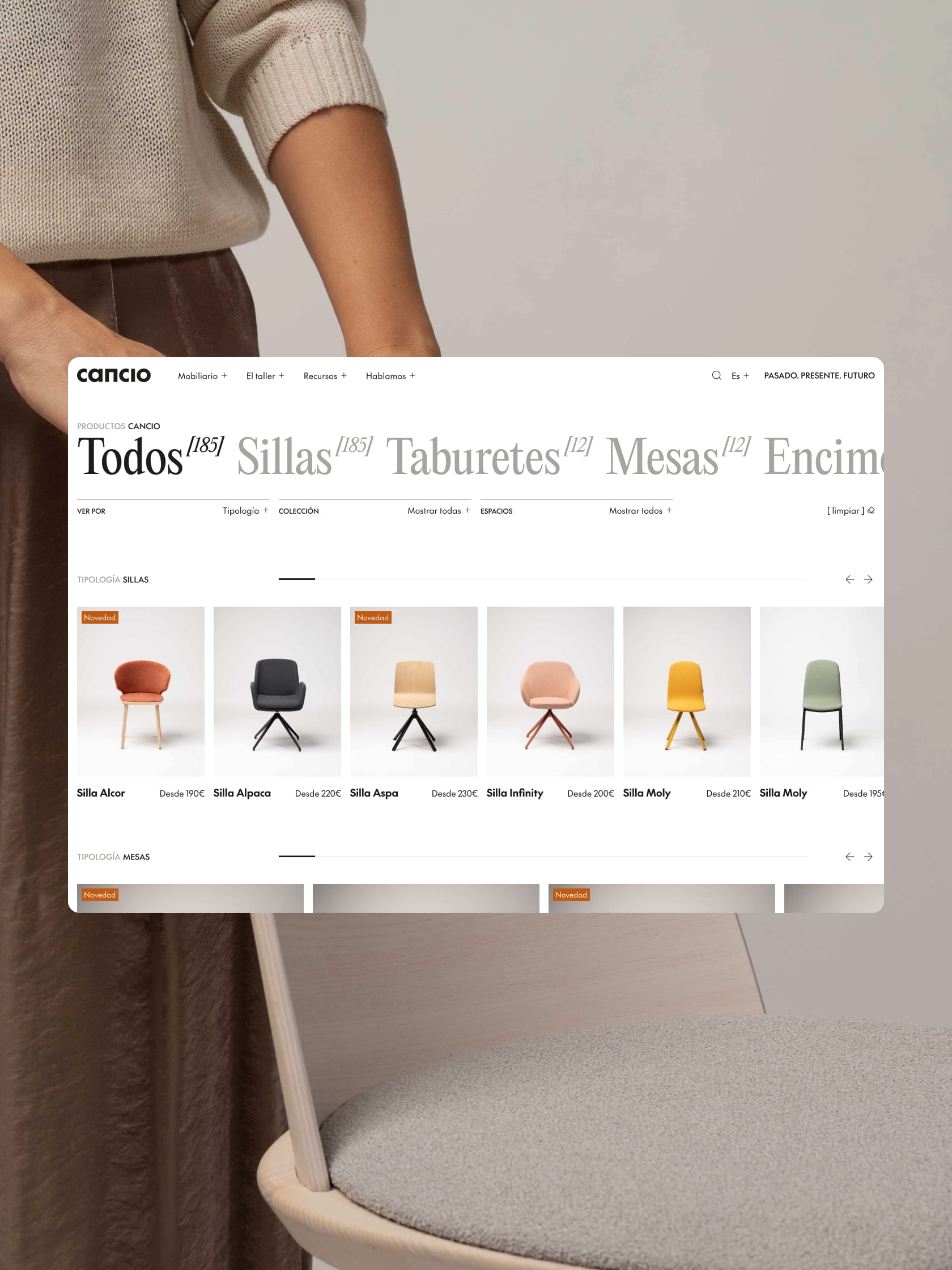
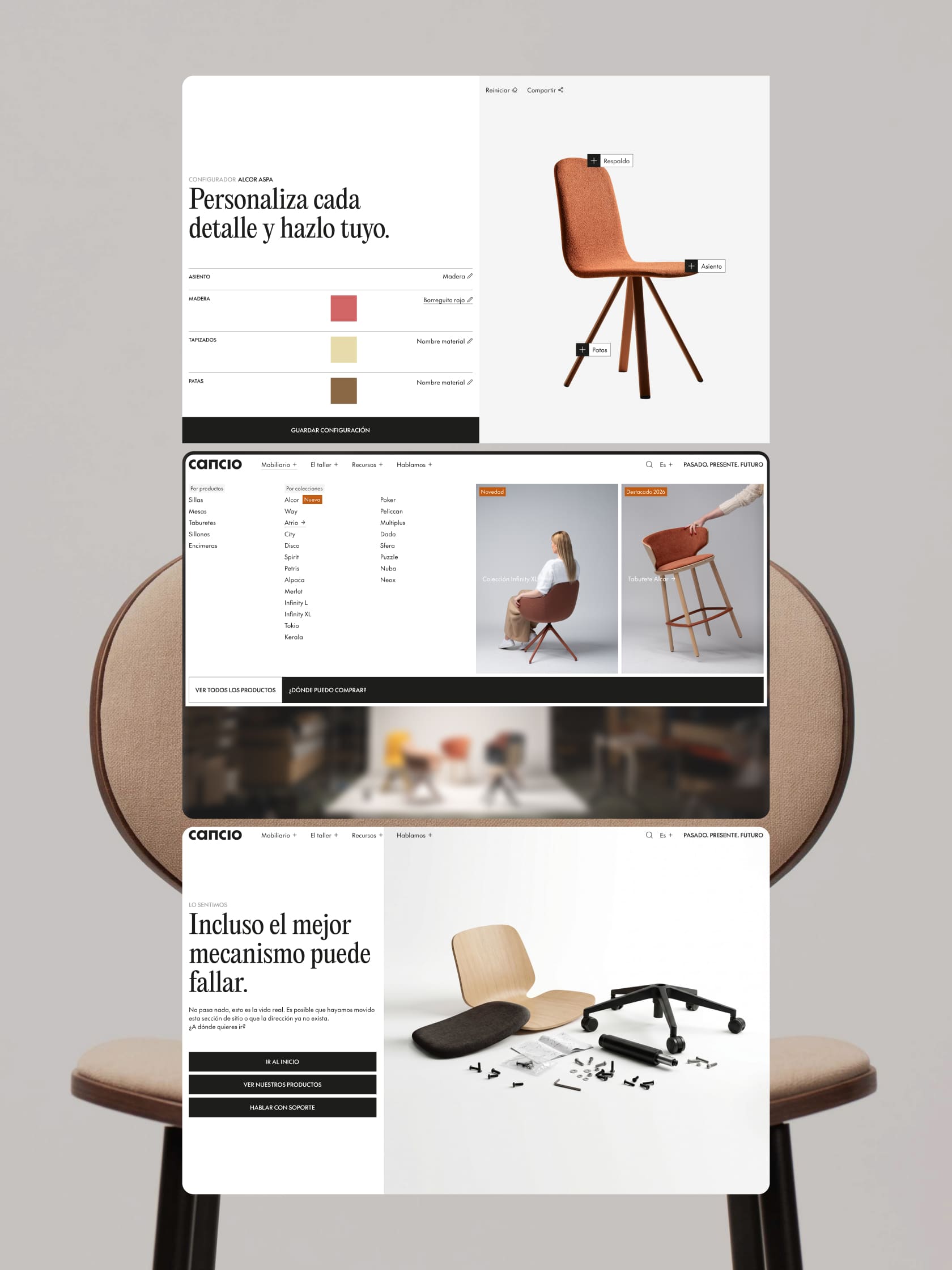
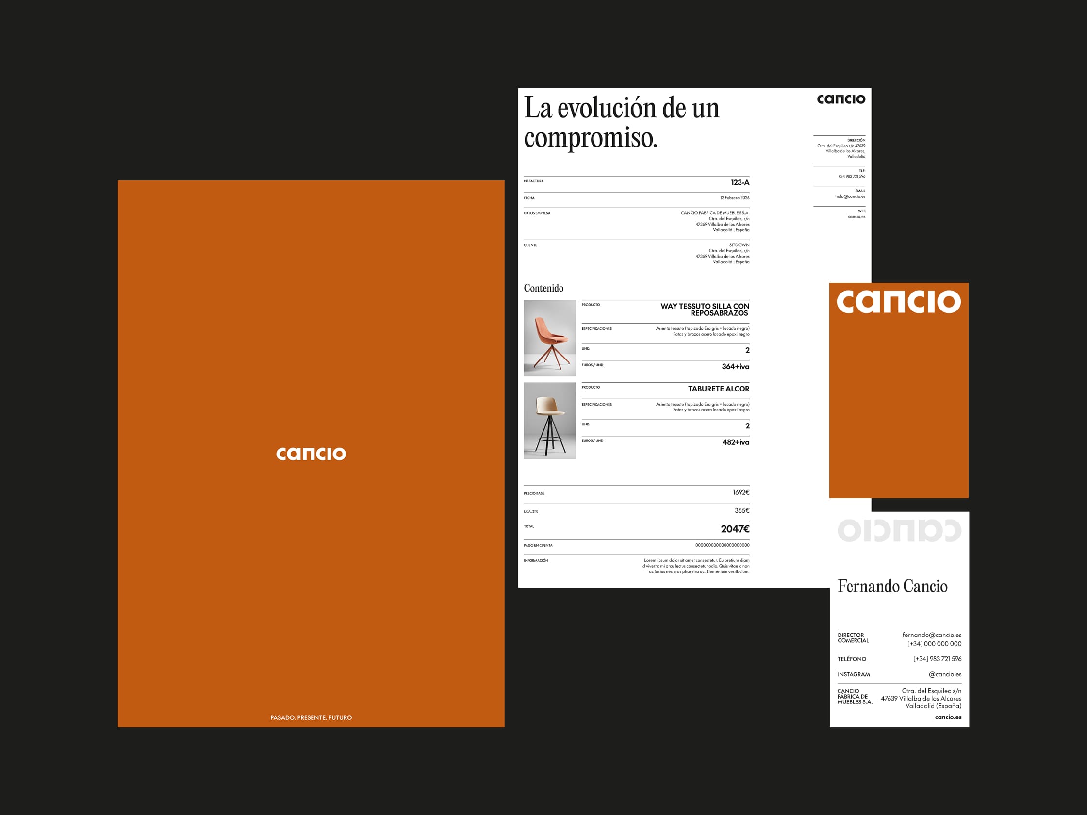
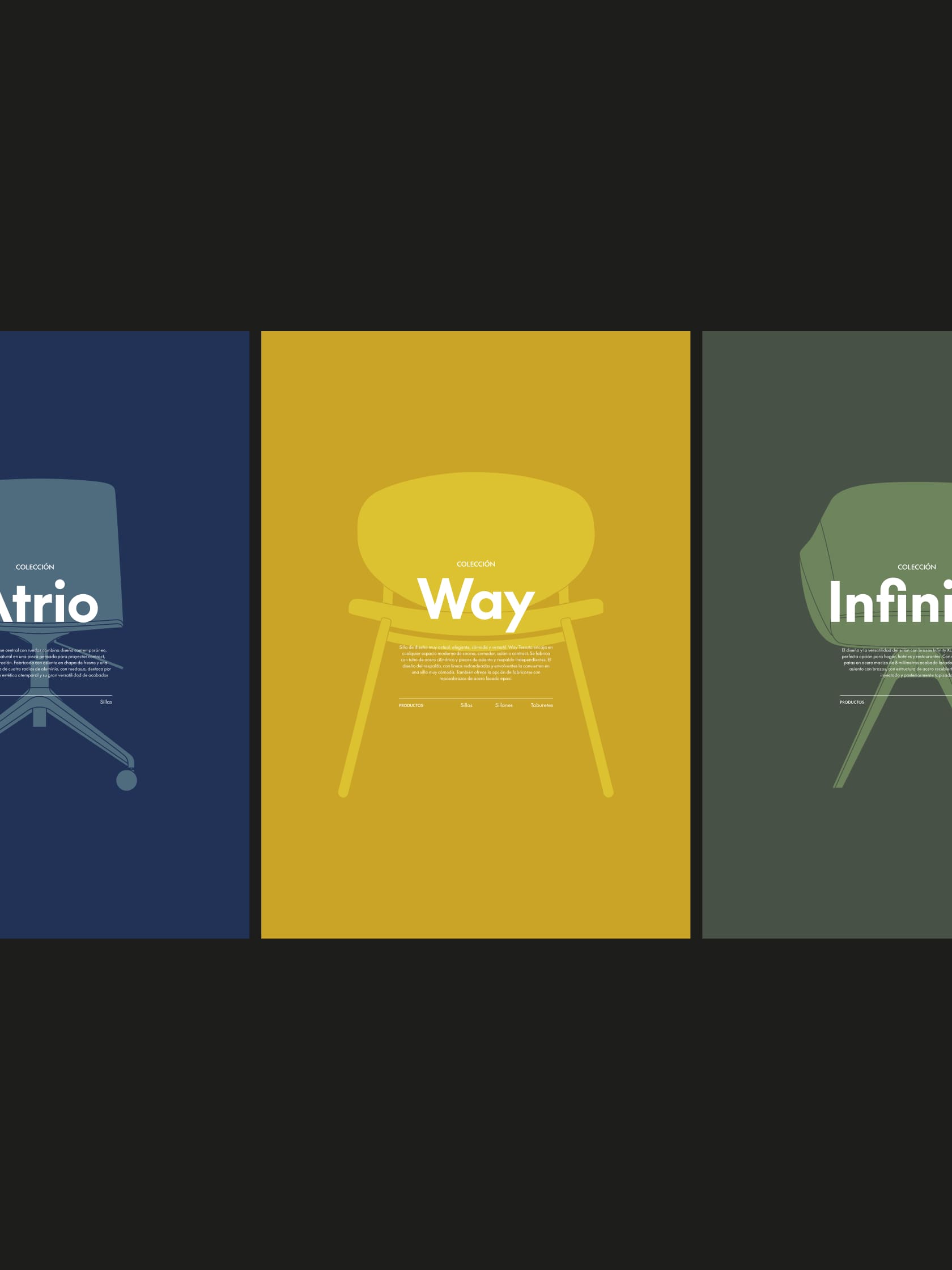
Visual identity and web design. Strategic minimalism
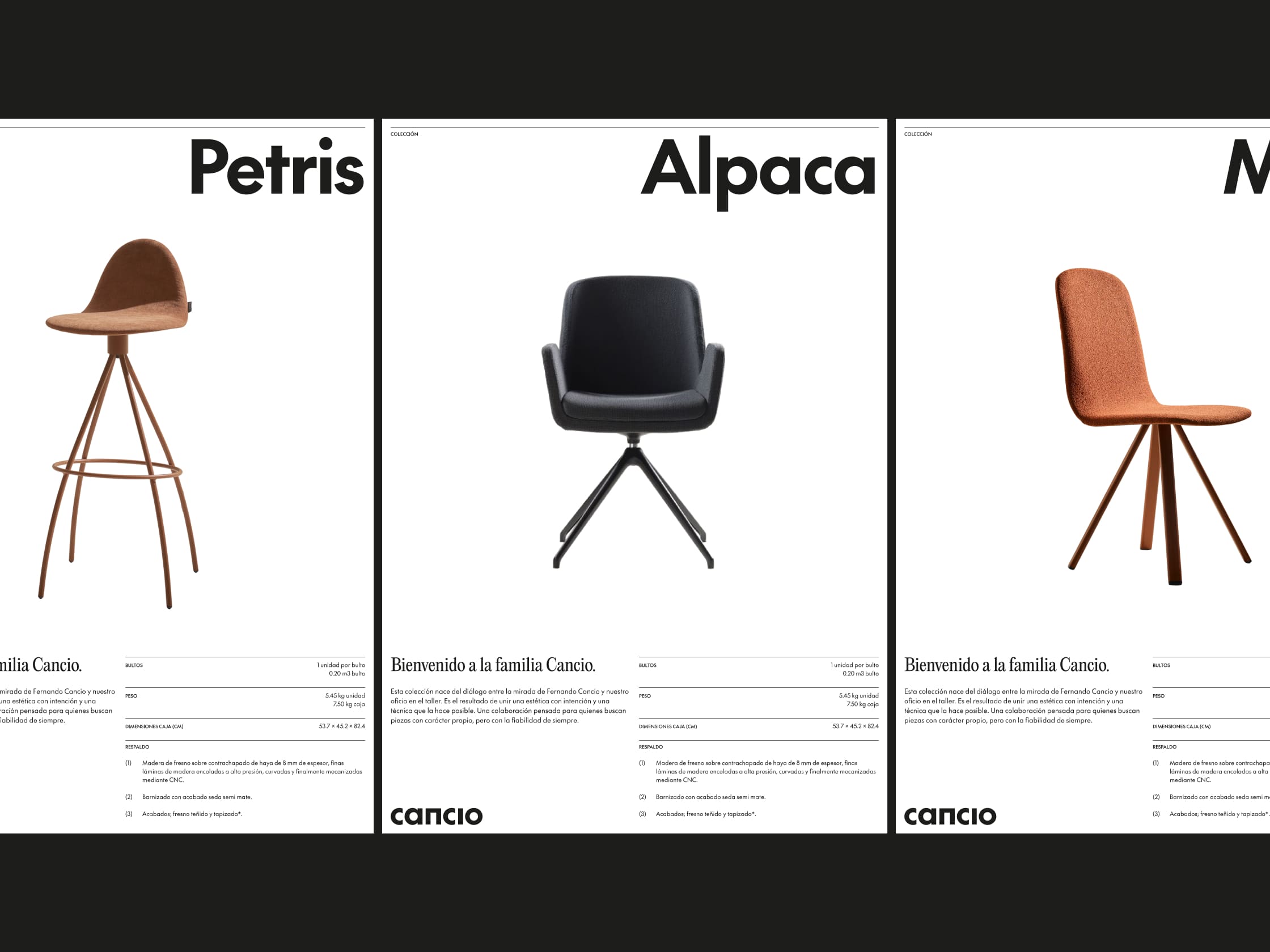
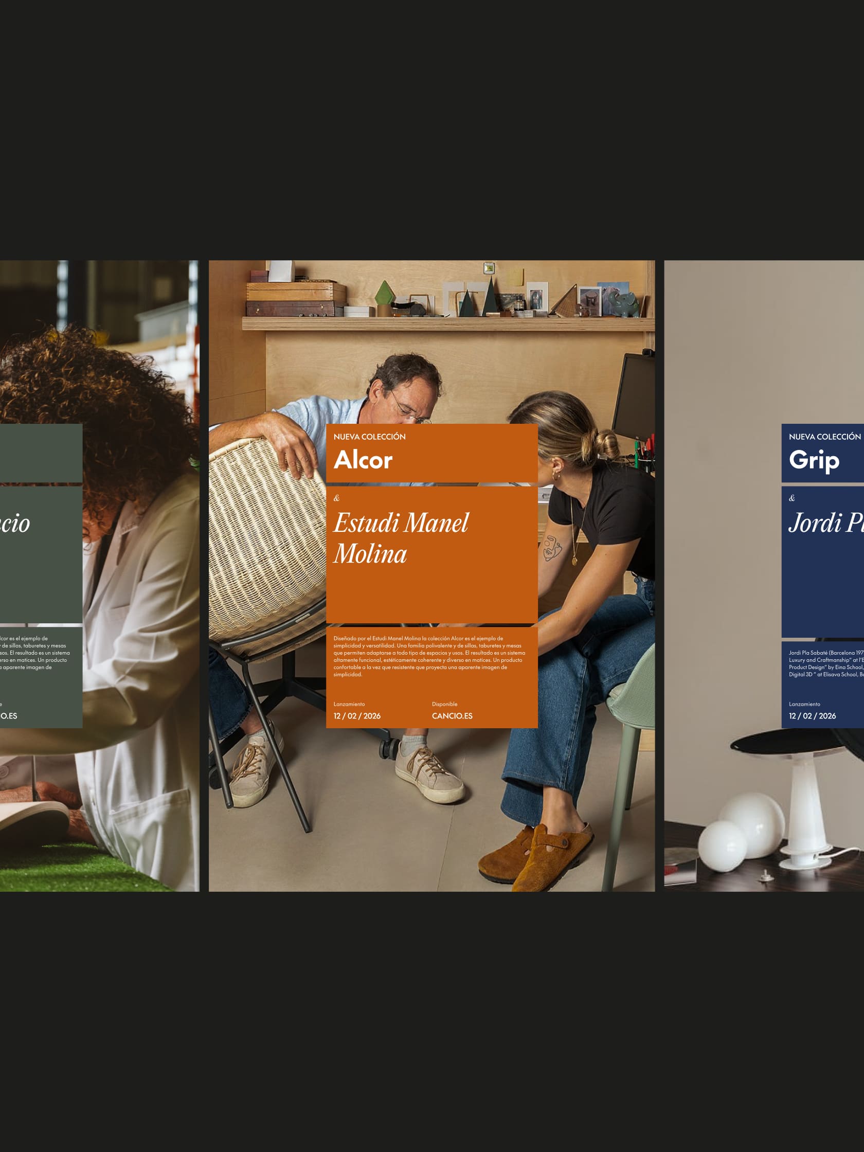
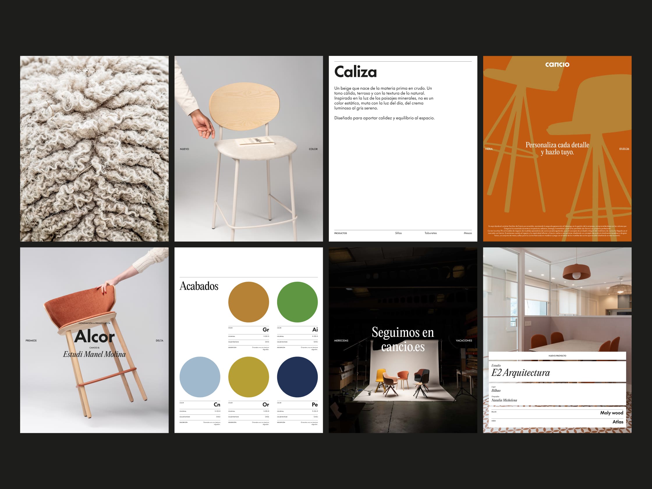
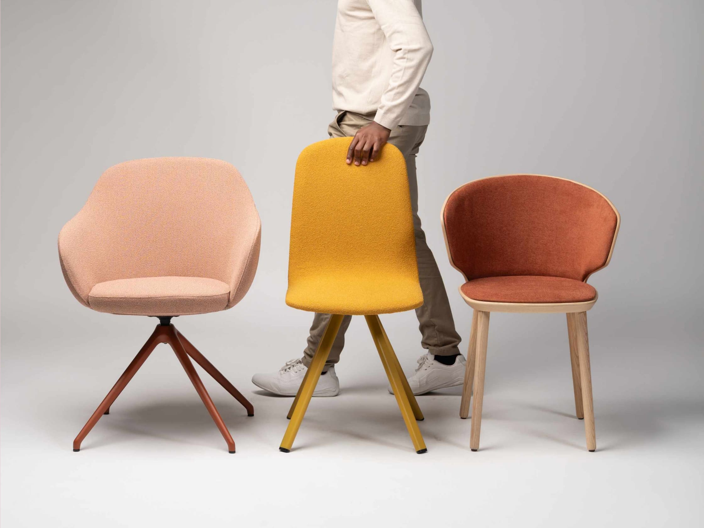
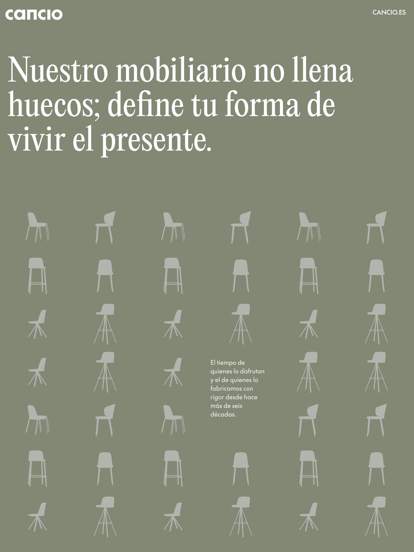
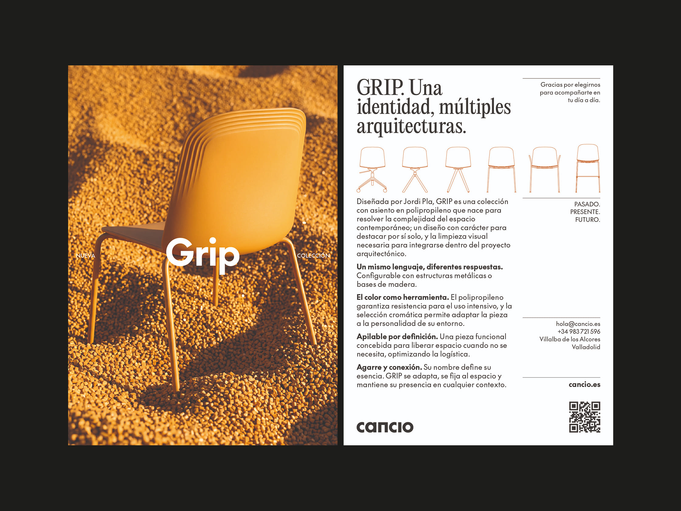
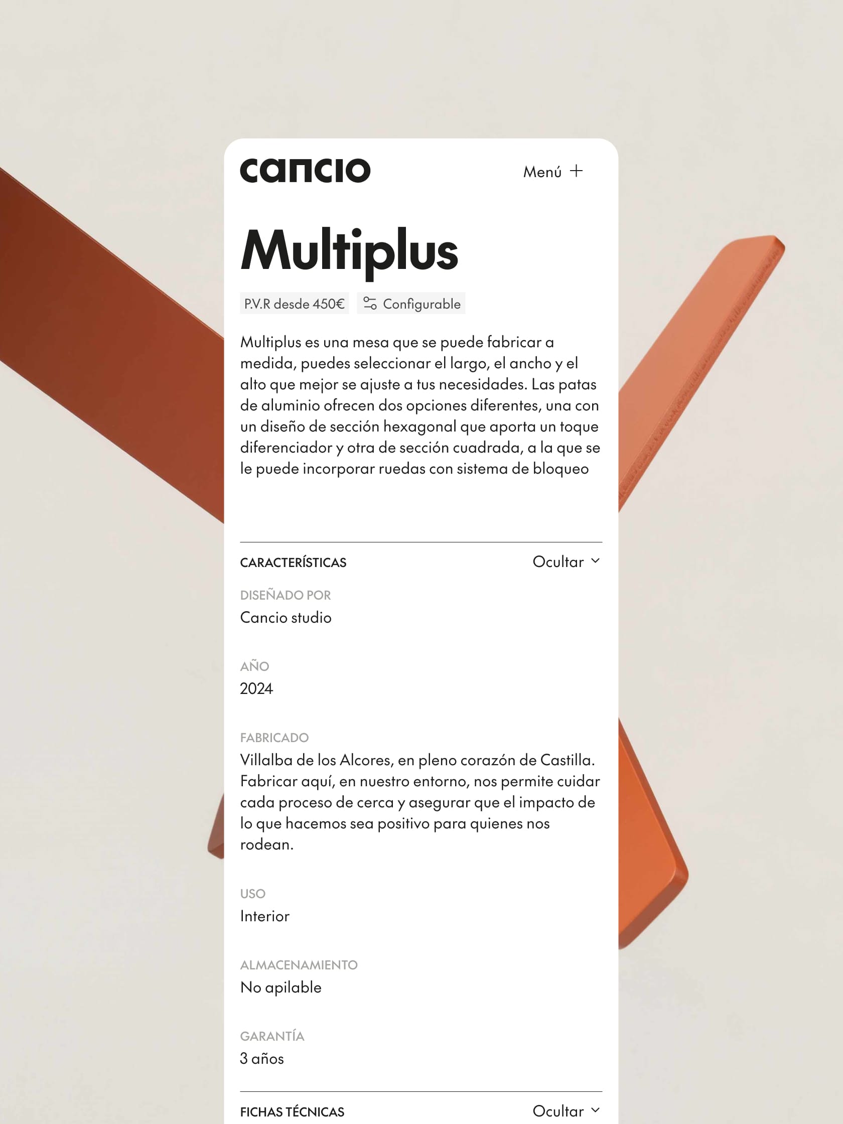
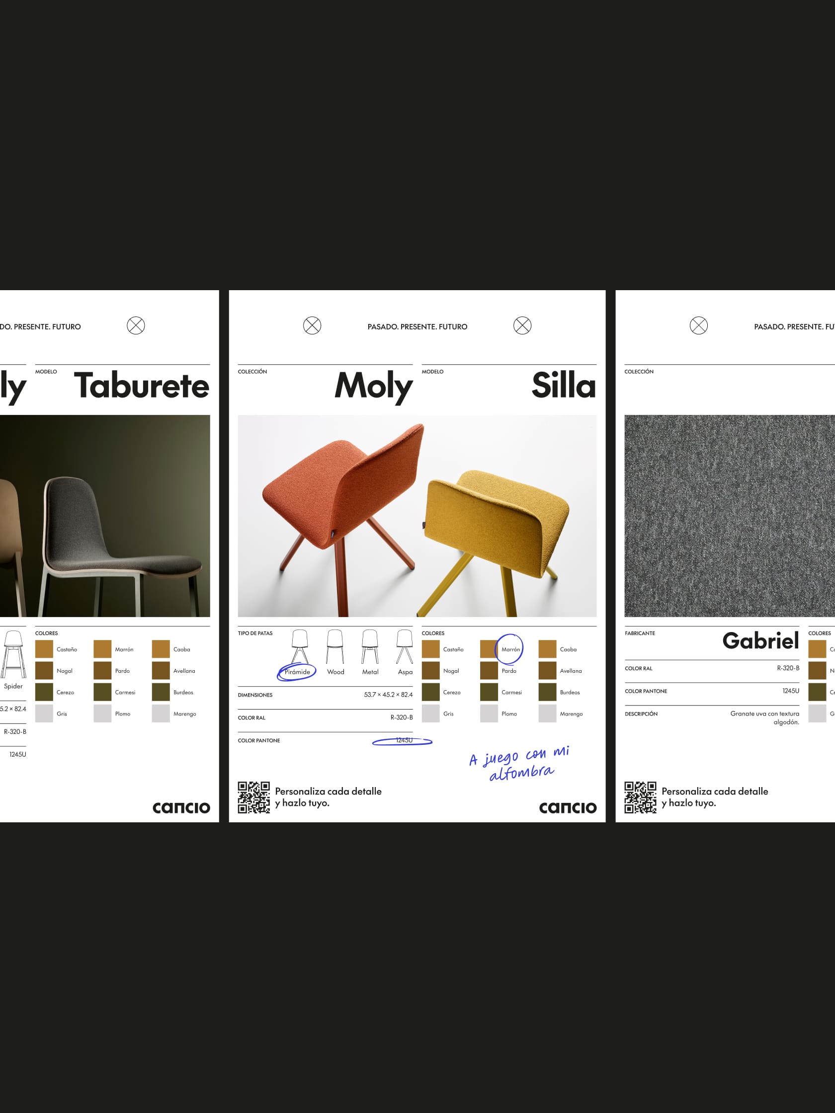
The visual identity stems from a primary palette built on chromatic pairs (light/dark) of four core colours. This foundation ensures consistency and recognition right from the start, while allowing a secondary palette to step in and embrace the dynamic nature of new collections. The non-negotiable rule is to anchor everything on black and white as the pillars of an elegant, minimalist design.
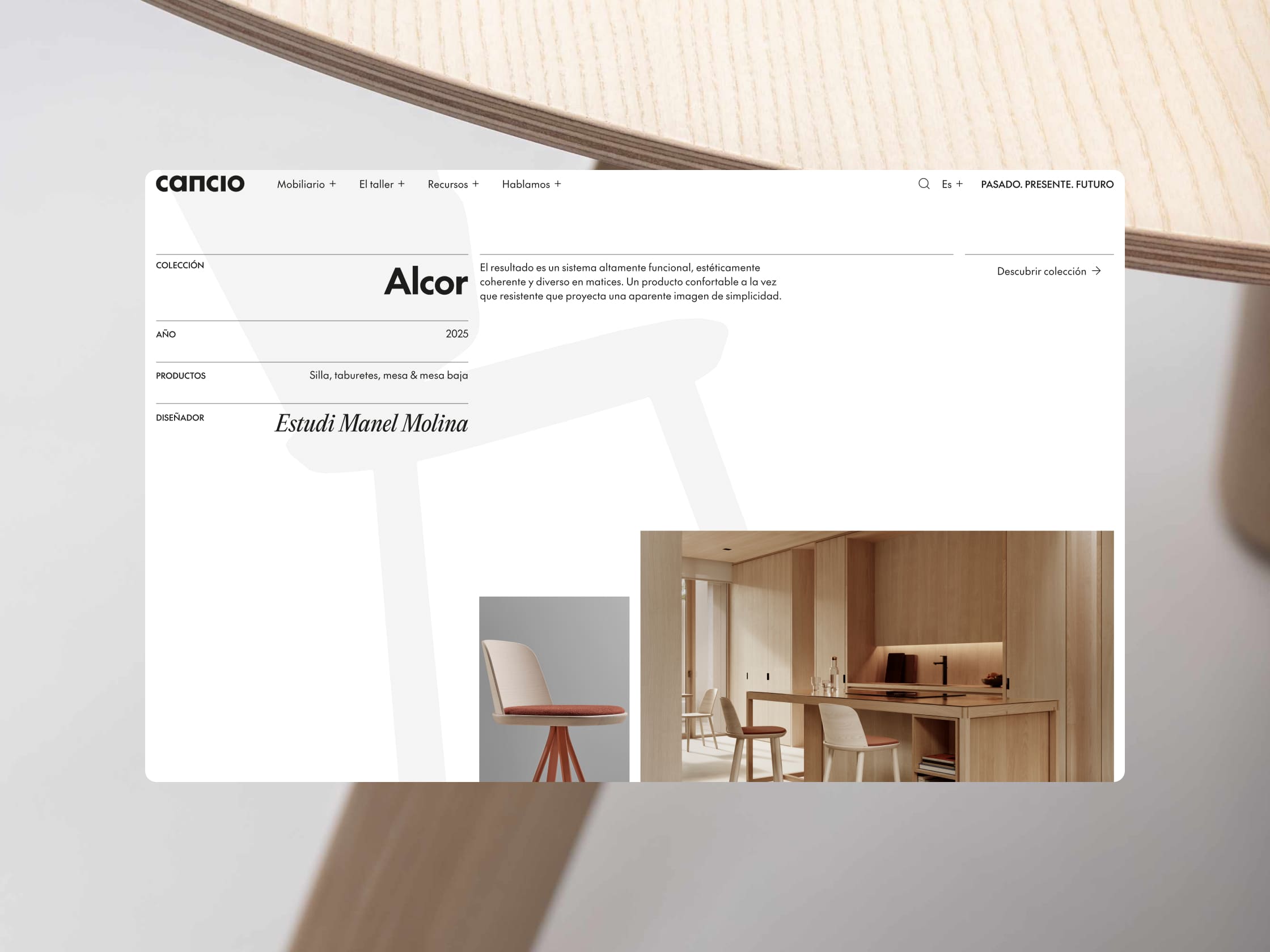
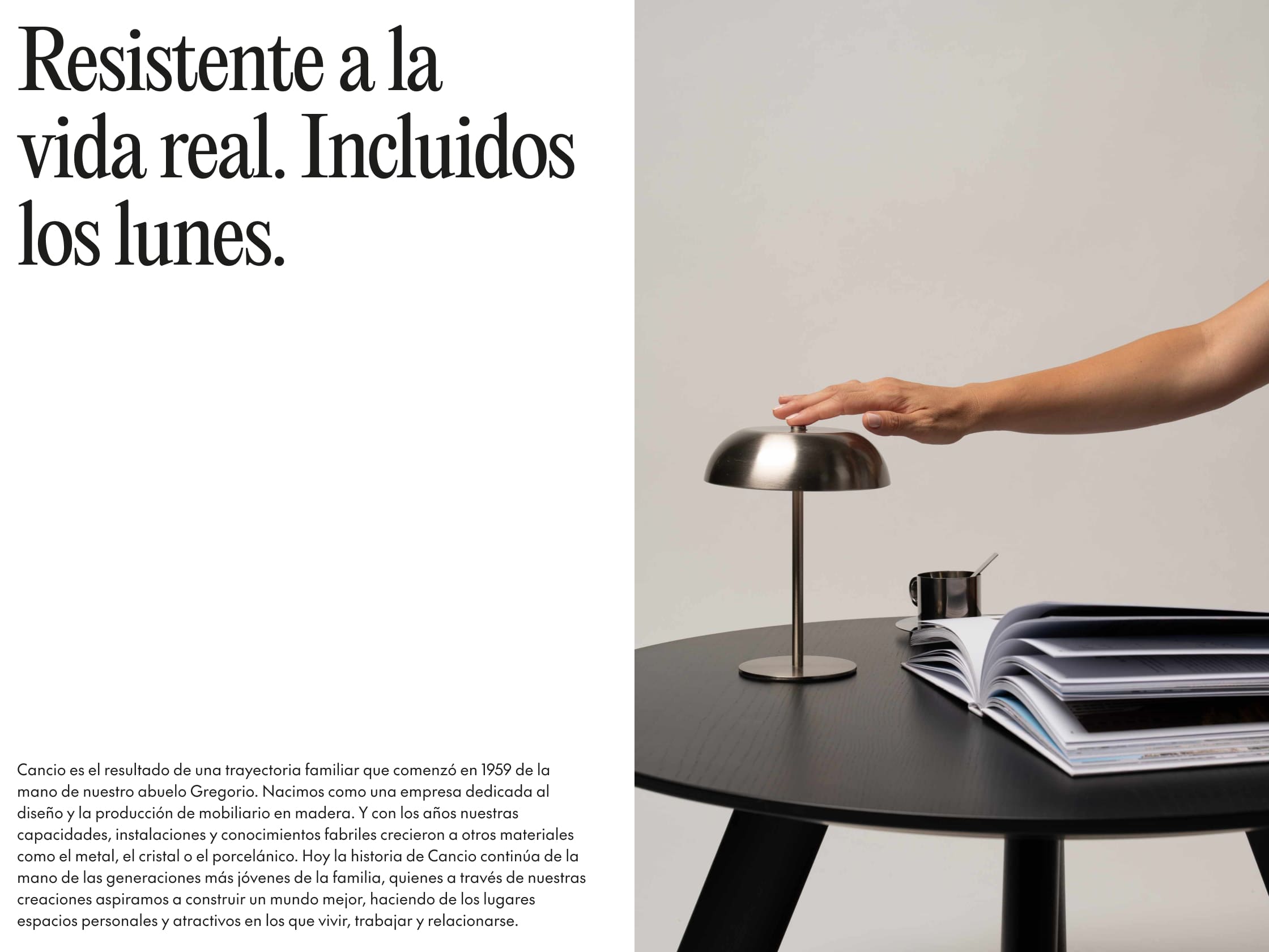
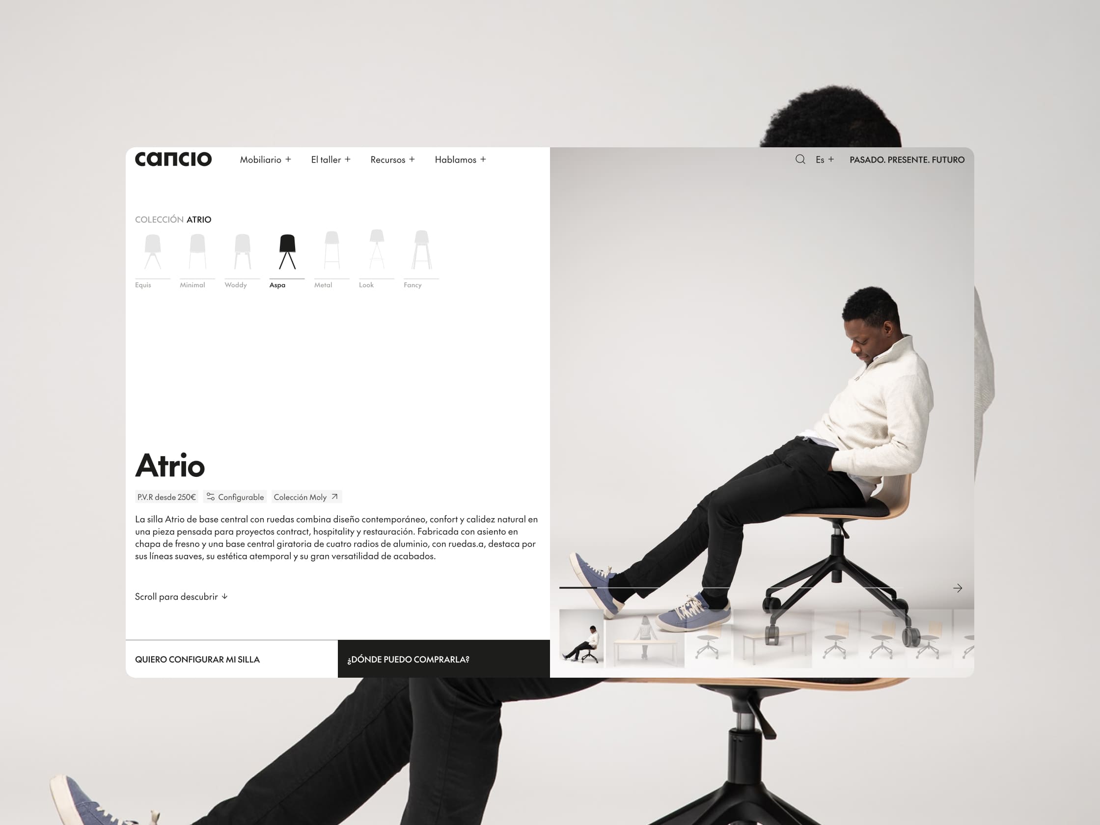
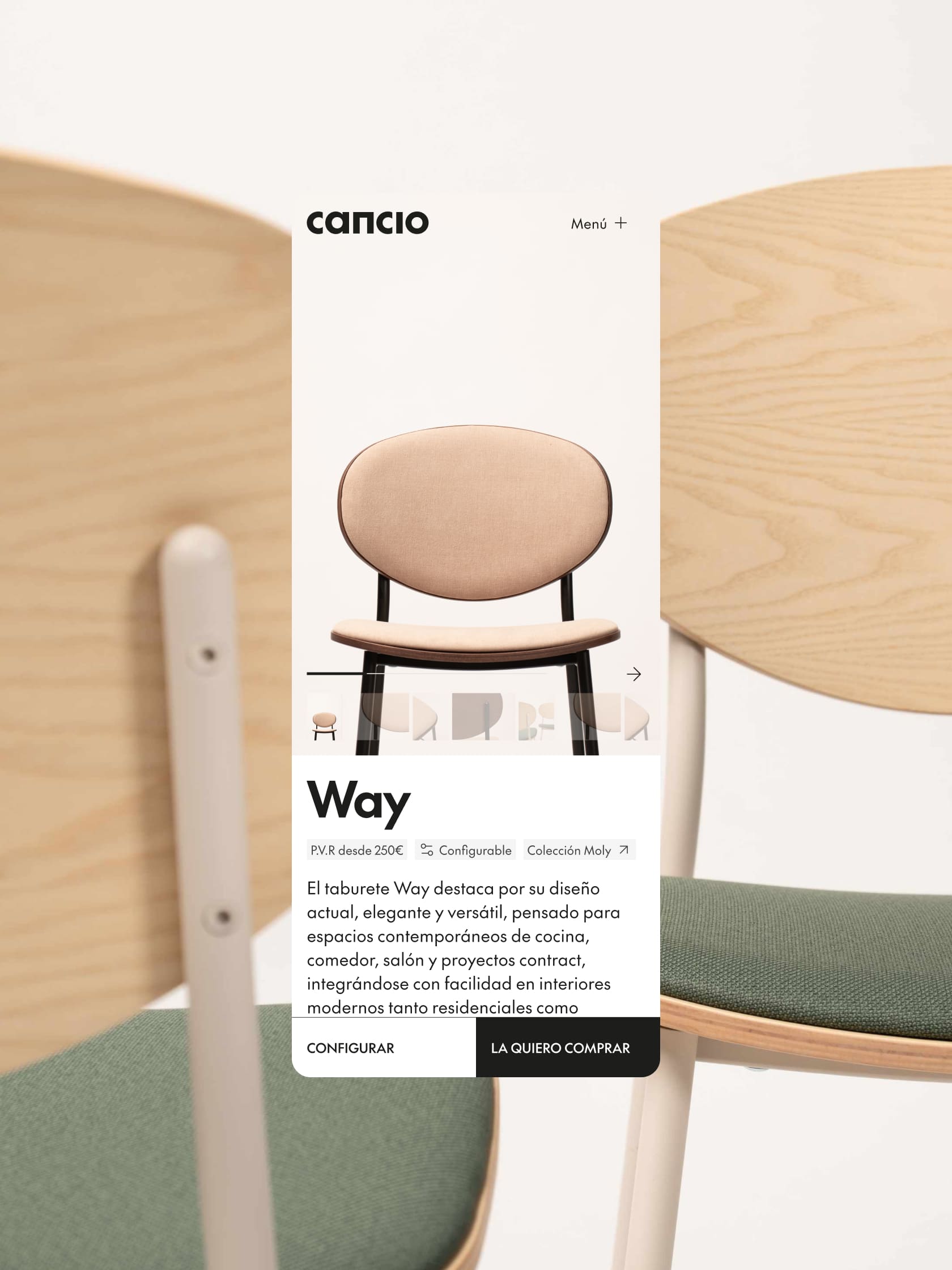
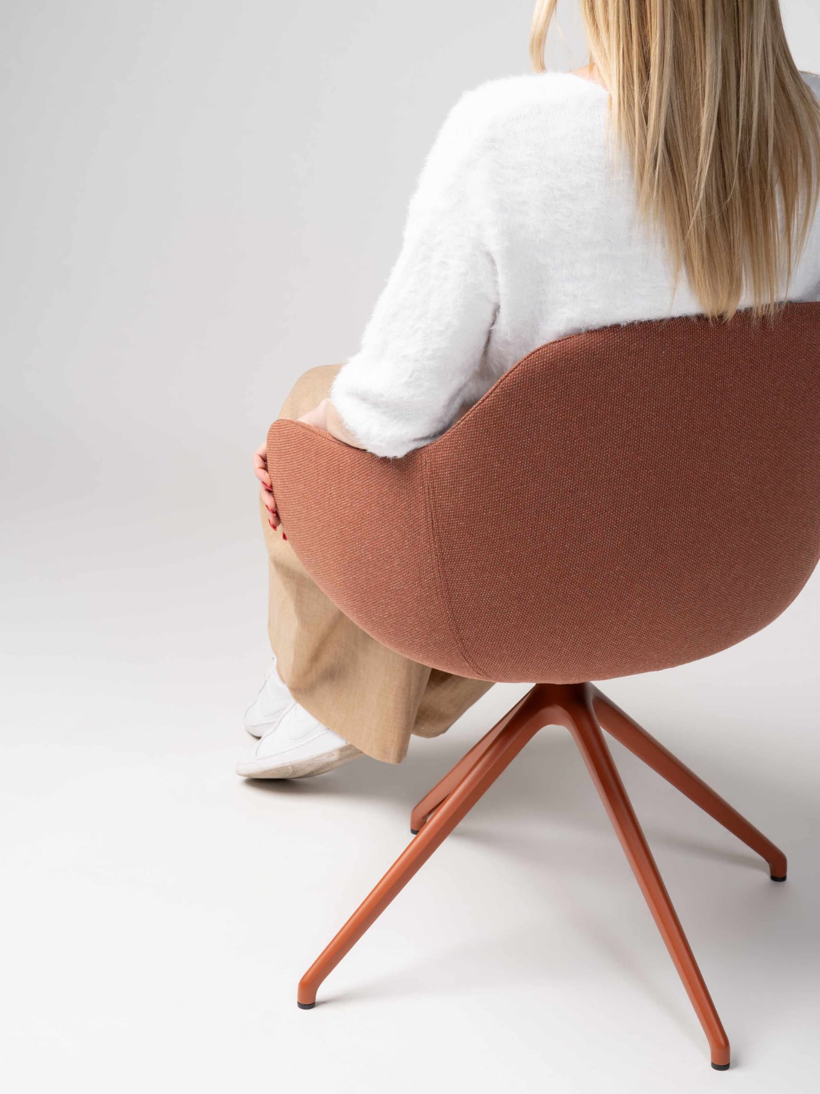
The web and editorial design rely on a clean, organised structure that plays with balanced asymmetry, breaking rigid layouts to create real visual impact. The secret to the layout is the absolute dominance of negative space, which prevents visual clutter, elevates the perceived value, and draws the eye straight to the lines of the furniture.