Honest, free, conscious.
The organic livestock branding project for Finca Sarbil presented the challenge of modernising a traditional farm while preserving its heritage. Sarbil is more than just a farm, it is a legacy of animal welfare and respect for the land. With 1,000 hectares of organic production and a three-generation heritage, the challenge was to evolve a brand rooted in a philosophy of total integrity towards its environment. We had to respect the family history and the traditional methods of Aritz and his family, modernising their image for an audience that values excellence and quality. Our mission was to move away from industrial aesthetics to create an identity that reflects the truth and the real flavour of extensive, pasture-raised farming.
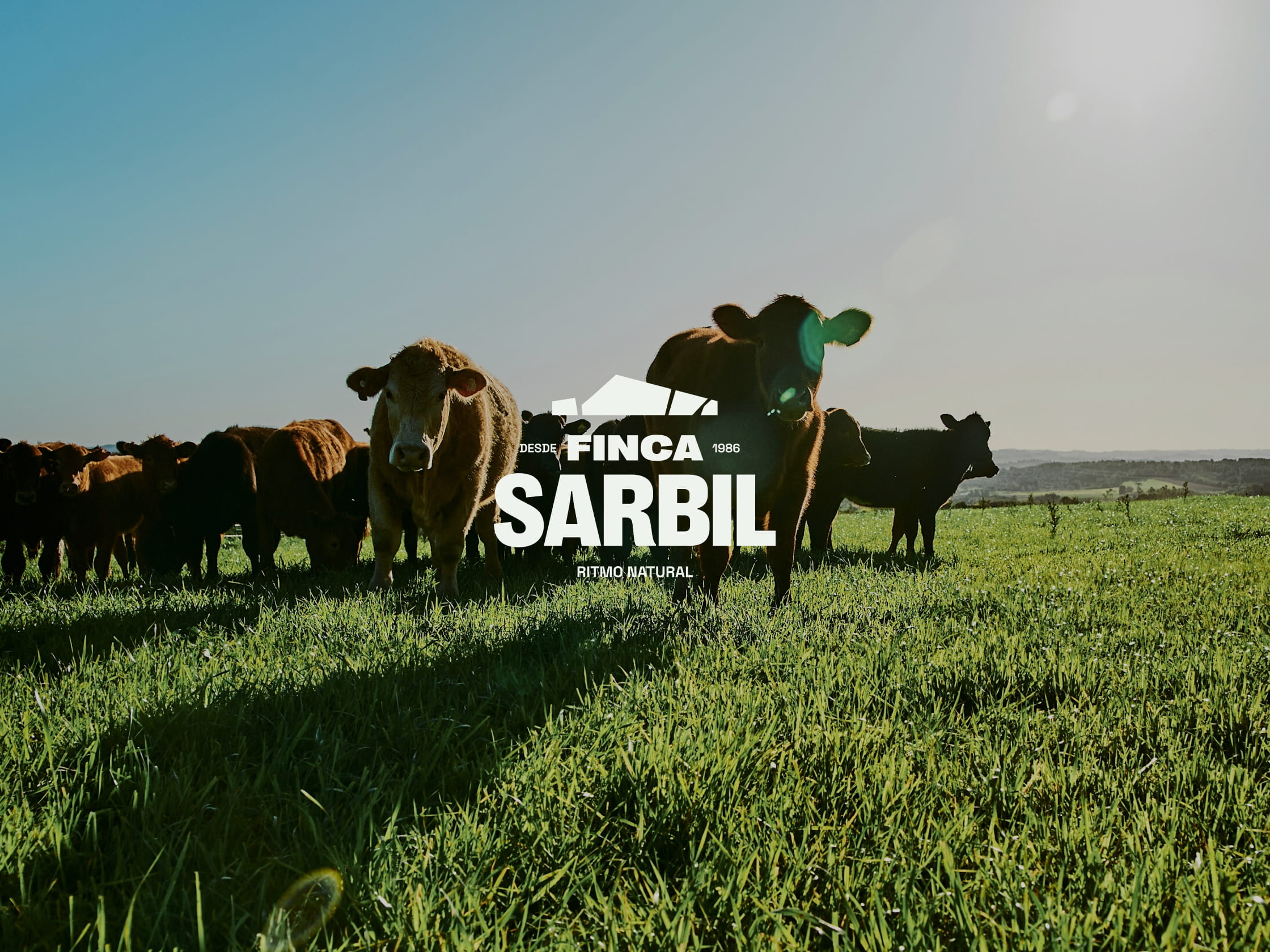
The strength of authenticity.
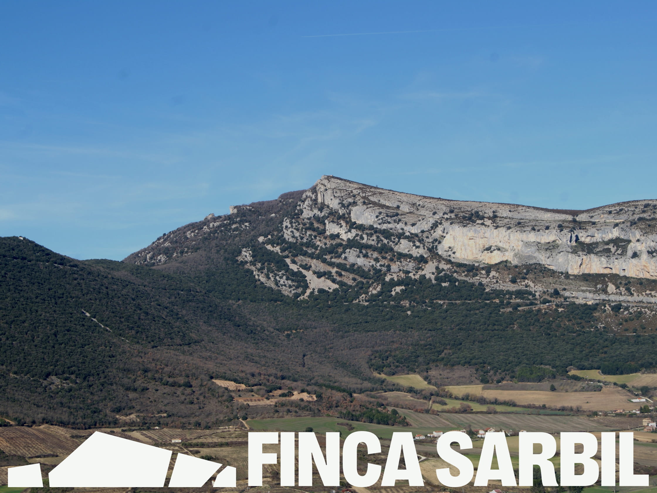
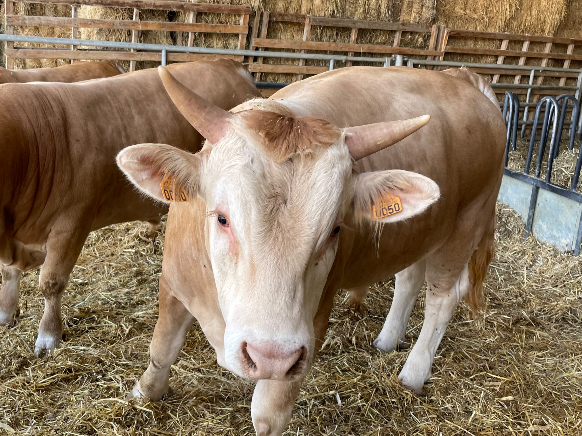
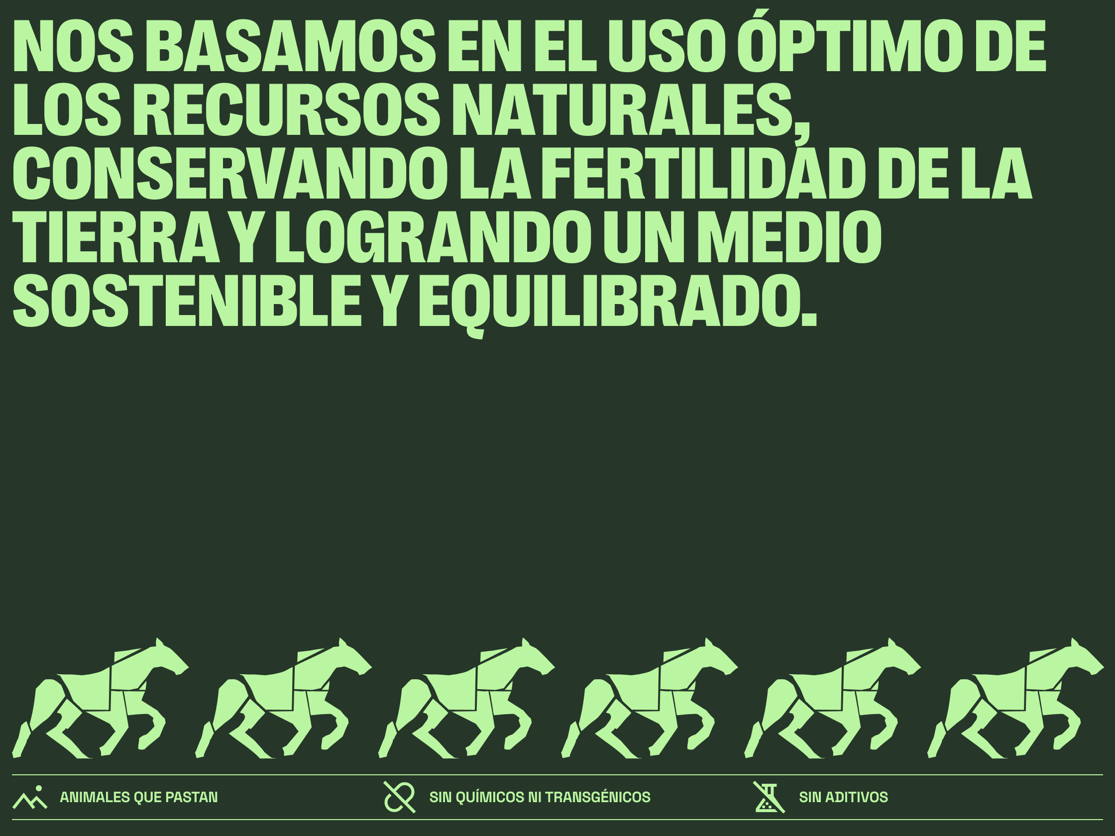
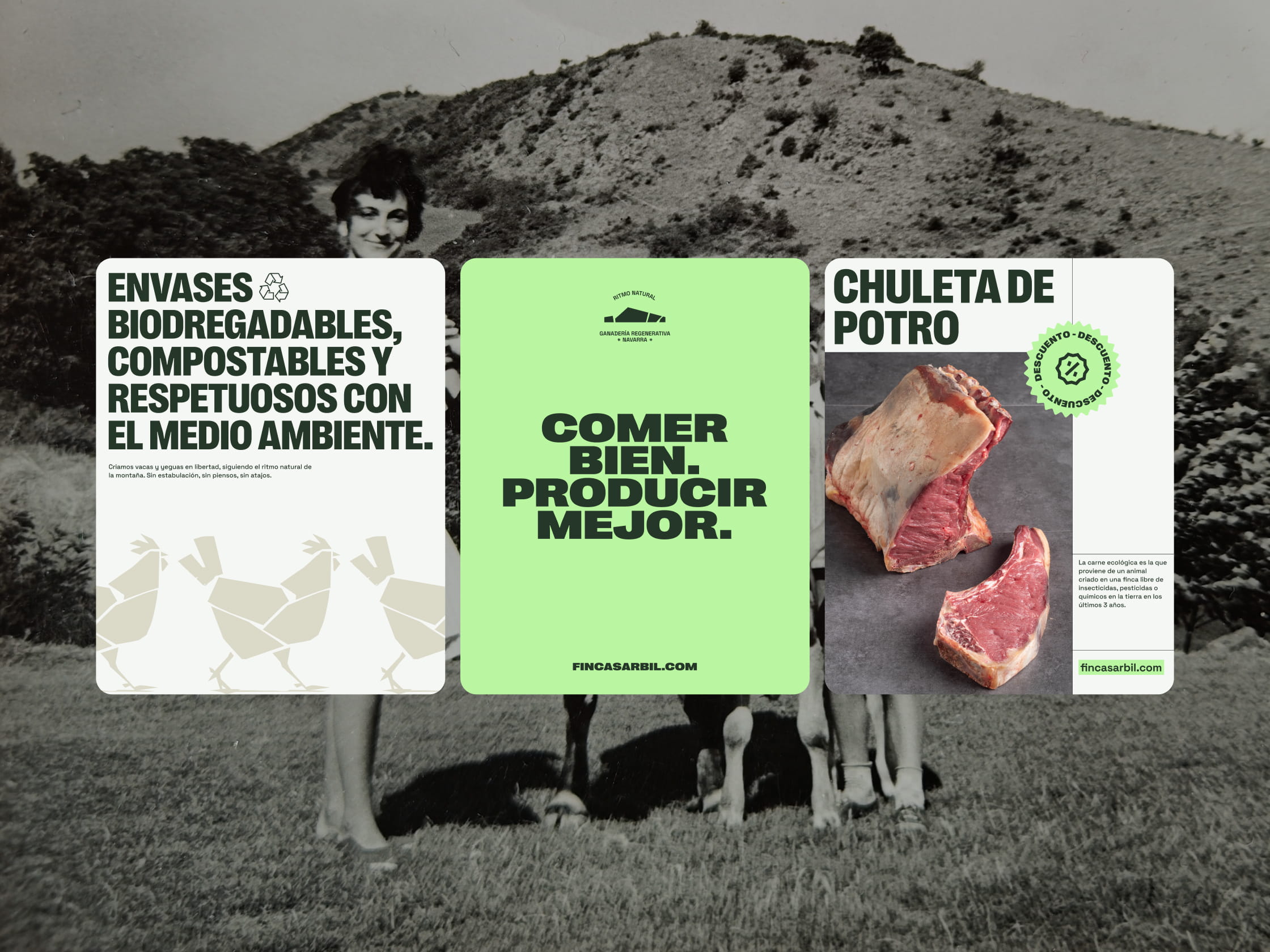
The visual identity is born from a profound respect for the environment. The brand icon is a minimalist representation of the farm itself, presided over by the mountain peak that dominates its landscape. It is a tribute to an ecosystem whose topography and scale allow the animals to undertake their own “transhumance”, moving freely according to the season to make the most of the resources provided by the varying altitudes. This freedom of movement is the foundation of their welfare and the essence of our vision, a brand that celebrates its place of origin.
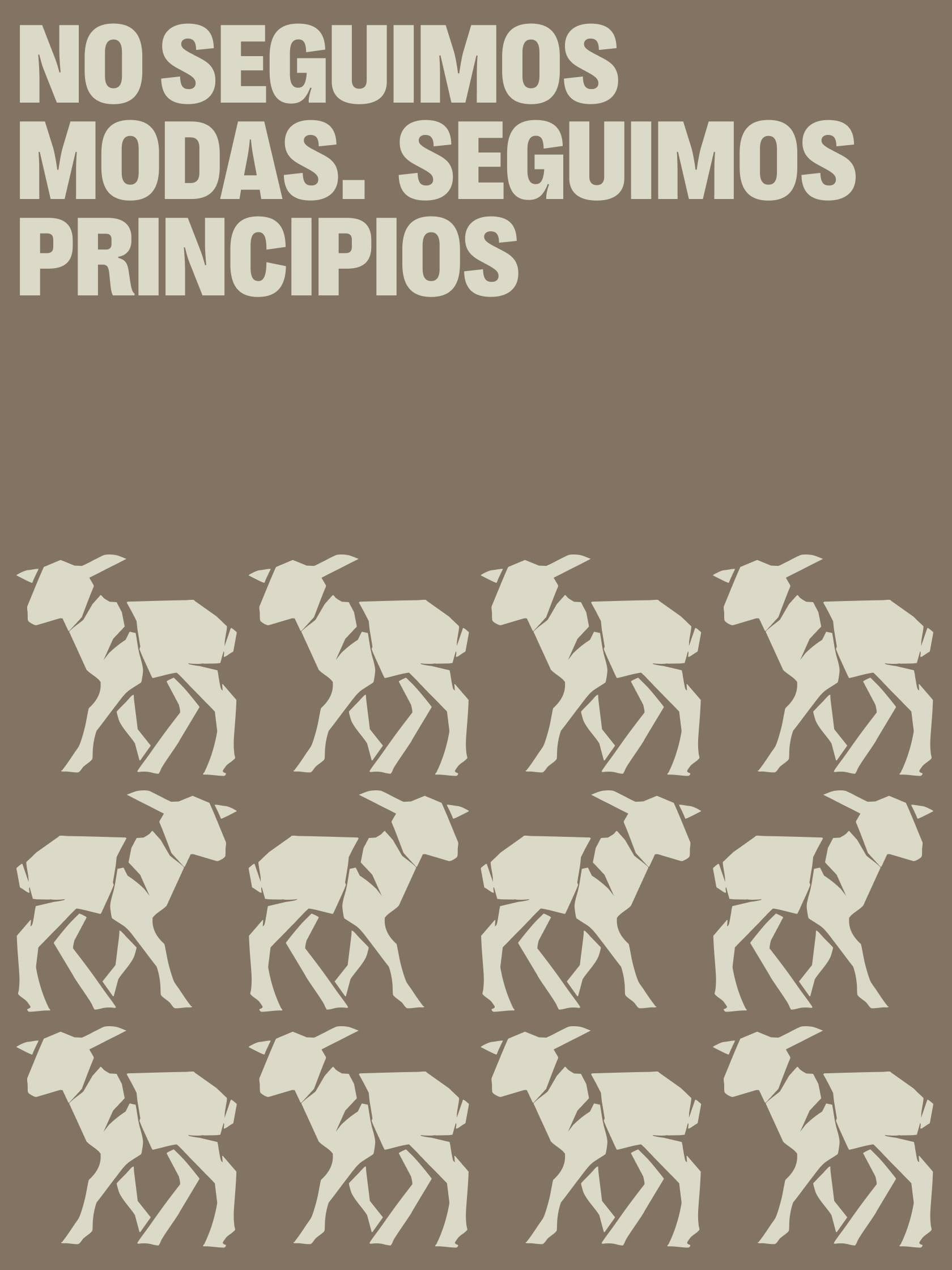
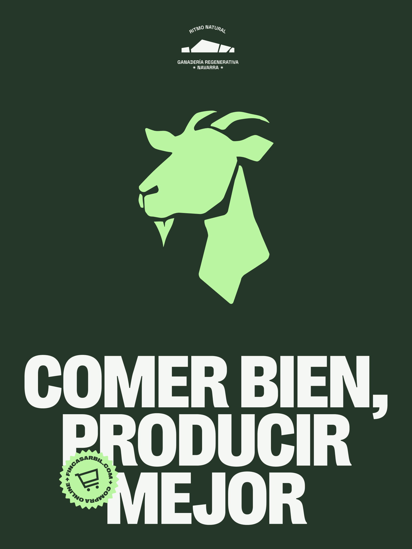
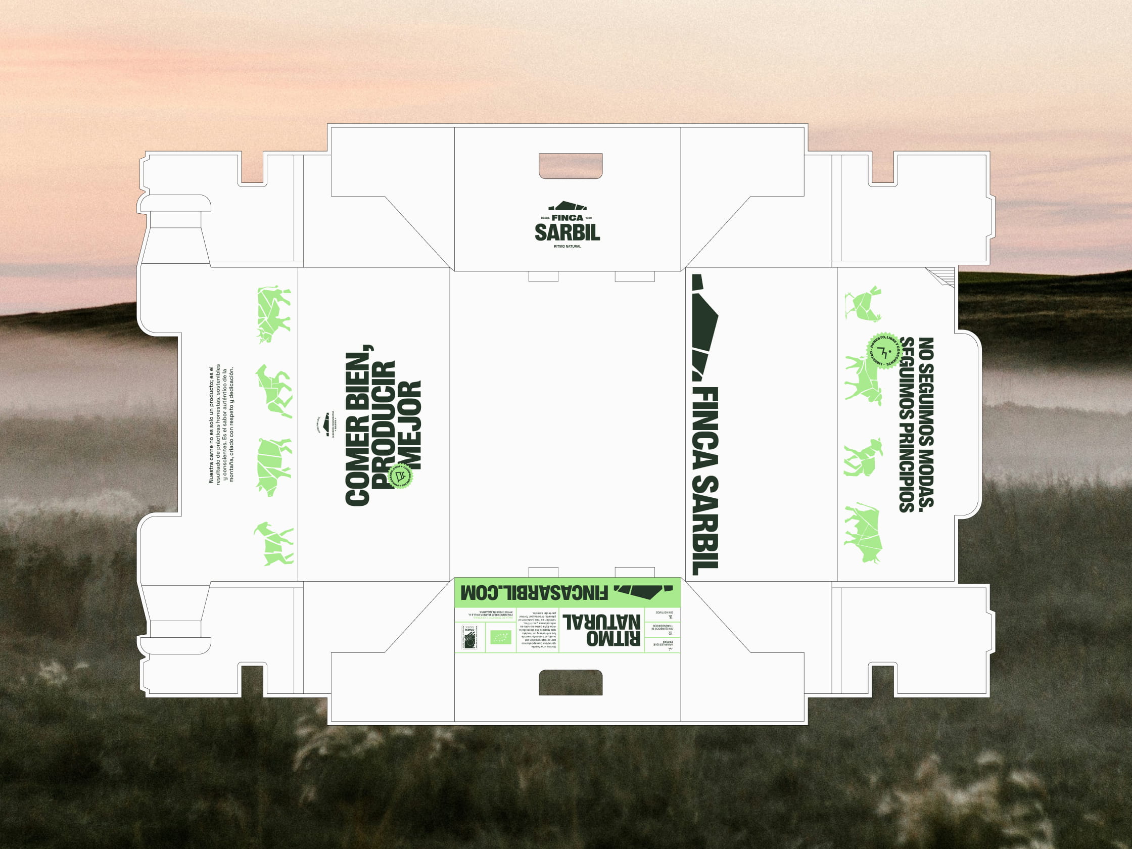
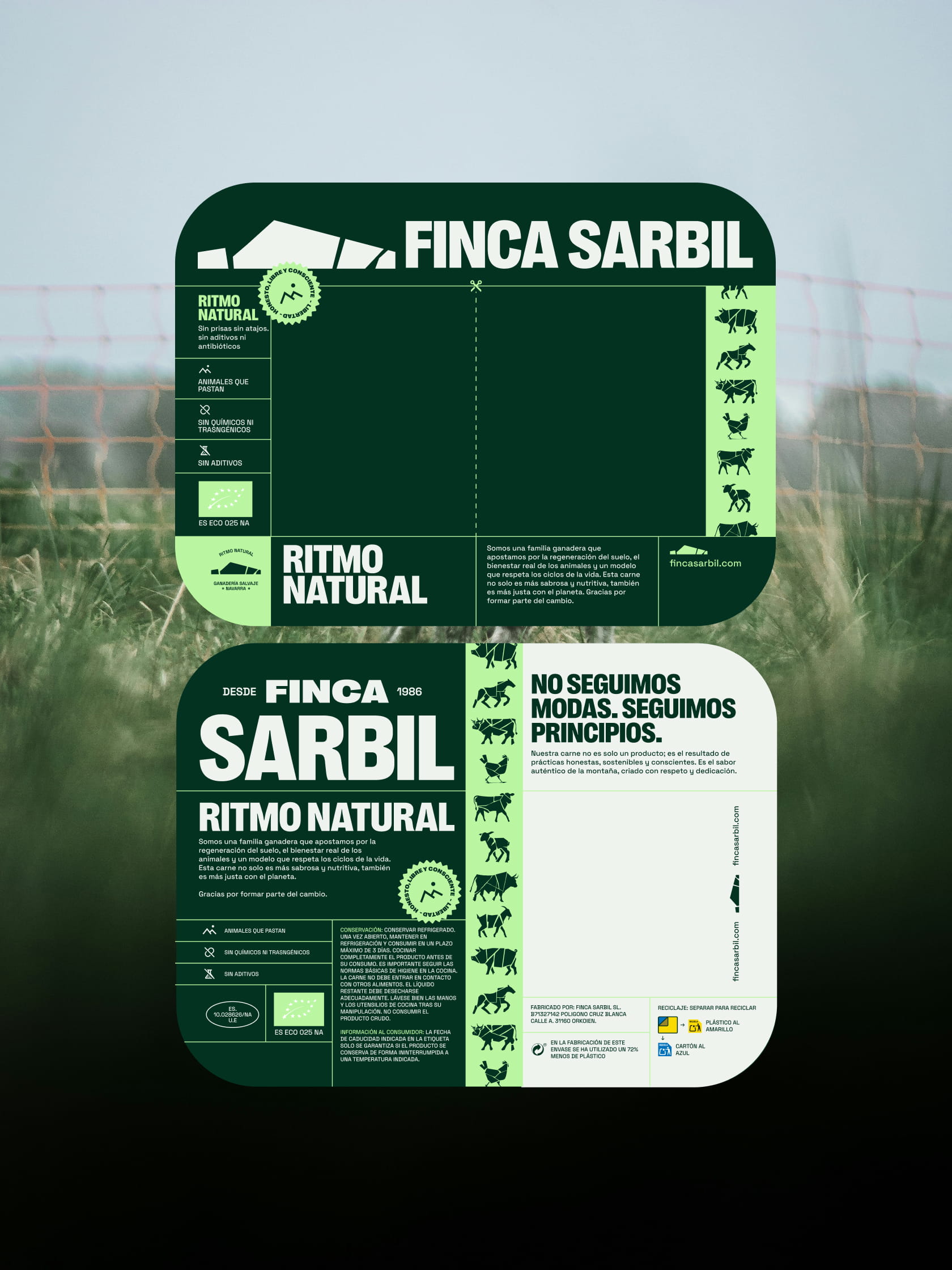
Our visual proposal focuses on boldness. We reclaimed the strength of traditional livestock brands through solid typography and a versatile brand architecture, capable of adapting to any medium without losing impact. The new system combines a robust logo with a minimalist icon that honours the farm’s surroundings. To revitalise the brand, we renewed its colour palette, adding a vibrant tone to its original dark green to project a brand that feels alive and fresh.
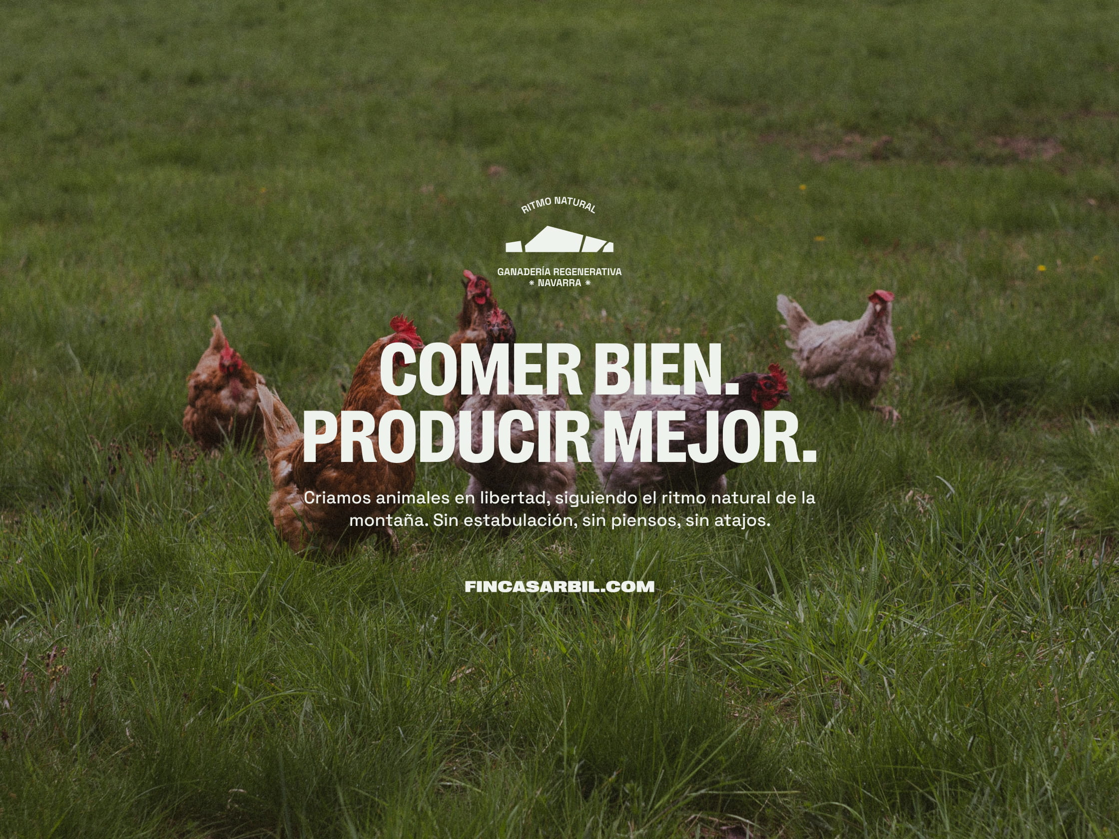
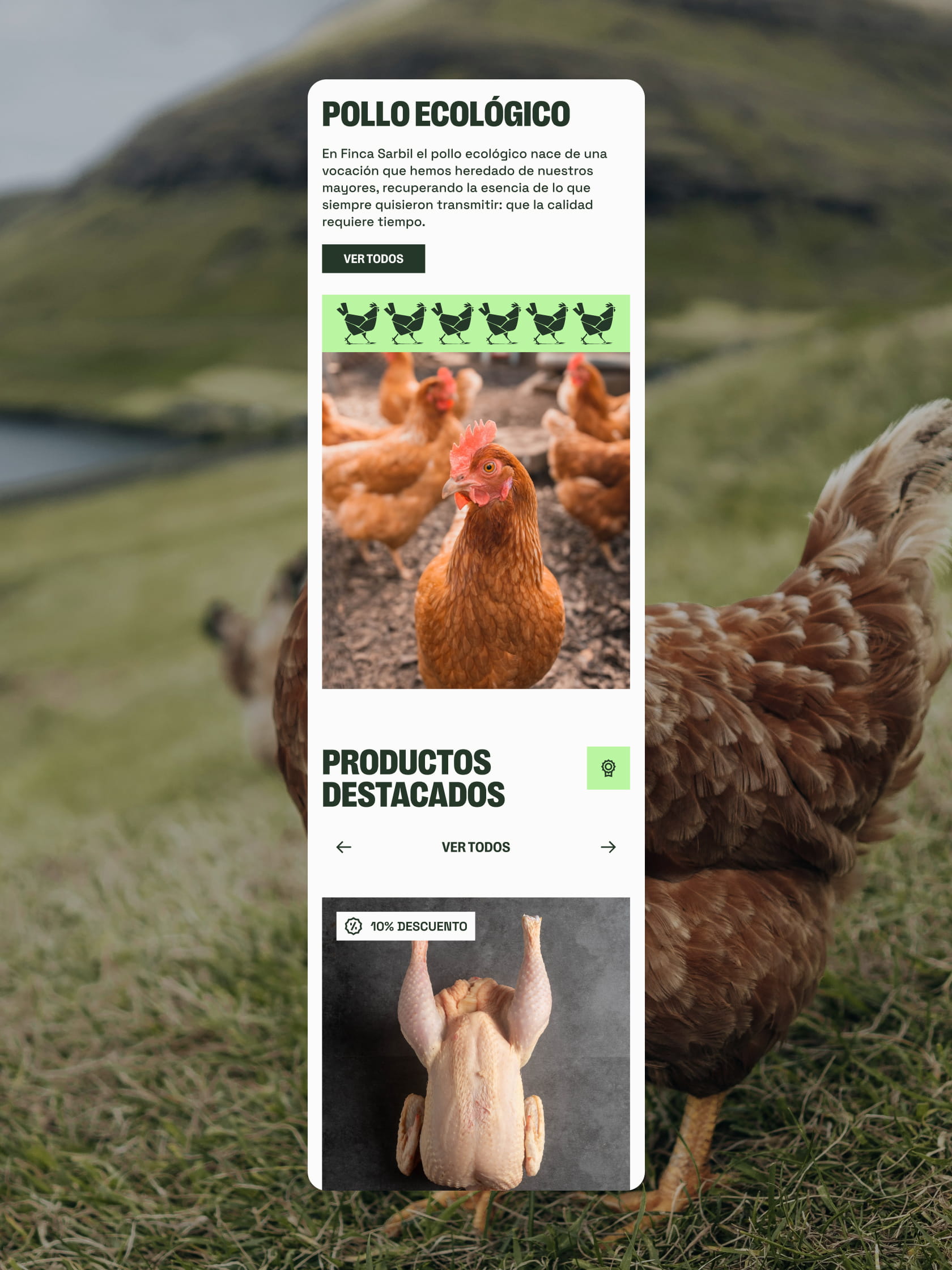
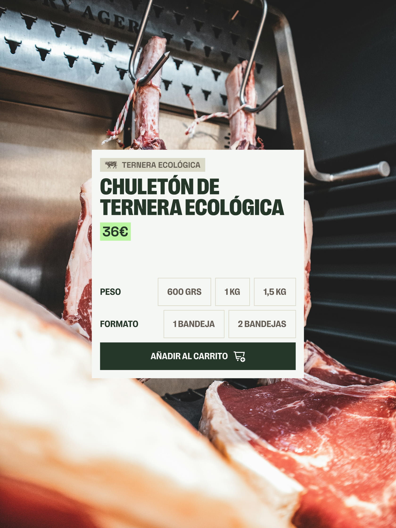
Web Proposal and Visual Narrative.
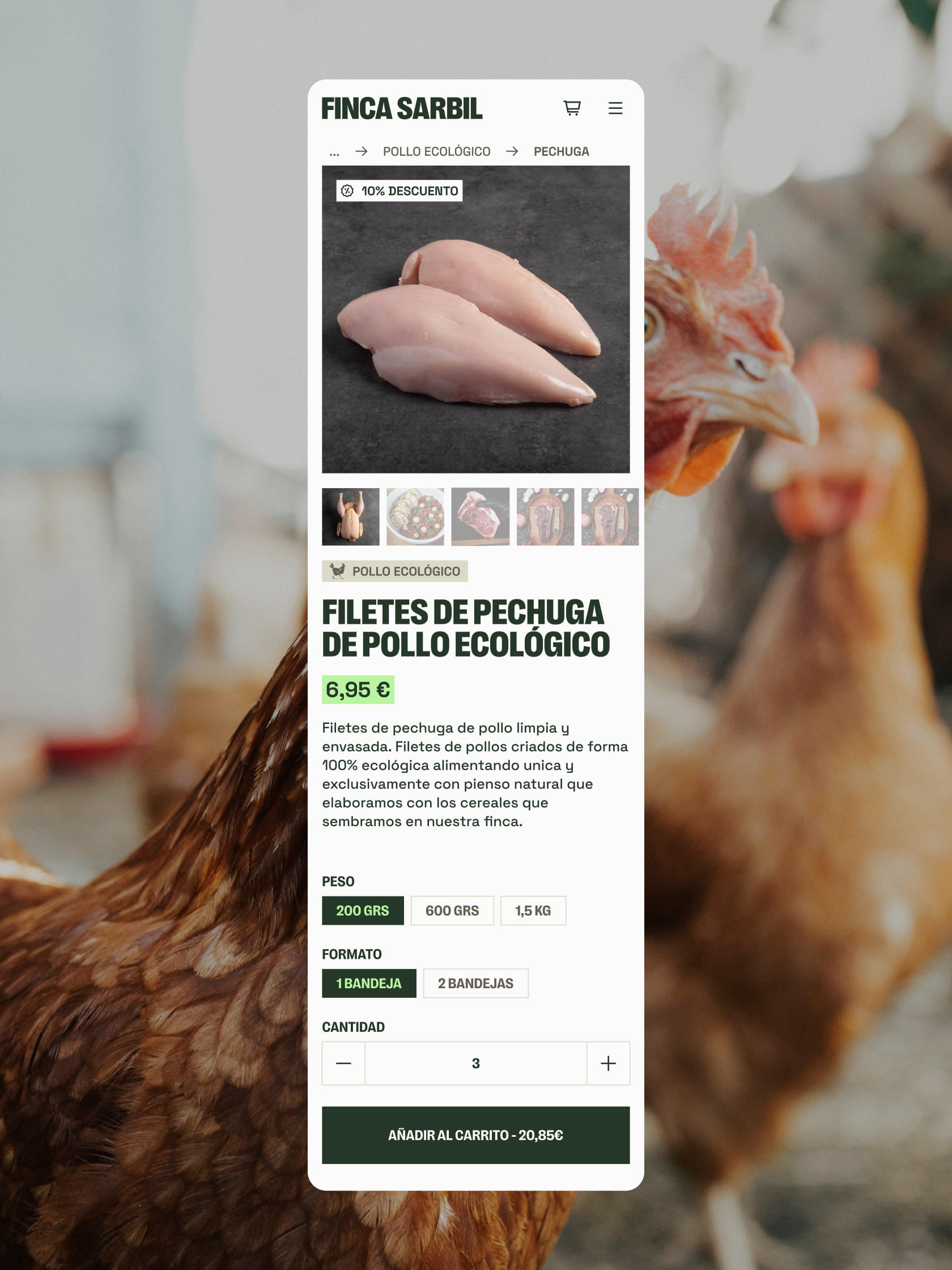
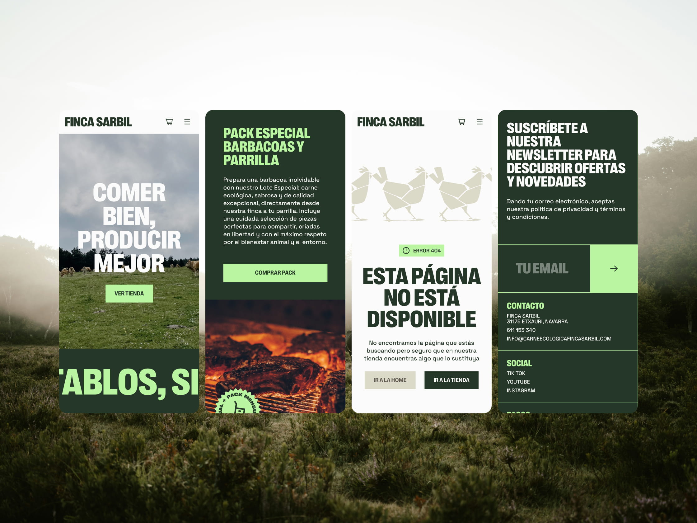
The project includes the design and art direction for a new web platform, conceived as a digital space where clarity takes centre stage. Although technical development is currently ongoing, our proposal focuses on bringing the farm experience to the screen through large-scale typography and intuitive navigation.
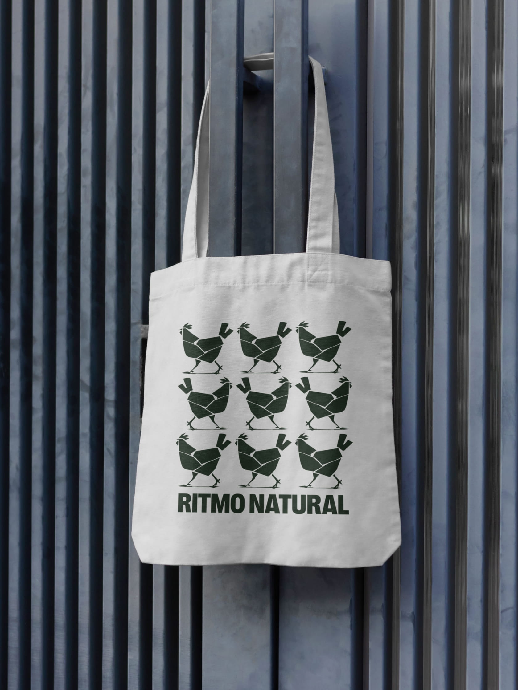
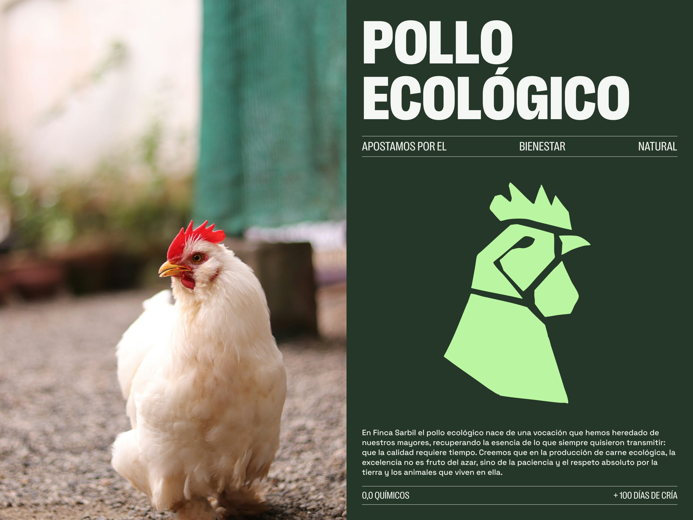
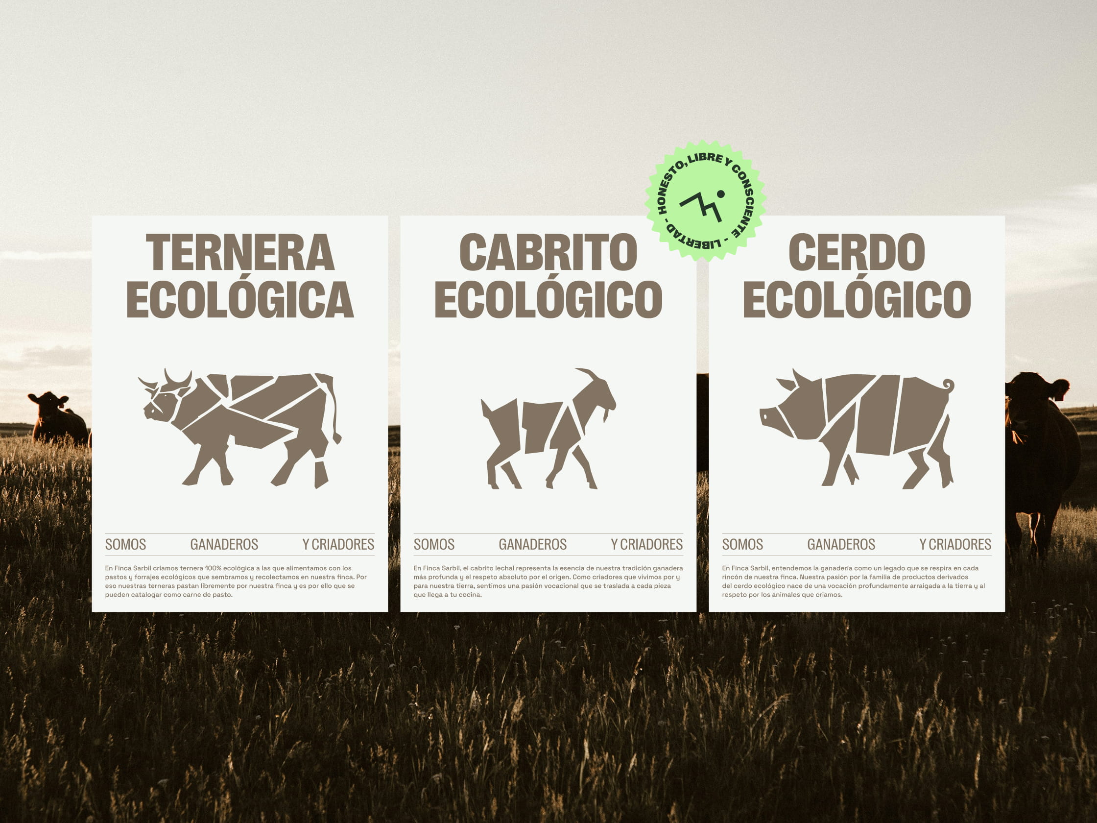
These bespoke illustrations, including portraits and full-body depictions, serve as a narrative tool that honours the heritage of the trade. It is about more than just representing product categories; it connects with an aesthetic of craftsmanship and respect for the source that defines this house.